For Your Consideration: Bringing Back Shoulder Patches

Are the Sabres blue uniforms to blame for their struggles on home ice? Most definitely yes (read: no).

It hasn’t gone unnoticed just how different things have gone for the Sabres when they’ve worn their black and red alternate jerseys compared to their standard home uniforms. The Sabres enter Friday’s game against the Devils with an 8-1-1 record in the goatheads and a dismal 5-19-2 in anything else on home ice.

Even though the real solutions to their home ice woes (goaltending, team defense, better luck in general) will have to come from the general manager’s office, it couldn’t hurt for the Sabres to consider a few tweaks to their home uniform to make the team look a tiny bit better when they take the ice at KeyBank Center.

Buffalo’s blue jerseys have long been fairly bland and unforgettable. There’s a little too much blue and not much else to break it up. The white stripes the team chose to add to their 2021 uniform redesign didn’t help much as they just look like the silver stripes so many fans wanted removed in the first place. I’m not sure why the Sabres avoided shoulder patches on their home and away jerseys, but reintroducing a shoulder patch would be a cool starting point for sprucing up the home uniforms. Pulling out the white trim from the socks and jersey stripes and resurrecting the pants striping from the pre-1996 jersey redesign would be two other items I’d like to see considered.

Interestingly, the Sabres haven’t won a playoff series since they removed shoulder patches from their jerseys. Of course, they still had shoulder patches in 2010 when they lost to Boston, but that’s of little importance to the larger conversation (what makes the jerseys look cool). The Sabres have had shoulder patches on their jerseys for 39 of their 53 seasons and it seems high time to bring them back.

Continue reading

Buffalo’s Best Moments in Red and Black

The Sabres will take to the ice downtown in black and red uniforms for the first time since the spring of 2006. As 90s Night will be full of nostalgia, let’s look back on some of the best moments of Buffalo’s black and red era.

These are presented in no particular order as ranking the best moments of that 10-year span would be awfully subjective. Feel free to share your favorite Goathead memories in the comments or on Twitter.

Continue reading

Back to the Future

The nostalgia train is pulling into Buffalo tonight as the Sabres will take to the ice in their black and red alternate jerseys when they host the St. Louis Blues.

It’s been a long time coming as fans (and even some media) have been pining for the team to hop on board with a throwback alternate uniform for some time. Many other teams around the NHL picked up on the 90s nostalgia trip in recent years. None moreso than the Arizona Coyotes who re-adopted their kachina look for both their home and road uniforms. I hope the Sabres don’t go that far in embracing the red and black jerseys. This set makes for a perfect alternate. There’s no need to go further.

Continue reading

The Instigator Podcast 11.9 – Sabres Unveil the New Goathead Jerseys

The Goathead jerseys have finally been unveiled by the Sabres ahead of their debut on November 23. We go deep on the new jerseys and our thoughts on the sharp new look. We even toss in a bit on the Reverse Retro uniform to go along with a bit of general jersey buying advice for those of you in the market.

We also discuss the Mitchell Miller fiasco and just how poor of a decision the Bruins made from the decision to sign him right on through to their decision to release him from his contract.

You can catch The Instigator Podcast on these platforms any virtually everywhere else you find your podcasts:
iTunes
Spotify
Spreaker
Audacy
Stitcher
iHeartRadio
TuneIn

The Instigator Podcast 10.47 – Red and Black is Back in Sabreland

The Sabres, at long last, have announced they will be bringing back their red and black uniforms as an alternate jersey for the 2022-23 season. The team made the announcement on Wednesday, stating that they will wear the jersey 12 times during the year beginning with a November face-off with the St. Louis Blues. We talk about the excitement surrounding the decision and the nostalgia this brings as we reminisce about some of the great memories made while the Sabres wore the Goathead the first time around.

We kick off the show with a discussion on the two contracts the Sabres signed this week as Ukko-Pekka Luukkonen and Tage Thompson each got a new deal from the club. While the UPL deal wasn’t a huge news item, the Thompson contract is. We break down some key points on the seven-year, $50 million contract for the Sabres center.

Remember to use code Instigator on DraftKings Sportsbook as new customers will get $200 in free bets if they place a $5 bet on any football game in week one.

You can catch The Instigator Podcast on these platforms any virtually everywhere else you find your podcasts:
iTunes
Spotify
Spreaker
Audacy
Stitcher
iHeartRadio
TuneIn

Sabres Unveil Safe but Sharp Heritage Classic Jerseys

While the official announcement was somehow scooped by the team’s online store, the Sabres unveiled the jerseys they’ll be wearing for the Heritage Classic on Thursday morning.

via NHL on Twitter

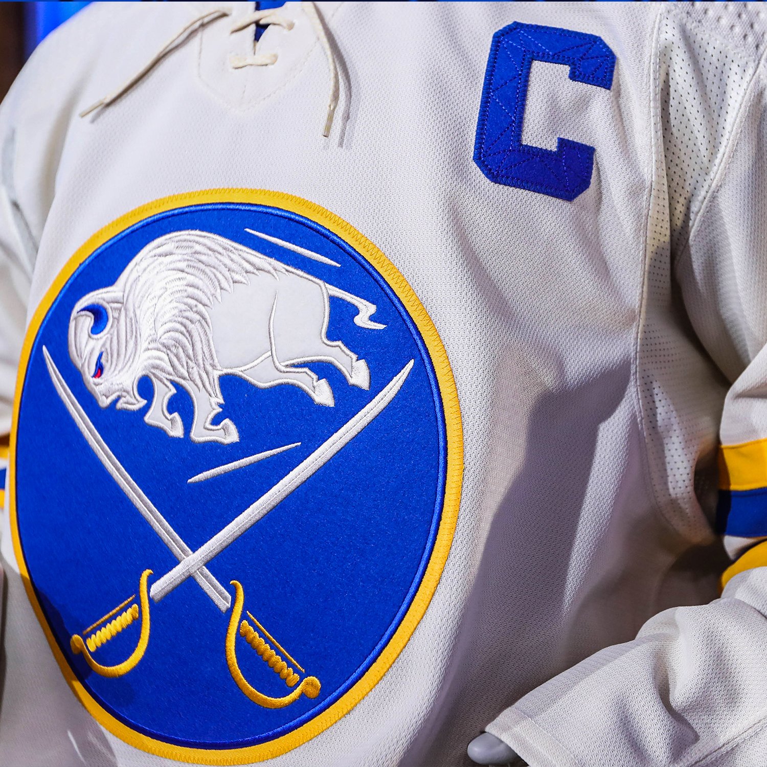
The cream-based jerseys are a first in the team’s history of uniforms and overall, it’s a sharp uniform, although maybe a little on the safe side.

I suspected the Sabres would sport some sort of a “fauxback” for this game given the only truly historic jersey set they have to draw upon is already the basis for their home and away uniform. The cream base helps these lean in hard on the fauxback style and helps differentiate it from the 50th anniversary jerseys (which obviously weren’t throwbacks), the 40th anniversary jerseys and even the 2018 Winter Classic uniform which was at least tangentially throwback inspired.

The thicker striping pattern on the sleeves and hem are a great addition as it gives a more bold look than the thinner stripes seen on the 40th alternates or even the team’s home and away set. Ditto for the white trimmed pants stripe, which is something they should be adopting full time. The return of the bumblebee sock striping is going to fly under the radar but might be one of the coolest features of this uniform.

Adding felt to the crest is a nice touch – it certainly made the 2018 Winter Classic crest feel awesome – the rest of the logo remains unaltered. It’s a fine choice given the direction they went.

I don’t care much about the felt names and numbers. One, because I think it’s a concept that’s been overdone on these fauxback type jerseys. Two, because doing the blue on blue makes the unique stitching on felt numbers invisible. I don’t think the stitching pattern is anything special to begin with (hated it on the 40th alternates), but if you’re going to incorporate a design style, you might as well take full advantage. Lastly, there have been screenshots of disclaimers on the Shop One Buffalo site which indicate that the felt lettering probably won’t be available for the jerseys fans purchase. So it’s a purely cosmetic addition which will be difficult, if not impossible to discern on the ice and offers no added benefit to fans who purchase the jersey.

If there’s anything to critique about these jerseys, it’s that they are a bit on the safe side. While Toronto’s jerseys haven’t been released as of this post being written, it looks as if they’ll pull from an old Toronto Arenas uniform design. The Sabres have had quite a few issues embracing not only their history, but the history of hockey in Buffalo as a whole. This could have been a great opportunity to draw on a uniform design of one of Buffalo Bisons teams of the past. Instead, we got a fairly standard fauxback Sabres jersey. A good jersey, mind you. But not quite as adventurous as it could have been.

The jerseys themselves look great in the promotional images that have been shared. I think they’re going to look terrific on the ice as the design of the pants and the sock striping is going to really tie this all together. We won’t have to wait all that long to see them, either. We’re just about three weeks away from the Heritage Classic and I think it’s a safe bet that we’ll see these at KeyBank Center for the team’s throwback night on March 25.

Sabres to be Back in Black for 22-23

The Sabres will be back in black and red in 2022-23 after Icethetics confirmed that a leaked image is indeed a mockup of the alternate jersey the Sabres will be wearing next season.

Logo on right via Icethetics YouTube video

There’s still a lot to iron out regarding the jersey as the image leaked was a low quality mockup that even included an error which left out one of the red angled hem stripes. Icethetics cleaned up the design a bit in the video linked above, but the lack of a high-quality image opens the door for more surprises as more information comes available. For example, the additional details on the embroidery of the 50th anniversary jerseys wasn’t immediately known from the initial leaks and rumors over those uniforms. So don’t be surprised if there are some “hidden” details which come out at the official unveiling.

Continue reading

The Instigator Podcast – Reverse Retro Edition

With the NHL’s new Reverse Retro jerseys unveiled, we discuss the best of the best and some of our least favorite designs of the collection. We argue over the quality of the Rangers jersey while expressing our excitement over the Sabres version. We also touch on the uncertainty surrounding the 2020-21 season and the frustrations caused by it.

Sabres Reverse Retro Hits the Bullseye

The butterknives are back. Among the many uniform requests Sabres fans have made in recent years, honoring the black and red era has been near the top of the list. Buffalo’s entry in the NHL’s Reverse Retro program doesn’t bring back the black and red color scheme, it’s certainly a step in the right direction.

For years it has seemed like the Pegulas and PSE would rather sell the team before truly acknowledging the era of black and red jerseys. That they’ve resurrected a design from the era certainly bodes well for future endeavors. So long as the proper deadlines are met.

The Reverse Retro alternates that will be worn this year are a fun homage to the third jersey the club released in 2000. The design looks great in the new blue and gold colorway and we even get the added treat of the goathead logo adorning the shoulders.

I’ve been a fan of the team’s original third jersey for a long time, so I’m extremely pleased to see these return to action. The new blue and gold colors translate well to the design and the white base is a welcome choice as the blue and gold stripes work far better than a white and gold stripe would have on a blue jersey. I know the wordmark isn’t very popular with fans but I’ve always been fond of it. And it looks good in blue and gold, so I count that as a win. Continue reading

Ranking the NHL’s Reverse Retro Jersey Collection

The NHL’s newest jersey initiative was formally introduced today, with the Adidas Reverse Retro alternate jersey set unveiled for all 31 teams. The premise was to put a modern spin on a jersey from each team’s history. There doesn’t appear to be any hard and fast rules for how the designs were picked as most put a club’s current colors onto an old design. But others borrow vintage colors or even use throwback designs in the case of the Hurricanes and Avalanche.

It’s a jersey collection that could have easily strayed into questionable territory but taking in all 31 designs, there’s really only a couple which aren’t overly appealing. Perhaps most importantly is what this represents for the league. This is a new take on a jersey program which puts the onus on designs which will be fun for fans to see on the ice and hanging in their closet. This is a big step forward for a league that’s often seen as too boring and conservative. Not to mention it’s going to be an excellent revenue source in a time when any penny earned will go a long way.

Naturally, with a host of new jerseys to enjoy, the only logical course of action is to rank each of the designs. I look forward to hearing how wrong my rankings are in the comments or on social media. Continue reading