Are the Sabres blue uniforms to blame for their struggles on home ice? Most definitely yes (read: no).
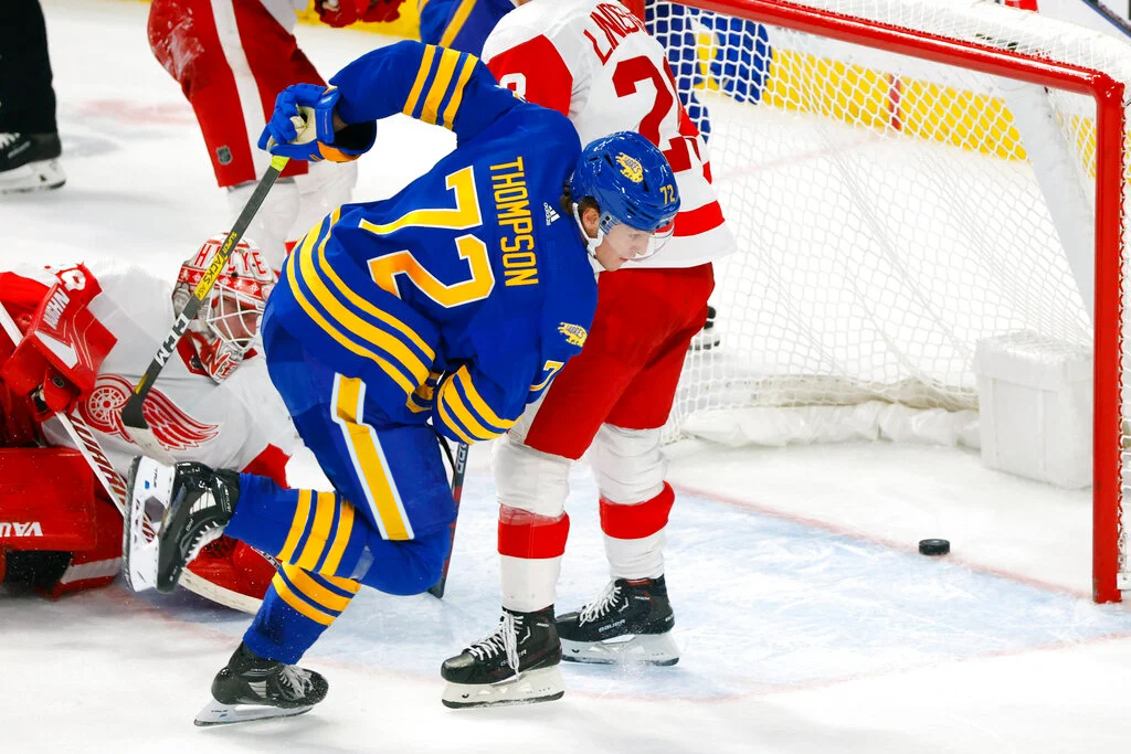
It hasn’t gone unnoticed just how different things have gone for the Sabres when they’ve worn their black and red alternate jerseys compared to their standard home uniforms. The Sabres enter Friday’s game against the Devils with an 8-1-1 record in the goatheads and a dismal 5-19-2 in anything else on home ice.
Even though the real solutions to their home ice woes (goaltending, team defense, better luck in general) will have to come from the general manager’s office, it couldn’t hurt for the Sabres to consider a few tweaks to their home uniform to make the team look a tiny bit better when they take the ice at KeyBank Center.
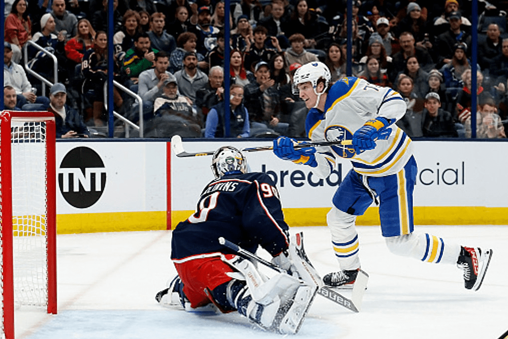
Buffalo’s blue jerseys have long been fairly bland and unforgettable. There’s a little too much blue and not much else to break it up. The white stripes the team chose to add to their 2021 uniform redesign didn’t help much as they just look like the silver stripes so many fans wanted removed in the first place. I’m not sure why the Sabres avoided shoulder patches on their home and away jerseys, but reintroducing a shoulder patch would be a cool starting point for sprucing up the home uniforms. Pulling out the white trim from the socks and jersey stripes and resurrecting the pants striping from the pre-1996 jersey redesign would be two other items I’d like to see considered.
Interestingly, the Sabres haven’t won a playoff series since they removed shoulder patches from their jerseys. Of course, they still had shoulder patches in 2010 when they lost to Boston, but that’s of little importance to the larger conversation (what makes the jerseys look cool). The Sabres have had shoulder patches on their jerseys for 39 of their 53 seasons and it seems high time to bring them back.
I have a few examples here of what the team’s current blue uniforms would look like if the white trim was nixed and a shoulder patch was added. I did put white trim back on the pants, something that adorned the team’s pants from their inception until 1996. Oddly, I feel that the trim on the pants looks far less out of place than the trim the team has on the jersey and socks despite effectively doing the same thing.
One version uses the team’s current alternate logo on the shoulder, something we saw at the 2018 Winter Classic and a fitting piece of their current logo set. The other is a bit out of left field and brings back the B with a sabre going through it. This was first introduced with the black and red jerseys and carried on to the slug uniforms. Some form of this logo has seen four Eastern Conference Finals and a Stanley Cup Final. When considering that, plus the magic in the black and red jerseys this season, it might be worth trying to borrow some of that magic. Food for thought. I also plugged each of those changes on to the white uniform for good measure.

The idea that the team would return a shoulder patch on their own accord seems unlikely. The return to royal blue was extremely well received and this year brought more excitement with the new goathead jerseys. A minor tweak few would notice, or care about, probably wouldn’t matter much.
I also doubt that many fans care all that much about the finer details of the team’s jerseys. Just look at how many knockoffs you see at games. But it’s worth pointing out given how underwhelming the team’s home uniforms are compared to the rest of the jerseys they sport.
If there was a groundswell of support for change, it wouldn’t be unprecedented. Plenty of teams have made their alternate jerseys their full time set thanks to popularity with the fanbase. There’s also the case of Tampa Bay’s 2011 redesign to consider.
After their redesign removed some of the notable aspects of the team’s previous look – specifically the lightning bolt on the pants and black trim – the team received a great deal of pushback. So much so that they opted to make some changes on the fly to their new uniforms. They brought back the popular bolts on the pants and added black trim to their numbers as an homage to their previous look and as a nod to the fans. Looking back, it was an impressive choice by the organization to acknowledge that they were paying attention and adjust accordingly.
Is that something that would happen here? Probably not. For one, the only true uniform feature that was truly universally adored was the royal blue and gold color scheme. Even though it took the organization a few years longer than it needed to in order to make the switch, they did it. Shoulder patches and white stripes just don’t rate. As I stated above, I have doubts that many fans would even notice a change like that and that fewer would care.
For those of us who like to spitball ideas about jerseys, it’s a fun exercise. I won’t be starting a change.org petition any time soon, but the next time the team lays an egg in their home blues, remember the shoulder patches.

The Sabres should just go back to home white jerseys. I know it was a league decision. But why can’t we were the white jerseys for more games in Buffalo.
LikeLike
Maybe the Sabres will get a sponsor patch next season to help make some money for the team to add something to the jerseys as well.
LikeLike