Who’s Up Next as the NHL’s Uniform Supplier?

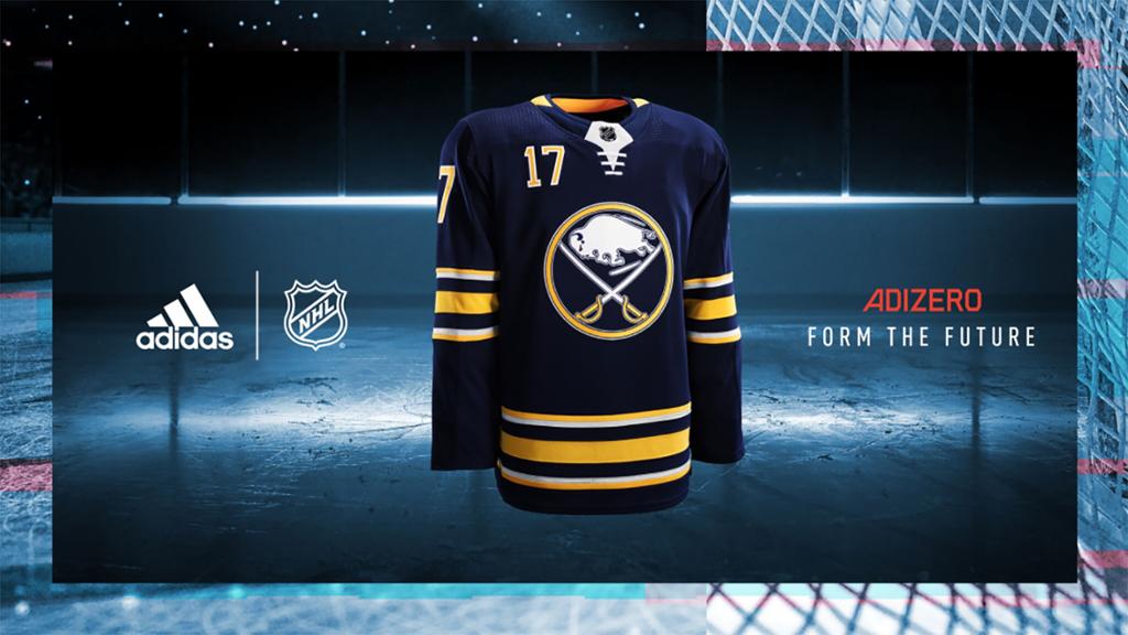
For a league that tends to prefer the conservative approach, the NHL’s jersey partnership with Adidas has brought about a host of boundary-pushing initiatives.

Now, the league will need to pivot as Adidas will not be renewing their contract with the league following the 2023-24 season. This isn’t new territory for the league – or the sport as a whole – as the current agreement came about as Reebok was taking on an even greater focus on CrossFit and training. Similarly, Nike’s relationship with Bauer hockey ebbed and flowed before Nike’s involvement in hockey all but ended in the mid-aughts.

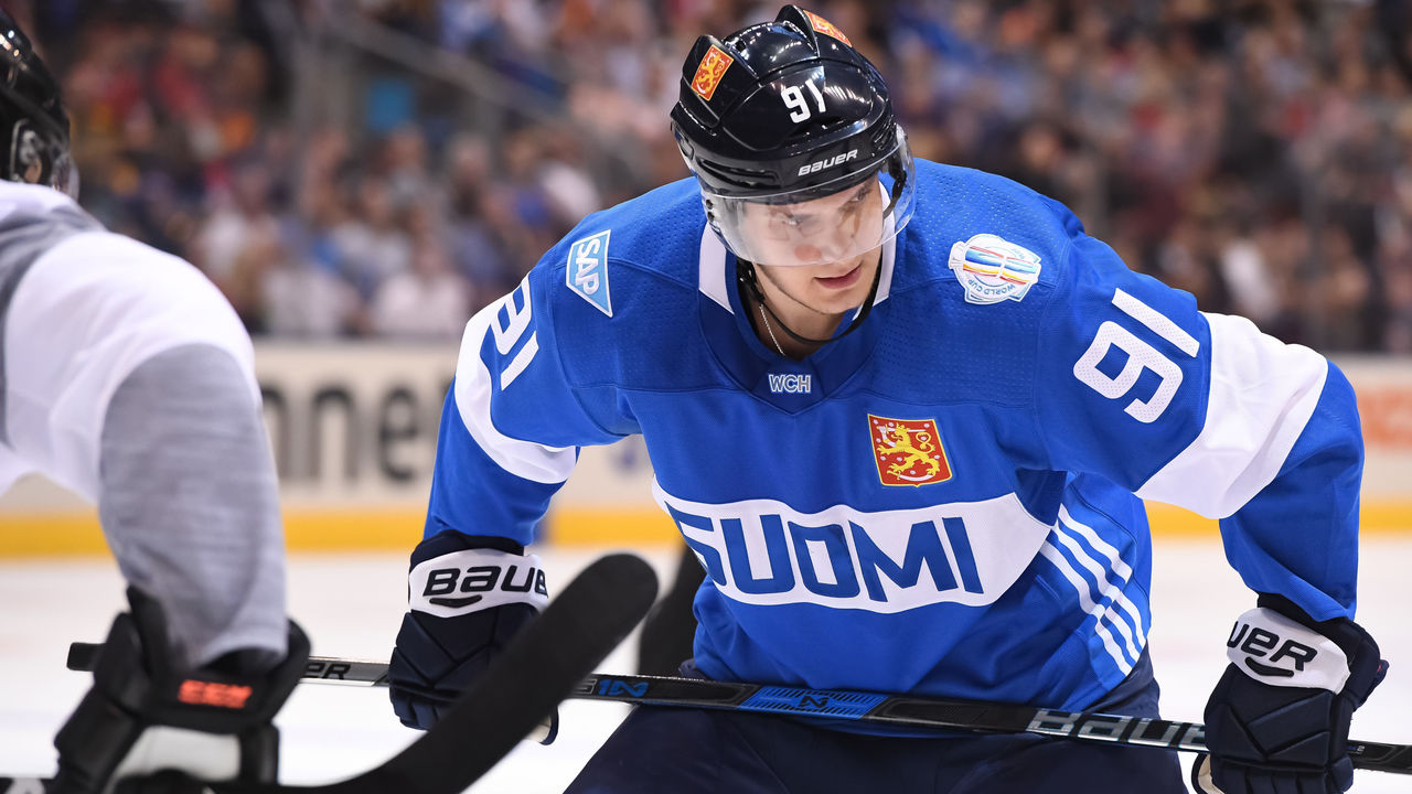
The Adidas era of jerseys should be looked upon fondly by NHL fans. They did admirable work with the 2016 World Cup of Hockey, hitting a couple of home runs with the uniforms for the tournament.  

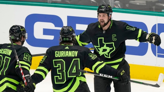
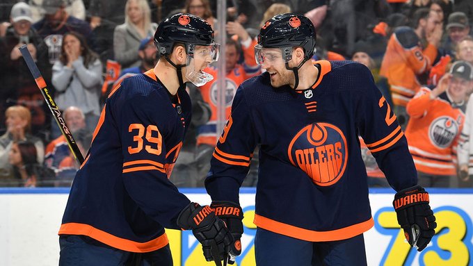
Redesigns over these last seven years have been somewhat minimal, with many teams returning to former designs as opposed taking on new looks. But Adidas has left their mark on the league’s alternate jerseys. Pushing boundaries with the designs in Dallas and Edmonton and finding the right mix of heritage and contemporary design with Winnipeg’s (sadly) short-lived Jets script alternate.

Arguably the biggest impact we’ve seen from Adidas is the Reverse Retro program. The new take on alternate jerseys has brought about a raft of excellent and nostalgic uniforms and is a fairly sharp derivation from the typically conservative NHL. Whether the program continues after Adidas departs is a pretty big question from both an aesthetic and revenue perspective.

Continue reading

The Instigator Podcast: Fabric of the Game with Chris Creamer and Todd Radom

It was a great pleasure to have Chris Creamer and Todd Radom join the podcast to discuss their new book Fabric of the Game. It’s a tremendous book that details the history of the jerseys and logos of the NHL. Todd and Chris discuss the impetus for the book, the countless hours of research it took to compile some of the incredible stories in the book and some of their favorite bits of the text. We also talk about their personal favorite aspects of uniform design and the NHL’s Reverse Retro line.

The Instigator Podcast – Reverse Retro Edition

With the NHL’s new Reverse Retro jerseys unveiled, we discuss the best of the best and some of our least favorite designs of the collection. We argue over the quality of the Rangers jersey while expressing our excitement over the Sabres version. We also touch on the uncertainty surrounding the 2020-21 season and the frustrations caused by it.

Sabres Reverse Retro Hits the Bullseye

The butterknives are back. Among the many uniform requests Sabres fans have made in recent years, honoring the black and red era has been near the top of the list. Buffalo’s entry in the NHL’s Reverse Retro program doesn’t bring back the black and red color scheme, it’s certainly a step in the right direction.

For years it has seemed like the Pegulas and PSE would rather sell the team before truly acknowledging the era of black and red jerseys. That they’ve resurrected a design from the era certainly bodes well for future endeavors. So long as the proper deadlines are met.

The Reverse Retro alternates that will be worn this year are a fun homage to the third jersey the club released in 2000. The design looks great in the new blue and gold colorway and we even get the added treat of the goathead logo adorning the shoulders.

I’ve been a fan of the team’s original third jersey for a long time, so I’m extremely pleased to see these return to action. The new blue and gold colors translate well to the design and the white base is a welcome choice as the blue and gold stripes work far better than a white and gold stripe would have on a blue jersey. I know the wordmark isn’t very popular with fans but I’ve always been fond of it. And it looks good in blue and gold, so I count that as a win. Continue reading

Ranking the NHL’s Reverse Retro Jersey Collection

The NHL’s newest jersey initiative was formally introduced today, with the Adidas Reverse Retro alternate jersey set unveiled for all 31 teams. The premise was to put a modern spin on a jersey from each team’s history. There doesn’t appear to be any hard and fast rules for how the designs were picked as most put a club’s current colors onto an old design. But others borrow vintage colors or even use throwback designs in the case of the Hurricanes and Avalanche.

It’s a jersey collection that could have easily strayed into questionable territory but taking in all 31 designs, there’s really only a couple which aren’t overly appealing. Perhaps most importantly is what this represents for the league. This is a new take on a jersey program which puts the onus on designs which will be fun for fans to see on the ice and hanging in their closet. This is a big step forward for a league that’s often seen as too boring and conservative. Not to mention it’s going to be an excellent revenue source in a time when any penny earned will go a long way.

Naturally, with a host of new jerseys to enjoy, the only logical course of action is to rank each of the designs. I look forward to hearing how wrong my rankings are in the comments or on social media. Continue reading

Concepts for the Sabres “Reverse Retro” Jersey

In a move akin to the NBA’s recent jersey expansion, the NHL appears set to introduce a new jersey for all 31 teams beginning in the 2020-21 season.

Early reports describe the new jersey set as a “reverse retro” alternate, with some early leaks indicating the direction the league and teams appear to be going with the program. With indications that all 31 teams will be getting their own reverse retro jersey, the league is taking a new tack with regard to the alternate uniform program. The current process allows for teams to utilize a third jersey with rules providing somewhere between 10-15 games that teams may wear their third jersey. Teams also have latitude to utilize a vintage uniform with stricter stipulations on the number of games they can be worn. Continue reading

The Instigator Podcast 7.8 – New NHL Duds and a Chat with Pat Moran on Buffalo Sports and Blogging

A slightly different podcast this week as Tyler and I were unable to convene but I was lucky to grab fellow Buffalo podcaster Pat Moran for a wide-ranging discussion over the excellent show he launched earlier this year, the state of the Bills and what it was that brought him back into the fold with the Sabres after losing faith during the dregs of recent years. Prior to jumping into my chat with Pat, I run through the new jerseys that were released or leaked around the league this week, touched on the 2018 Hall of Fame induction class and the big coaching changes that dropped in Chicago and Los Angeles.

You can listen to The Instigator Podcast on most podcast streaming services, including large providers such as iTunes, Spotify, Stitcher, iHeartRadio and TuneIn and most other third-party podcast streaming apps. You can find links to subscribe and rate the show below:

iTunes
Spotify
Stitcher
iHeartRadio
TuneIn
Google Play

The NBA Model Should Lead the NHL towards more Jersey Choices

There are more than a few areas in which the NHL could stand to follow the NBA’s lead. Marketing their stars, targeting growing and untapped markets, and simply being forward thinking in the presentation of the game.

It’s unlikely that the NHL will ever surpass the NBA in terms of popularity and revenue, but taking basketball’s lead in an attempt to grow hockey’s footprint – and ultimately the league’s revenue – is a method which could pay dividends for the NHL. The only remaining hurdle seems to be the NHL’s inability to get out of their own way.

More often than not it appears that the NHL is more than happy to stay in their lane and keep their head down when it comes to presenting the sport. It’s not that the product is bad, per se, but that the league doesn’t seem to be willing to explore new opportunities or look at things in a different manner.

The tweet above regarding the new NBA uniform policy is a great example, albeit a small one,  of the NBA opening up to new ideas. The root of this new development is to create a new revenue stream across the entire league by giving all 30 teams a fourth uniform to wear as they see fit. But it’s being done in a manner that is very fan-centric which adds a great deal of appeal. Continue reading

Sartorial Sabres Build A Better Sweater

Guest Post from Pro Stock Hockey

Forget about six years without a trip to the playoffs — suddenly, things are looking good for Buffalo Sabres fans.

Yes, a good chunk of that optimism might stem from hiring a general manager who helped build three champions in 10 years at Pittsburgh. Or the fact that the new GM plundered the staff of the other Stanley Cup finalist for his new coach — who just happens to be maybe the greatest blue-liner in Sabres history.

Yet a rebuild spearheaded by Jason Botterill and Phil Housley might take years before it pays off with as big a win as the Sabres posted June 20, when the NHL debuted new jerseys for its 31 teams with new supplier adidas. Continue reading

Minor Tweaks Equal a Major Win for Sabres Jerseys

The Sabres new uniforms aren’t royal blue and that’s okay. The slight tweaks the Sabres jerseys received in the Adidas changeover drastically improved the overall look of both the home and road jerseys.

In conjunction with Adidas and the NHL, the Sabres took a step away from the grey/silver accents that have graced the uniforms since featuring prominently during the red and black era and being utilized as an accent on the Slug jerseys. Gone are the wildly unpopular apron stripes and arm pit accents.

It’s unfortunate that there was so much hubbub regarding switching to royal blue from navy because it ultimately distracted from what was one of the better redesigns in the entire league. Prior to the rumors and guesswork – some of which I’m guilty of – I think the number one item on almost every fan’s hit list would have been the silver accents. With those two prominent and unpopular features in the trash, the Sabres uniforms are cleaner and simpler and look that much better as a result.   Continue reading