The Sabres will be back in black and red in 2022-23 after Icethetics confirmed that a leaked image is indeed a mockup of the alternate jersey the Sabres will be wearing next season.
There’s still a lot to iron out regarding the jersey as the image leaked was a low quality mockup that even included an error which left out one of the red angled hem stripes. Icethetics cleaned up the design a bit in the video linked above, but the lack of a high-quality image opens the door for more surprises as more information comes available. For example, the additional details on the embroidery of the 50th anniversary jerseys wasn’t immediately known from the initial leaks and rumors over those uniforms. So don’t be surprised if there are some “hidden” details which come out at the official unveiling.
From what we can see thus far shows the bulk of the black jersey left intact, with only the collar lacking the same detail from the 1996-2006 era. The primary crest shows upgrades of its own and Icethetics indicates that the shoulder patches will also receive some changes as well.
It’s an exciting development as many fans have been clamoring for the team to bring back the uniform design for some time now. Add to that the disappointment that the team missed the necessary deadline to wear these jerseys during the 50th anniversary season, much like the Coyotes did with their Kachina jerseys and the Blues are doing with their mid-1990s blue jerseys.
That missed deadline made these an inevitability at some point and I supposed the delay can be blamed on COVID more than anything. Plenty of NHL teams have gotten in on the nostalgia trips in recent years and it’s nice to see the Sabres get in on the fun.
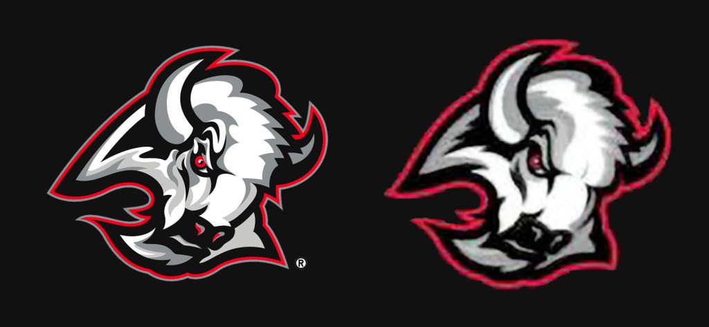
It’s interesting that they opted to make some subtle changes to the logo. The original black and red logo didn’t really need any upgrades and as this is a throwback alternate, of sorts, it would’ve made sense to leave the logo as is. That being said, the changes made haven’t made the logo worse than the original incarnation. Simplifying the white section to the left and under the eye definitely cleans up the logo and some of the other choices to smooth out and clean up the logo all work well. The area around the eye is still aggressive and sharp and it look slike two shades of silver (or grey) will be used throughout. Changing the forehead section might be a little disappointing to some as the jagged angles were a key characteristic on all of Ryan Miller’s Sabres masks. The only real downgrade is dropping the silver outline, and perhaps removing the red accent on the nostrils (though that may be due to the image quality).
Overall, I’d say the logo changes are good, despite being unnecessary. Many people may not even notice that anything has changed. As I mentioned before, the low res image may be hiding some more interesting details from sight that could really make the crest pop on the uniforms.
These jerseys ought to be a home run for the Sabres. They’re going to hit big on nostalgia and the subtle changes could wind up as welcome upgrades. I do wish the collar was two-color in some way – maybe trimmed in red – and I hope they don’t make any fundamental changes to the font. I also would’ve preferred the white jersey to the black, but those are both small quibbles. There was a time that it seemed the Sabres almost held a contemptible opinion to the the views of their fans. That seems to be changing and this is perhaps the most notable example.
I’m excited for when these are officially unveiled and I’m hopeful the Sabres have plans to keep these in their rotation for a long time to come.
