While the official announcement was somehow scooped by the team’s online store, the Sabres unveiled the jerseys they’ll be wearing for the Heritage Classic on Thursday morning.
The cream-based jerseys are a first in the team’s history of uniforms and overall, it’s a sharp uniform, although maybe a little on the safe side.
I suspected the Sabres would sport some sort of a “fauxback” for this game given the only truly historic jersey set they have to draw upon is already the basis for their home and away uniform. The cream base helps these lean in hard on the fauxback style and helps differentiate it from the 50th anniversary jerseys (which obviously weren’t throwbacks), the 40th anniversary jerseys and even the 2018 Winter Classic uniform which was at least tangentially throwback inspired.
The thicker striping pattern on the sleeves and hem are a great addition as it gives a more bold look than the thinner stripes seen on the 40th alternates or even the team’s home and away set. Ditto for the white trimmed pants stripe, which is something they should be adopting full time. The return of the bumblebee sock striping is going to fly under the radar but might be one of the coolest features of this uniform.
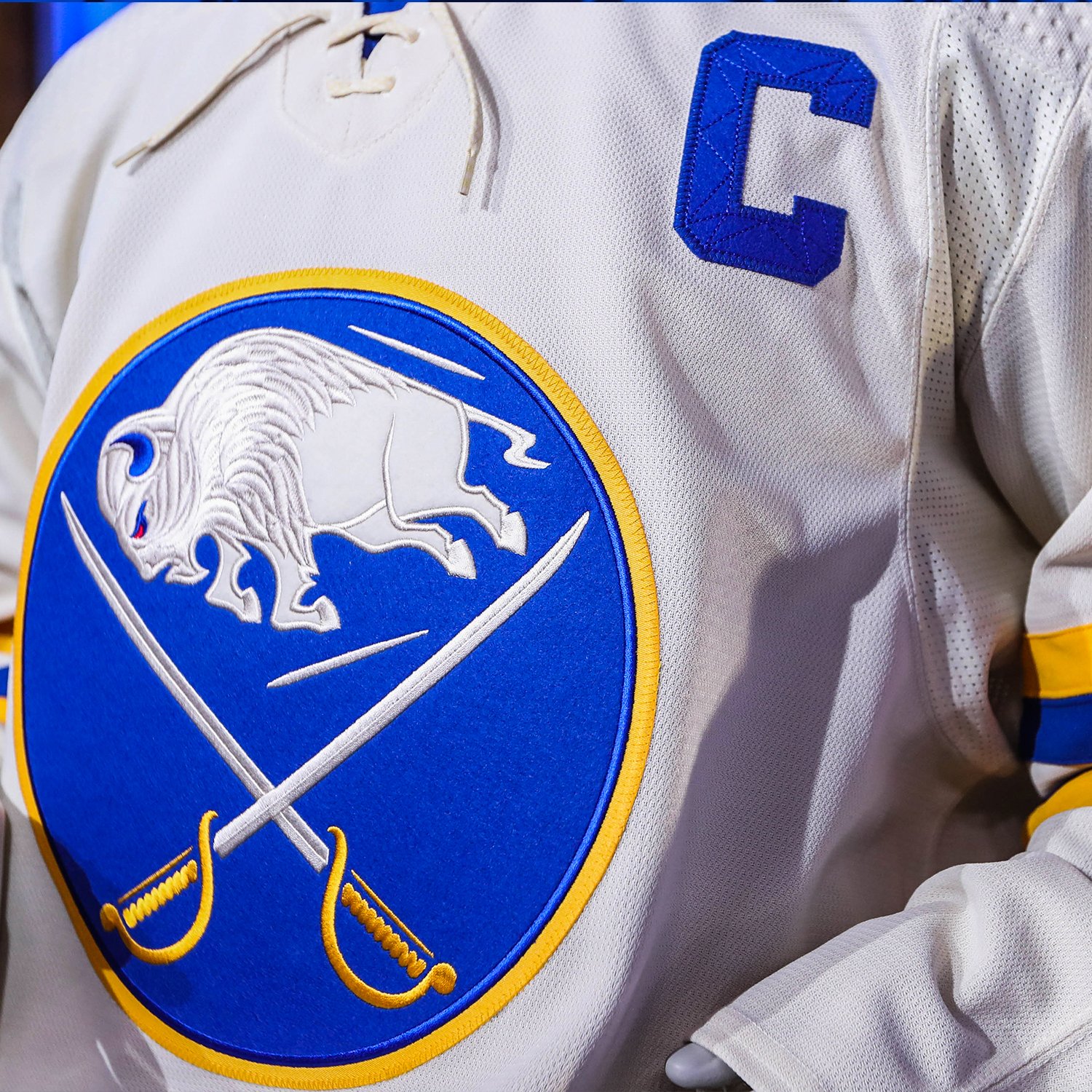
Adding felt to the crest is a nice touch – it certainly made the 2018 Winter Classic crest feel awesome – the rest of the logo remains unaltered. It’s a fine choice given the direction they went.
I don’t care much about the felt names and numbers. One, because I think it’s a concept that’s been overdone on these fauxback type jerseys. Two, because doing the blue on blue makes the unique stitching on felt numbers invisible. I don’t think the stitching pattern is anything special to begin with (hated it on the 40th alternates), but if you’re going to incorporate a design style, you might as well take full advantage. Lastly, there have been screenshots of disclaimers on the Shop One Buffalo site which indicate that the felt lettering probably won’t be available for the jerseys fans purchase. So it’s a purely cosmetic addition which will be difficult, if not impossible to discern on the ice and offers no added benefit to fans who purchase the jersey.
If there’s anything to critique about these jerseys, it’s that they are a bit on the safe side. While Toronto’s jerseys haven’t been released as of this post being written, it looks as if they’ll pull from an old Toronto Arenas uniform design. The Sabres have had quite a few issues embracing not only their history, but the history of hockey in Buffalo as a whole. This could have been a great opportunity to draw on a uniform design of one of Buffalo Bisons teams of the past. Instead, we got a fairly standard fauxback Sabres jersey. A good jersey, mind you. But not quite as adventurous as it could have been.
The jerseys themselves look great in the promotional images that have been shared. I think they’re going to look terrific on the ice as the design of the pants and the sock striping is going to really tie this all together. We won’t have to wait all that long to see them, either. We’re just about three weeks away from the Heritage Classic and I think it’s a safe bet that we’ll see these at KeyBank Center for the team’s throwback night on March 25.
