The nostalgia train is pulling into Buffalo tonight as the Sabres will take to the ice in their black and red alternate jerseys when they host the St. Louis Blues.
It’s been a long time coming as fans (and even some media) have been pining for the team to hop on board with a throwback alternate uniform for some time. Many other teams around the NHL picked up on the 90s nostalgia trip in recent years. None moreso than the Arizona Coyotes who re-adopted their kachina look for both their home and road uniforms. I hope the Sabres don’t go that far in embracing the red and black jerseys. This set makes for a perfect alternate. There’s no need to go further.
Getting to this point wasn’t a smooth journey. There was a lot of expectation that the team would be rolling out black and red jerseys in some manner during the 50th anniversary season. That didn’t come to fruition. Then, during the 90s night celebration for the anniversary season, players from the era were given brutal knockoff uniforms to wear for the evening. It was a bad look for the team and they heard about it. Now, a few years later, we will finally get a chance to see the black and red color scheme return to the ice.
There have been a few cases where the Sabres have been slower to adopt a practice utilized by other teams around the league. Whether it be playing on nostalgia with an alternate uniform, or getting creative with giveaways. It led to frustration at times, but I’m encouraged by the fact that the club has shown they’re listening and, more importantly, acting on what they’re hearing from the fanbase. If this is the first major sign of that, there’s great reason for optimism on many more endeavors.
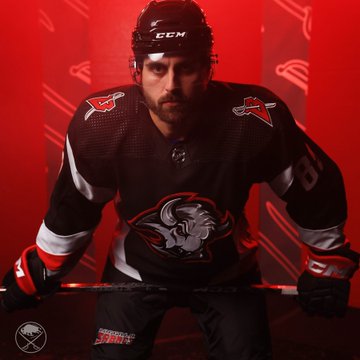
The jerseys themselves are terrific. The subtle changes made to the logo looks terrific on the jersey. Even removing the additional silver trim from the logo – something I thought might look on in practice – was definitely the right move. Not returning to triple-layer numbers is a downgrade overall, but something few fans will ever notice. Plus, the triple-layer numbers always looked better on the white jerseys than the black ones. There is one thing that I think real purists may be irked by and it’s the font on the nameplates. On its own, the font looks normal. That classic 90s font. But when seen side-to-side with an original goathead jersey, you notice the removal of serifs from the letters and how it takes a little something away from the lettering as a result. Again, a minute feature that few people (if any) will ever notice.
It’s probably important to point out that these are technically a new uniform as opposed to a true throwback. The Sabres even said as much on their website. The jersey is modeled after the uniform worn from 1996 to 2006. Even though many of the updates are fairly minute, they all add up to what is a different uniform for the team. That might rub you the wrong way if you’re especially nostalgic for the original black and red uniforms. But this new model gives you the best of both worlds. You get a jersey with some contemporary updates – most notably to the logo – with the flair and foundation that made the 90s uniform a favorite for fans of a certain age.
Another exciting development is that Craig Anderson, Eric Comrie and Ukko-Pekka Luukkonen all have black and red gear ready for nights the team wears their alternates. Not only does that mean fun, new gear and mask artwork to check out, but the team will look that much more cohesive on nights they’re in their alternate uniforms. Not unlike how they looked when Linus Ullmark or Carter Hutton wore their 50th anniversary equipment.
The key factors were nailed by the Sabres and Adidas. As mentioned, the updates to the logo look terrific and the applique on the jersey adds a level of depth you didn’t get with 1990s embroidery techniques. The incredible shoulder patch is back – with a matching 3D helmet sticker to go along with it. I hope we see more merch featuring that alternate logo in the near future. I’d also love to see the team find a way to reincorporate a version of the B with a sword through it on their current jerseys. They could use a shoulder patch.
Wednesday is going to be a lot of fun. The Thanksgiving Eve games are usually a raucous affair to begin with and the 90s night theme ought to ratchet that up a fair bit. The team snapped their losing streak with an emphatic win on Tuesday and hopefully they can carry some of those vibes forward and give the fans a win to take to Thanksgiving dinner and tomorrow’s Bills game.
