It sure sounds like the Sabres and Maple Leafs are lining up a potential Heritage Classic in Hamilton on March 13. Right now the game is still firmly a rumor, but there’s a whole lot of smoke that points in the direction of a Sabres/Leafs outdoor game.
The lack of confirmation on the game likely stems from the ongoing uncertainty regarding COVID-19 and the impact that has on opening the USA-Canada border and the ability to continue hosting large events such as an NHL outdoor game. So, while the next iteration of the Heritage Classic hasn’t been officially confirmed, it seems as if all parties are aware of the intention to play the game barring any unforeseen hiccups.
That the league held off on announcing this game along with the other three outdoor game announcements made at the Stanley Cup Final tells me there’s still a fair bit of doubt surrounding the game. If I had to guess it rests mostly with any potential restrictions that could be put in place by Health Canada and the Ontario government between now and March. The border will be another issue, but a lesser one in my opinion as capacity restrictions would have a larger impact than the ease of border crossings.
Even with some of the question marks surrounding the immediate future of the event, the potential for another Sabres outdoor game is exciting. Not only is this much closer than Citi Field, but it more than likely means the Sabres will be getting another special uniform for the event.
Knowing that the Heritage Classic is an event that always draws on throwback designs for the participating teams, I’d expect something cool for the Sabres come March. I also wouldn’t be surprised to see the team take the ice in a uniform that draws beyond the precise history of the Sabres franchise. Calgary, for example, wore a uniform derived from the 1924 Calgary Tigers. And given the Sabres current uniforms are a terrific homage to the uniforms they wore from 1970 to 1996, drawing inspiration from elsewhere might just offer the best possible design for fans to gobble up at the merchandise stands.
I’ve put together four jersey designs which differ from the team’s current uniforms while drawing from different vintage aspects and the larger hockey history of Western New York.
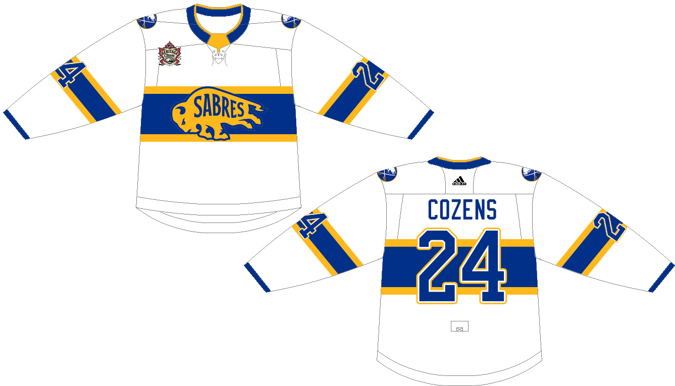
Retro Modern
This jersey is the only one of the group which would be unique to the Sabres. It pulls the center stripe which was used on the Sabres Skills Challenge jerseys in 2019. The charging buffalo secondary logo occupies the center crest on a jersey which ultimately shares design cues with Montreal’s red uniforms and the Chicago Blackhawks jerseys from the 2009 Winter Classic.
This would be a faux vintage jersey, pulling those various throwback design cues and utilizing Buffalo’s secondary logo in favor of the crossed sabres and bison. Even though there wouldn’t be any true historic tie-in from the Sabres’ perspective, getting that sharp secondary logo on the front of a sweater feels like a win and Buffalo’s blue and gold looks good in that Montreal striping pattern.
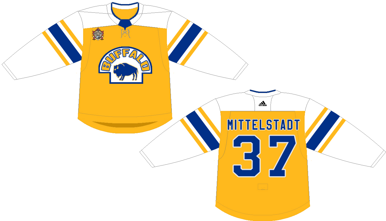
1930s Buffalo Bisons
This jersey draws inspiration from the uniforms of the first Buffalo Bisons hockey team which played from 1928-1936 as a member of the International Hockey League. They played their games at the Peace Bridge Arena in Fort Erie, so in a way this design would be fitting for a Buffalo hockey team to wear in a home game being played in Ontario.
You’ll notice the changes between this concept and the actual jersey worn by the Bisons. Given that recent years have spawned jerseys that either borrow old logos or old colors (but not both) my assumption is that the league and the Sabres would want to keep Buffalo in blue and gold for this game. Additionally, they’d likely be hesitant to brand the jersey for the Bisons, thus a pair of changes to the initial design were going to be necessary.
I went with a gold jersey as opposed to royal as I didn’t feel the blue version worked well within the template this uniform follows. Going with gold also offered a loose tie-in to the bright orange base of the Bisons jerseys from that period. I played with a couple of wordmarks before ultimately settling on Buffalo on the logo. Since Bisons would be a non-starter and Sabres just didn’t look quite right, Buffalo felt like a good middle ground.
Of the four designs I played around with, this is my least favorite of the bunch. It doesn’t all gel together as cohesively as I’d like and it just looks a little funky. A more skilled designer could do a better job making the various design cues tie together across the eras.
There are a few other very cool Bisons designs from their IHL and AHL days. The barber pole sleeves would look cool in blue and gold though I suspect the crest would be a little too similar to the design of the Minnesota Wild’s Winter Classic jersey to fly for 2021-22. I also stumbled across this awesome Buffalo script jersey on Twitter recently which with a little dressing up could be an extremely cool vintage look for the team to wear.
Buffalo Bisons Bottlecap
A vintage jersey lineup wouldn’t be complete without mentioning the Bisons bottlecap jerseys from their AHL days. The old threads are absolutely stunning and it’s unfortunate that the very obvious copyright issues prevent them from being more ingrained in the history of both the franchise and the city’s larger sporting culture.
Putting aside those copyright issues for a moment, consider this jersey as a potential Heritage Classic design. The old Pepsi bottle cap doesn’t look quite as sharp in blue and gold as it does in the traditional red, white and blue, but it still works. I swapped the traditional script for the updated script from the 40th anniversary sweaters and used the striping pattern from later in the franchise’s existence to not only call back to those alternate jerseys but to offer something different than that team’s typical three-stripe sleeve. The double stripes were also utilized by the Bisons on both their red and white uniforms at various points. The hangar effect depicts five stars as a way to honor the Bisons’ five Calder Cup championships. This is also the only hangar effect I opted to add to this group as I think the teams’ current hangar effect design is superb and something I’d simply carry over to the other versions. Maybe with the date added for each respective jersey’s background.
I played with putting a shoulder yoke on this jersey as a few iterations of the Bisons uniforms had something on the shoulders but nothing looked quite right. I opted to leave a shoulder patch off as there were no patches on the old Bisons uniforms, though I suspect the Sabres would want some additional branding with their logo on this if it was a real option.
It is too bad that there isn’t some agreement to be struck that would allow the Sabres to pay tribute to the team that directly preceded their existence in the city. The logo is phenomenal and the Bisons have quite a rich history which is well worth acknowledging. I suspect it may be easier to find common ground but I don’t know if it’s an exercise the Sabres would be all that interested in engaging with given their generally flippant attitude towards their own history, let alone that of other Buffalo hockey franchises.

1931 Buffalo Majors
My personal favorite of the bunch, the Buffalo Majors design is pulled from the American Hockey Association club which played at the Broadway Auditorium from 1930-1932. There isn’t a whole lot of information about the team (or league) available but you can find a few photos of the Majors on the web, including this portrait of Ralph Rennie in his uniform from thee 1931 season.


The Heritage Classic design tries to follow the original Majors design as closely as possible, with a large middle stripe bounded by four smaller ones above and below with a simple wordmark in the middle. The larger template makes the sleeves look a little funky, so the smaller image here is meant to better depict the jerseys as they look in the larger photo and as they’d look on the ice.
I don’t know what the Majors’ color scheme was but based on the photos available, it was fairly easy to adjust the jersey design to blue and gold. I chose a more muted blue to try and call back to the vintage uniforms of that era and I’ve included an alternate version here which uses a cream instead of white for even more of a faux vintage look.
Even though the game hasn’t been formally announced, any work on a jersey will have already been largely completed at this time. Both the teams and the league will need the appropriate lead time for merchandising and logo unveilings, so if this game is even tentatively scheduled, the jersey designs have likely already been finalized. I hope the Majors came up in the research of a design because I do think it has a unique look which would be extremely fun to see in this game or in a future alternate design.


There is a whole lot of hockey history in Buffalo and it’s just waiting for the Sabres to share with the fanbase. Pulling some design cues from the city’s hockey past would be a great way to get started.

I would be okay with an updated version of the 40th Anniversary jersey.
LikeLike
…………black and red
LikeLike
but good job on these! pretty sick bottle cap 1
LikeLike
These look awesome! Care to create some renders for Toronto?
LikeLike
It feels like I might be crossing enemy lines but I might need to toss a few together. Gonna be hard not to just recommend the St. Pats jerseys though
LikeLike