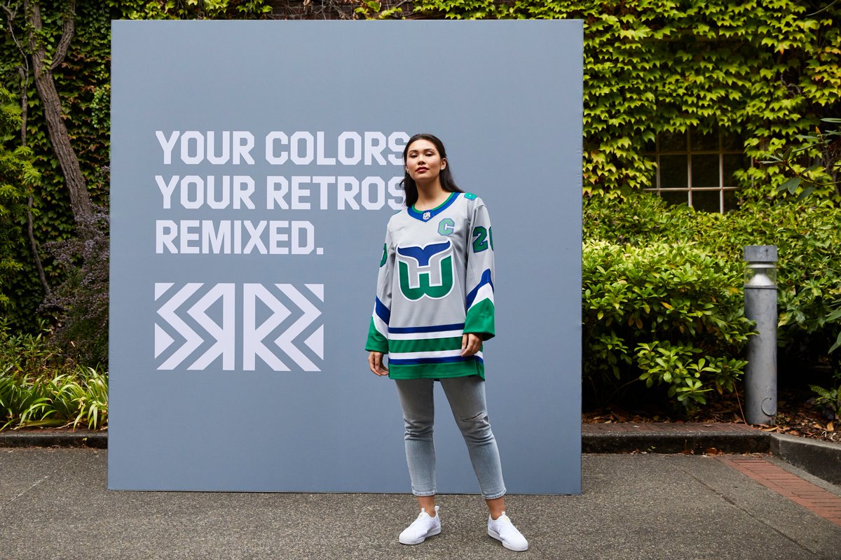
The NHL’s newest jersey initiative was formally introduced today, with the Adidas Reverse Retro alternate jersey set unveiled for all 31 teams. The premise was to put a modern spin on a jersey from each team’s history. There doesn’t appear to be any hard and fast rules for how the designs were picked as most put a club’s current colors onto an old design. But others borrow vintage colors or even use throwback designs in the case of the Hurricanes and Avalanche.
It’s a jersey collection that could have easily strayed into questionable territory but taking in all 31 designs, there’s really only a couple which aren’t overly appealing. Perhaps most importantly is what this represents for the league. This is a new take on a jersey program which puts the onus on designs which will be fun for fans to see on the ice and hanging in their closet. This is a big step forward for a league that’s often seen as too boring and conservative. Not to mention it’s going to be an excellent revenue source in a time when any penny earned will go a long way.
Naturally, with a host of new jerseys to enjoy, the only logical course of action is to rank each of the designs. I look forward to hearing how wrong my rankings are in the comments or on social media.
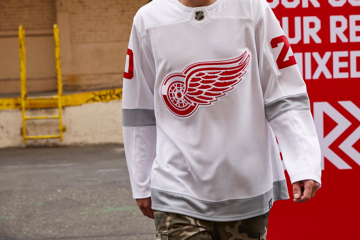
 Detroit Red Wings – Just a bland design caused at least in part by the lack of options from the franchise’s uniform history. The reverse retro concept is tougher to pull off when your club only has two colors, hasn’t changed them since their inception with barely any jersey alterations made along the way. That lack of wiggle room leaves us with a pretty vanilla result for Detroit’s reverse retro jersey.
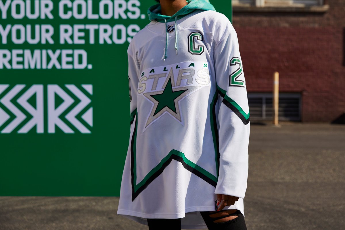
 Dallas Stars – Wounds from 1999 aside, Dallas’ star pattern jersey set was and is a clever look. This iteration could use a little more color – especially knowing that the expectation is for them to wear white gloves and pants with the set. The star outline across the jersey is such a cool feature, and all the white dead space takes away from that. I feel like filling the negative space with green would’ve been a better alternative. It is also a little odd seeing this without any gold as a trim color.
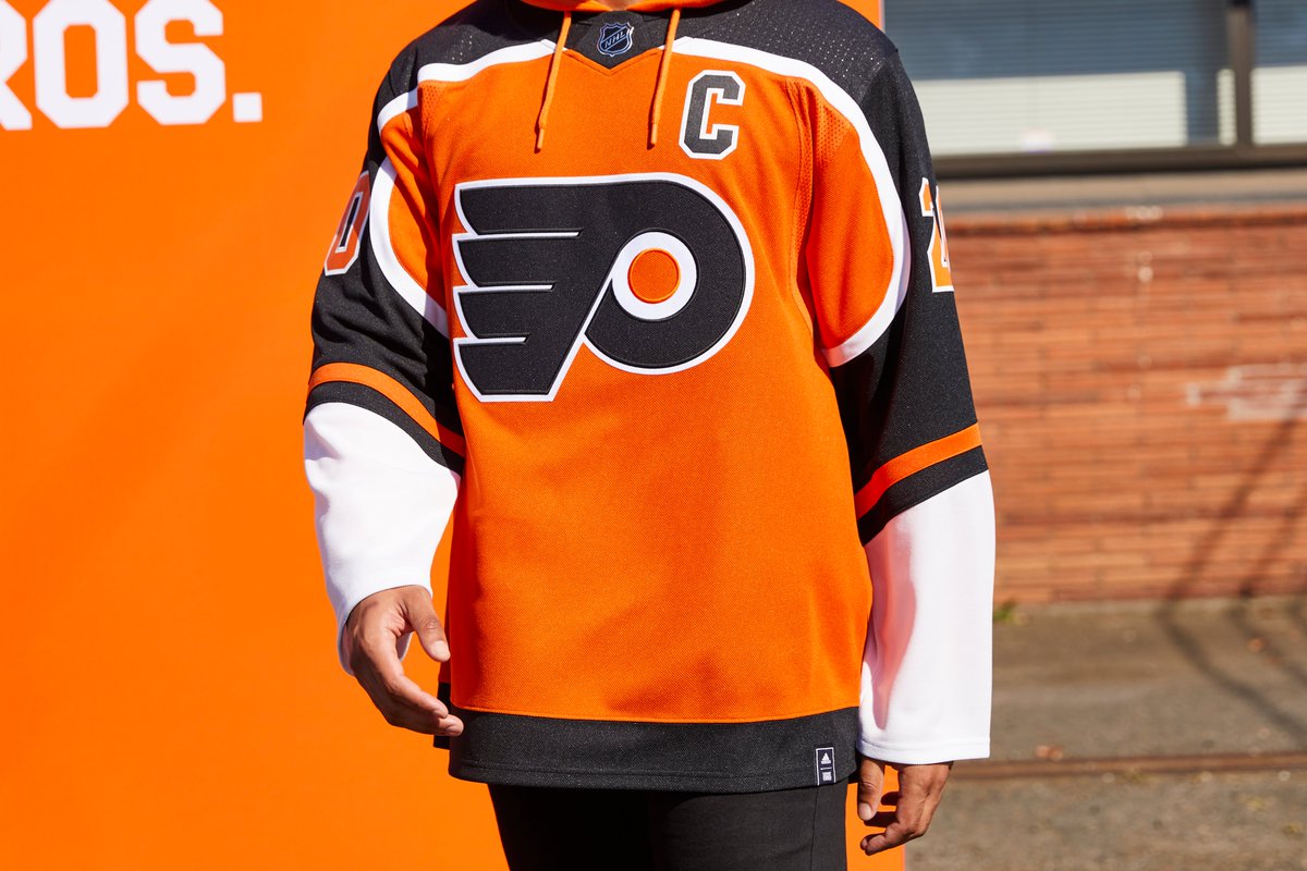
 Philadelphia Flyers – I’m not partial to light colors trimming each other and the way this jersey is laid out really distracts me as a result. When you have two light colors together it tends to lack definition and appear muted. At least to my eye. The white stripes trimming the orange areas on the sleeves just don’t work for me. A simple swap of those two sections would’ve made the jersey pop a bit more, though it would’ve been taking license with the idea behind the “reverse retro” concept.
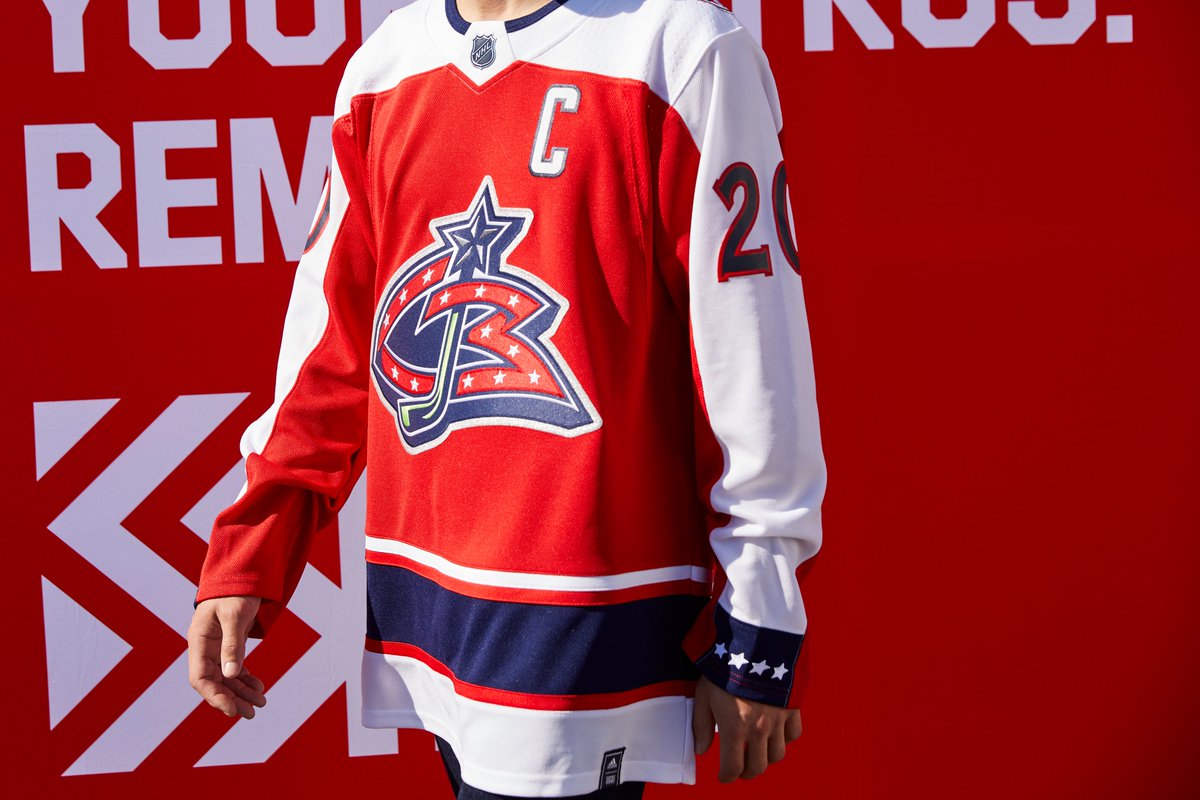
- Columbus Blue J
 ackets – As stated above, I’m not keen on light-on-light trim colors. Sometimes it looks great, but other times it’s awkward and unattractive. The white sleeves on the red jersey don’t work for me. It’s just not a look that is appealing to me given how the inversion of the colors worked out.
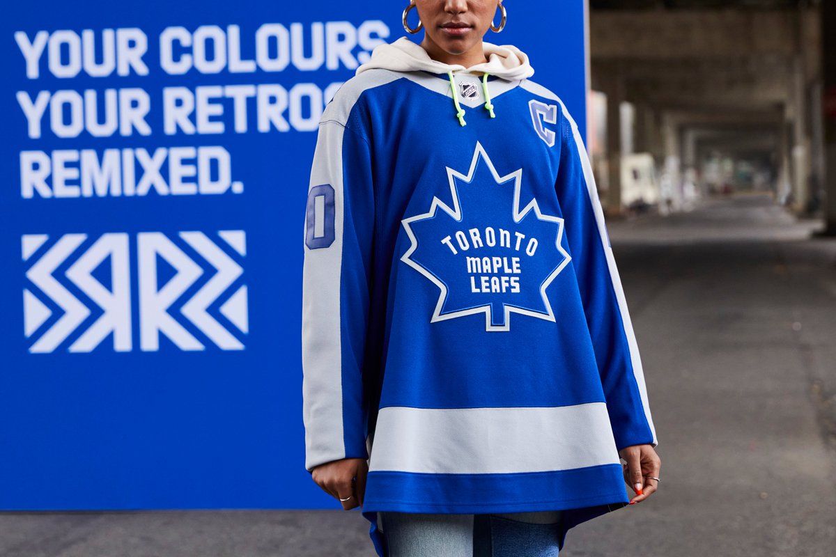
 Toronto Maple Leafs – Not a lot to like here from the Leafs. Plagued by similar issues as the Red Wings, Toronto’s choices were always going to be pretty limited. The silver accents don’t play all that well for me and leave the sleeves dull on a jersey pattern I’ve always been pretty fond of.
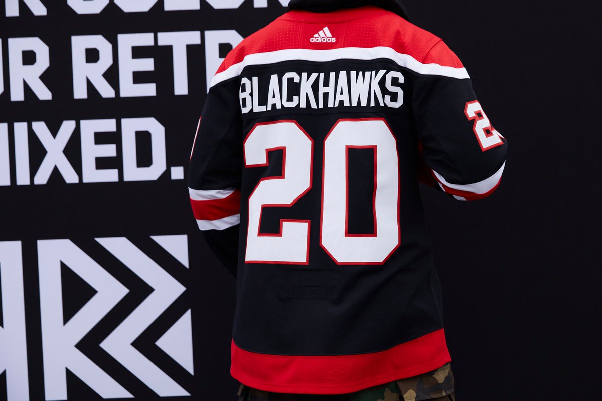
 Chicago Blackhawks – Maybe these are actually good and deserve a higher ranking, but given how many different Blackhawks jerseys we’ve seen over the past decade, it’s hard to get excited for another one. All of the Winter Classic and Stadium Series games have worn out the special edition Hawks jerseys to the point where it’s just a lot of white noise. The crest is cool, I guess. But I just think the Blackhawks and alternate jerseys need to take a break.
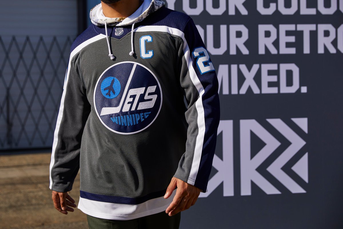
 Winnipeg Jets – There’s quite a bit of grey and silver in the reverse retro collection and the uses are very hit and miss. I’m not too keen on the Jets take even though I’m typically a fan of how their navy and light blue compliment each other. Maybe the grey is too dark, I’m not sure. A red version of their throwback Jets duds could’ve been pretty fun, for what it’s worth.
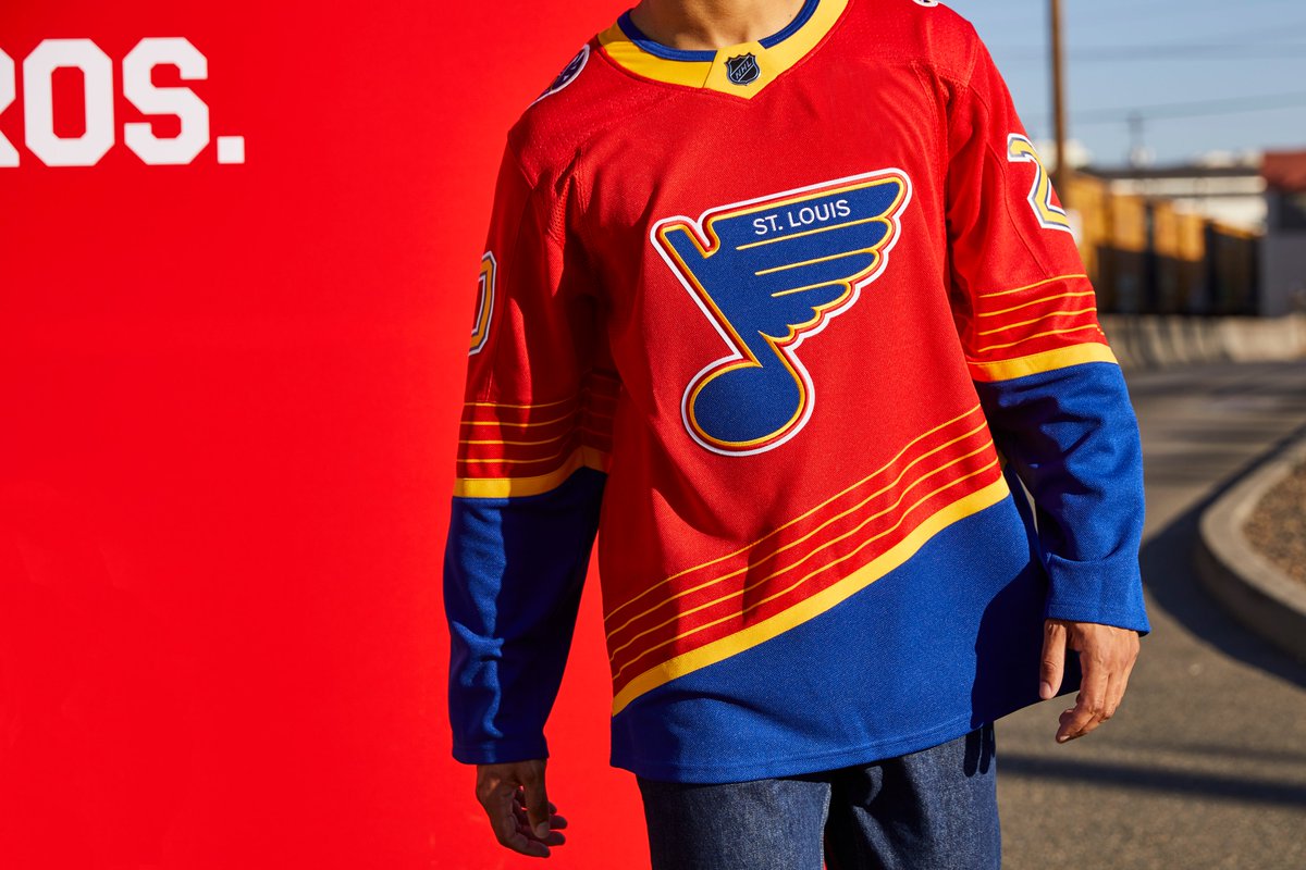
 St. Louis Blues – As a child of the 90s I really appreciate the wave of nostalgia for uniform designs of that era. The Blues brought back their blue, gold and red set for a handful of games last year and seemed to do so to positive reviews. The jersey set itself is funky, with the angled numbers and a red hit in the set. There’s going to be a lot made about a team called the Blues wearing a red jersey but that’s not so much an issue for me as the overall look of the uniform. As goofy as the 90s threads were, that shock of red worked well as a compliment. I thought these might be really tough to handle but overall, I think they look pretty good. It’s just not among my favorites of the collection.
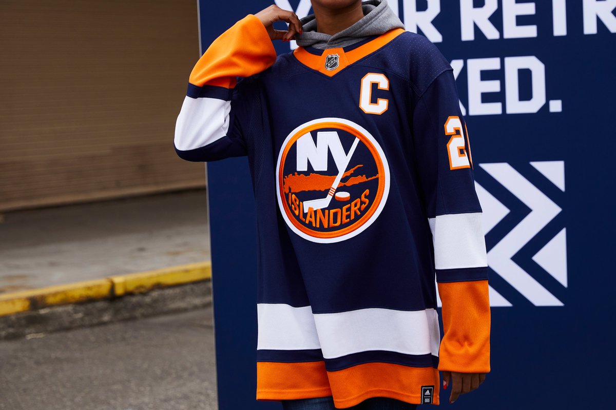
 New York Islanders – An uninspiring design that almost certainly has something to do with Lou Lamoriello’s presence with the club. The Isles are somewhat handcuffed since they’re effectively wearing their vintage uniforms and colors, so there’s not as much room for leeway in that respect. Fisherman would’ve been a fun choice here as would an orange base for the alternate sweater. But knowing Lamoriello’s preference for conservative uniform choices, I’m not overly surprised with the result. Still, swapping navy for their current light blue is an uninspiring result.
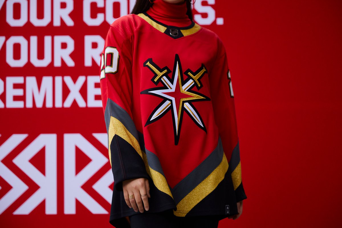
 Vegas Golden Knights – Count me as a fan of this jersey. The red plays nicely with the gold and grey stripes and it’s just as loud and flamboyant as the other jerseys in Vegas’ set. I think it’s cool that they pulled from the history of the Thunder to come up with a design and I think this will look good on the ice. In fact, I think this is a better jersey than the gold alternate they introduced. However, I am not a fan of their secondary logo. I know what it’s supposed to represent but it still looks like an asterisk with two swords behind it. It’s not an appealing logo and had they gone with their primary on this set I think it would’ve looked tremendous.
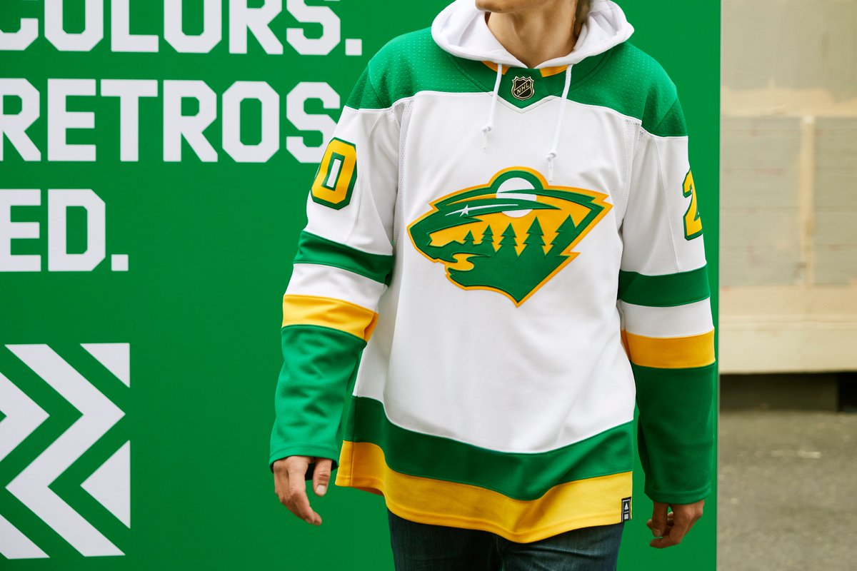
 Minnesota Wild – I love that they went with a North Stars design for this jersey. Their colors are excellent and it’s a fun throwback to celebrate. However, I’m not a fan of the decision toLo use their primary crest in the North Stars colors. I love Minnesota’s crest but it doesn’t look right in the green and gold of the North Stars. I had seen mockups of this jersey with the Wild’s stylized M as the crest, I think that would’ve fit better on the throwback design inspired by the North Stars.
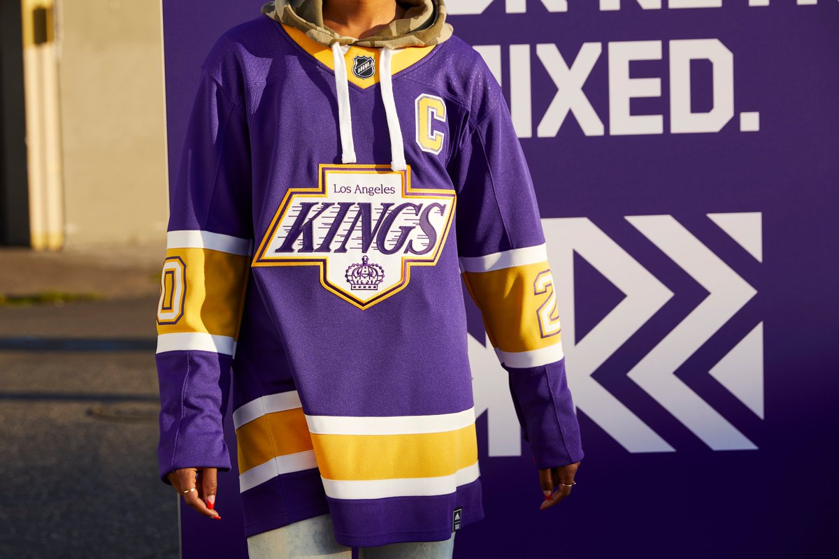
 Los Angeles Kings – Forum Blue! The Kings original colors are an excellent combination and they’re perfectly emblematic of the post-expansion NHL. It’s unfortunate that they went with the pattern and logo form their shift to black and silver and not something that fit better with their original colors. I don’t think this logo lends itself well to the purple and gold colorway and as a result it takes away from the look. However, I appreciate that they honored the heritage of the old crown logo by avoiding a black and silver recolor of that era’s uniforms.
 Florida Panthers – I could’ve done with a little less white on the sleeves but this is a really well executed design. The original logo looks tremendous and the new colors, particularly the Vegas gold look great set against the navy blue base of the jersey. Bonus points for the return of those awesome shoulder patches.

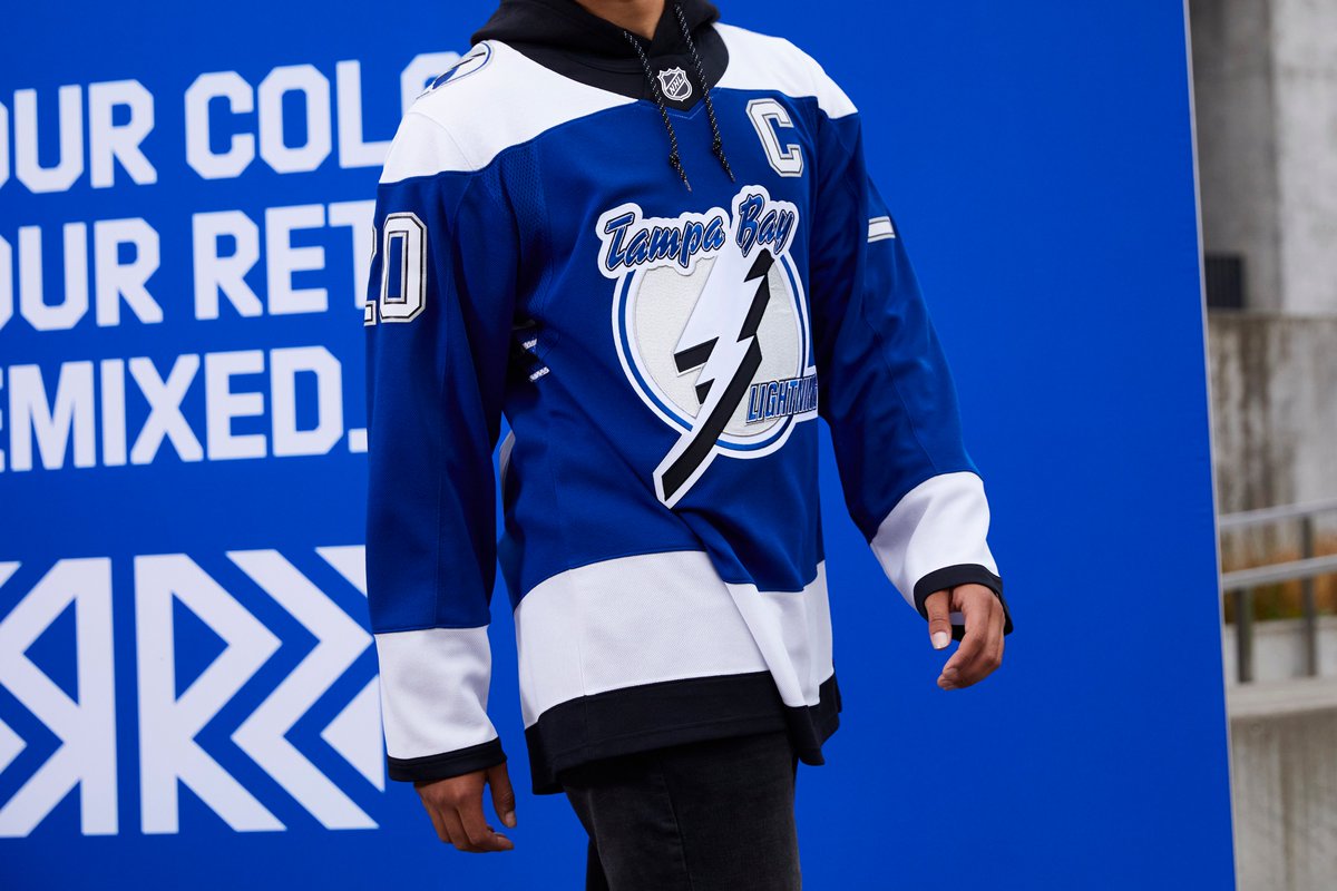
 Tampa Bay Lightning – This set lent itself pretty well to the color reversal practice. I was never a huge fan of the white shoulder yoke but I’m glad they kept it on this jersey (I think black would’ve looked goofy). The blue base looks excellent and I’ve always really loved Tampa’s original crest and I’ve always especially loved the shoulder patches from this set. The victory stripes are back, the blue really pops. It’s a good jersey!
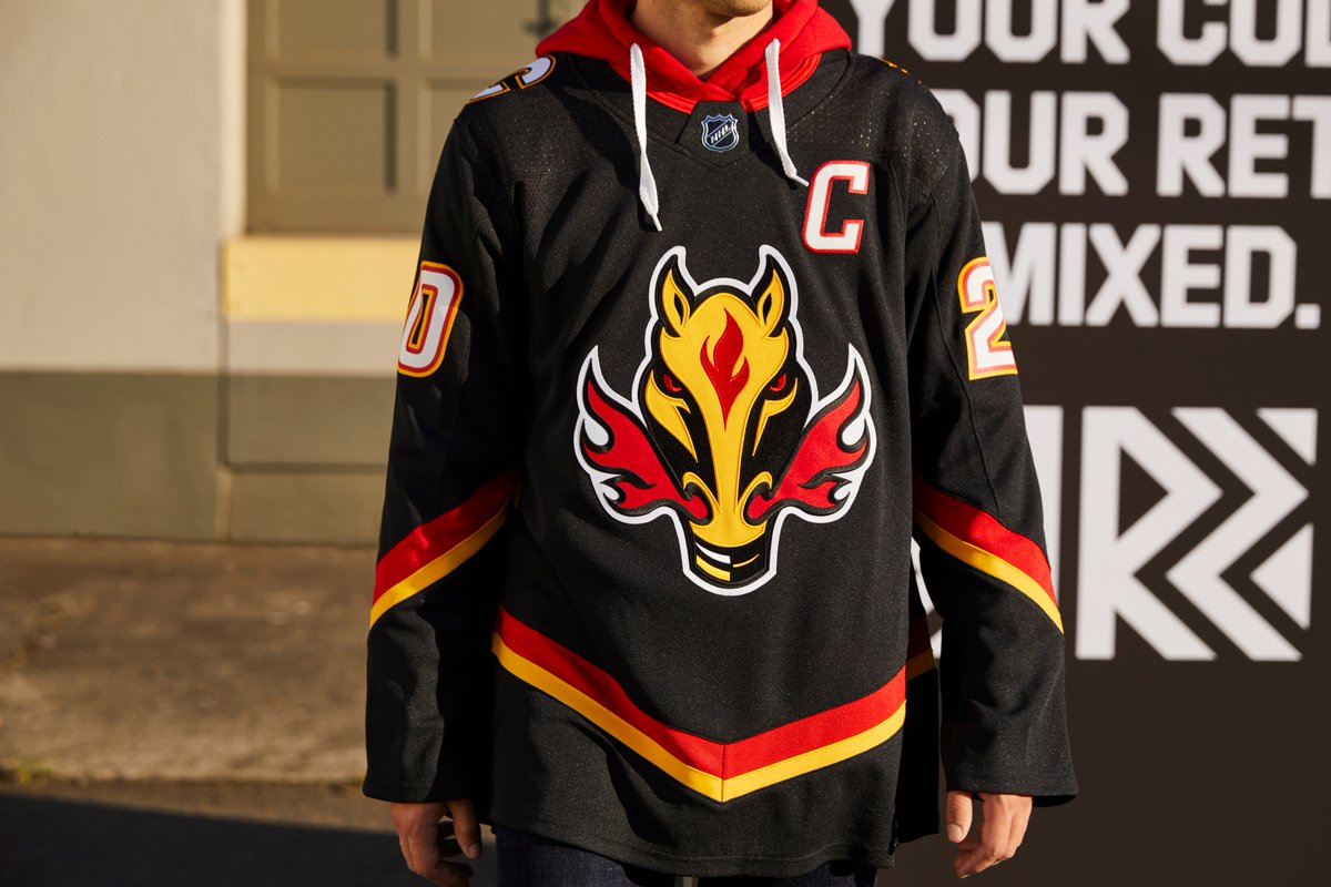
 Calgary Flames – Full disclosure, I’ve never been fond of the flaming horse crest. It’s an unappealing logo to me, so my opinion on this jersey is going to be tainted. Beyond the crest, nothing much has changed since we last saw this design. Which is cheating, in my opinion. I needed a little bit more reversing from this reverse retro jersey to really move the needle. I’m rarely going to complain about a black jersey though and I think going with a mostly black design with minimal color trim looks pretty good.
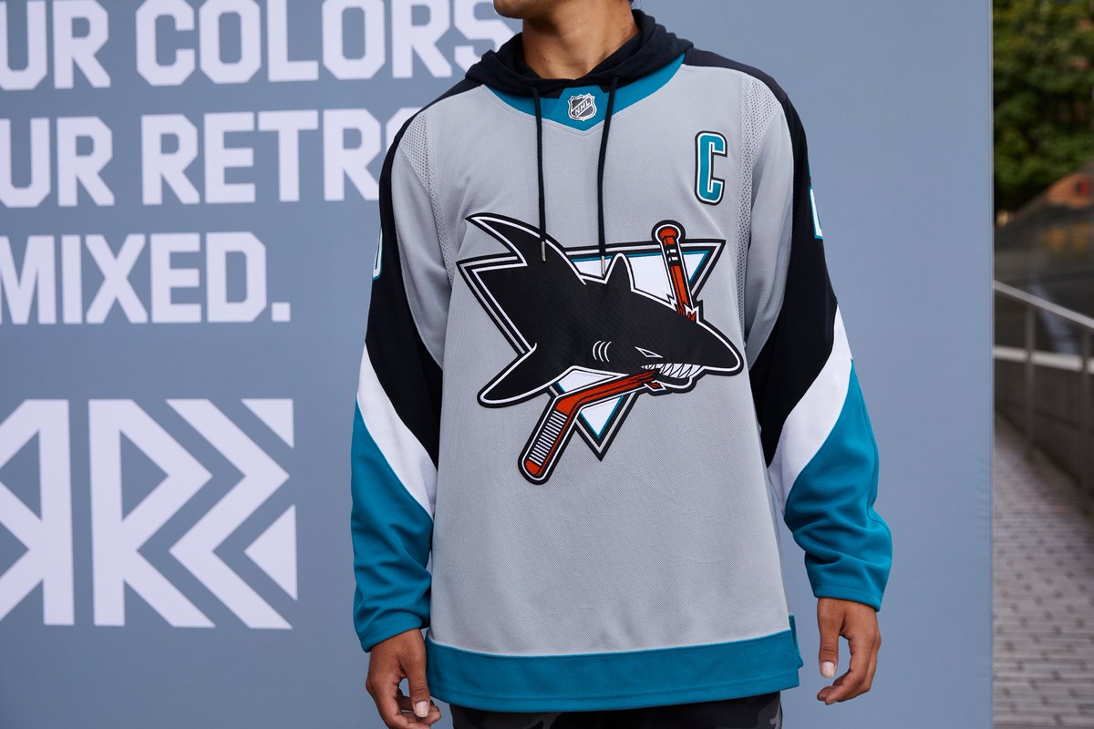
 San Jose Sharks – This is a major nostalgia tour for the Sharks and I’m here for it. Great move bringing back the original crest and while I always felt this pattern was really busy, it works well with the colorway Adidas worked out. Good colors, good logo, good jersey.
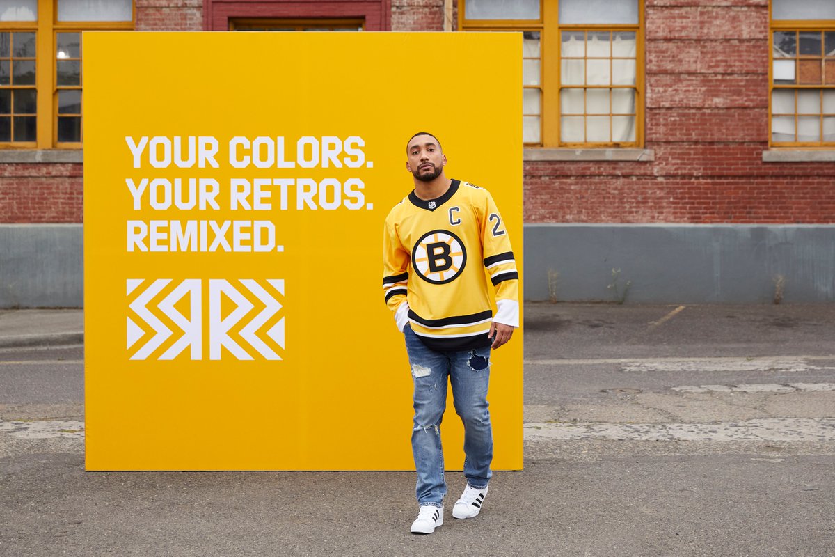
 Boston Bruins – The Bruins jersey was getting mixed reviews for execution but I’m pretty fond of it. Gold jerseys are always going to be hit or miss, but I think this one works. It may be basic but you get a hint of nostalgia with the shoulder patch and the striping pattern still pops on the gold base. It may be a straightforward design but it’s funky enough to work as an alternate while still fitting in the constraints of the reverse retro program.
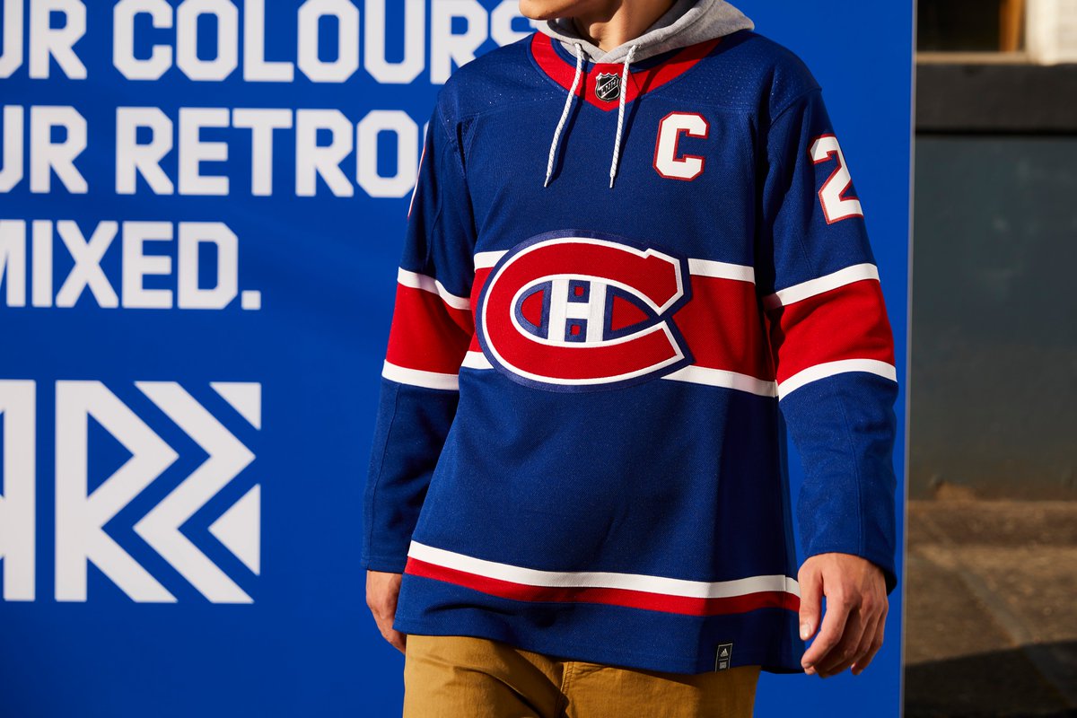
 Montreal Canadiens – A generally safe design for the Canadiens but I think it’s a pretty cool look overall. Not too much more to say in that regard I guess other than their colorway is pretty hard to screw up and the horizontal stripe looks just as sharp set against a blue jersey as it does set against a red jersey.
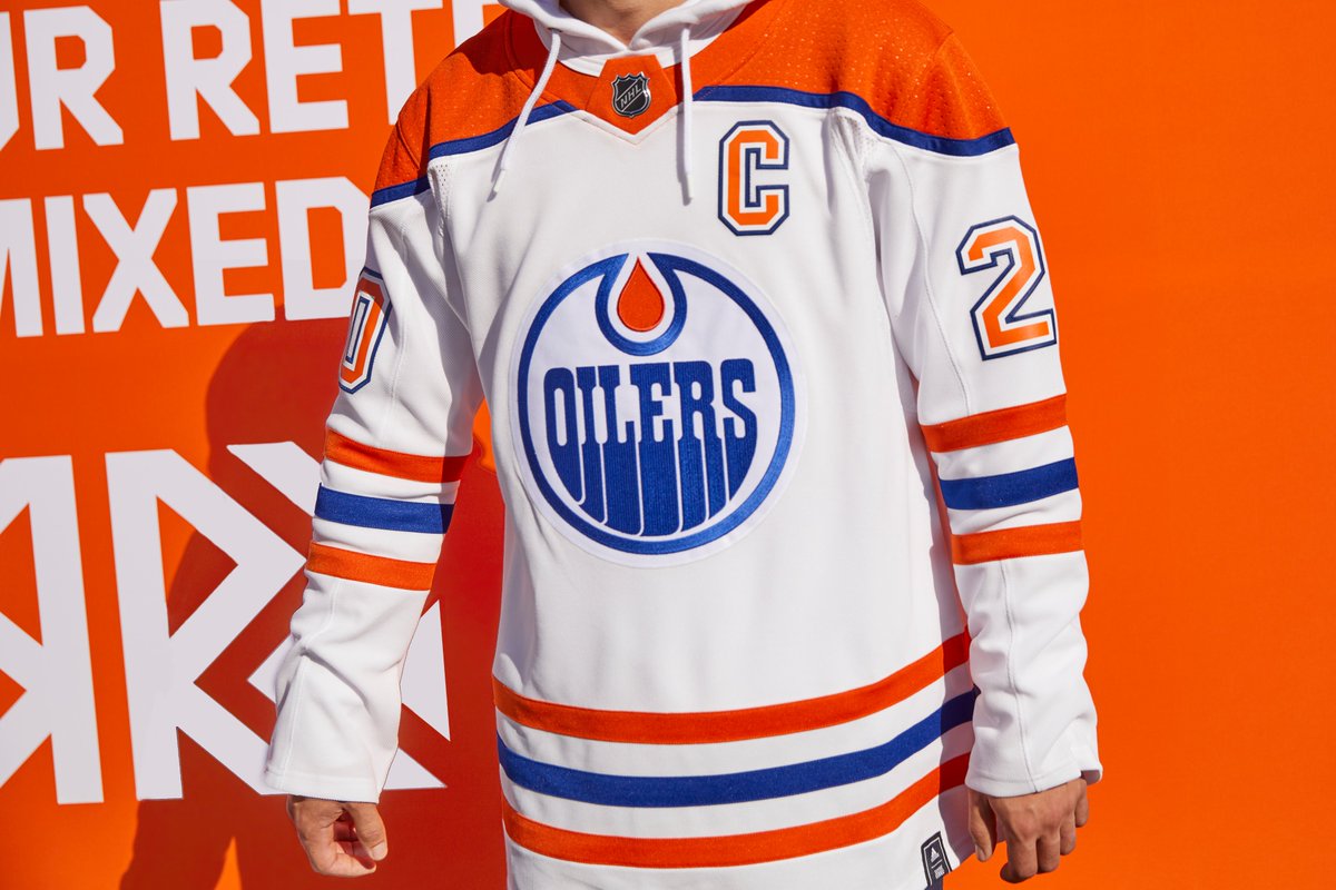
 Edmonton Oilers – I wasn’t sure what we were getting with this jersey as it was getting teased. The WHA jerseys that were used for mockups have a massively unappealing crest and I was worried that would come along for the ride. Instead we get a pretty normal jersey with a funky orange shoulder yoke. Had they gone with the McFarlane oil drop these would’ve been a home run, but these will look great on the ice.
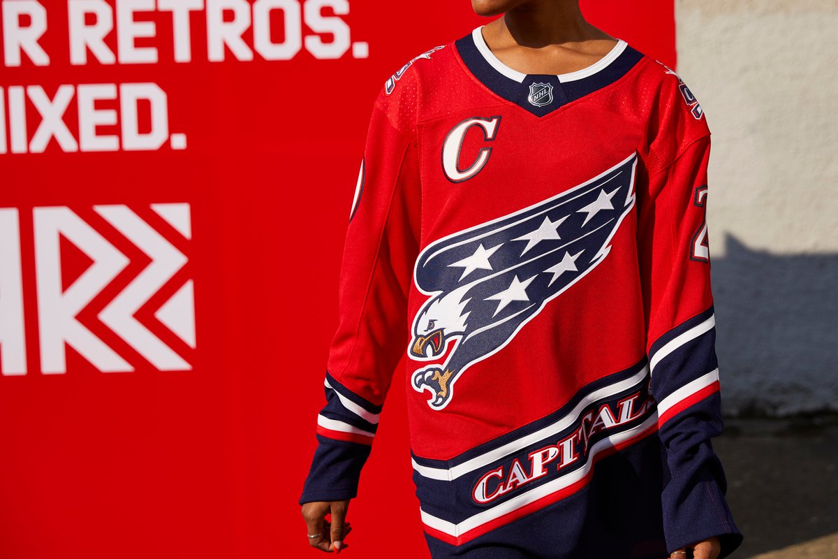
 Washington Capitals – I wasn’t sure how the screaming eagle was going to look in red, white and blue but I think it’s safe to say it looks good. It’s too bad they need to shift the captain’s letters to the opposite side of the chest but that’s a small quibble. The crest looks awesome and the rest of the jersey is equally attractive.
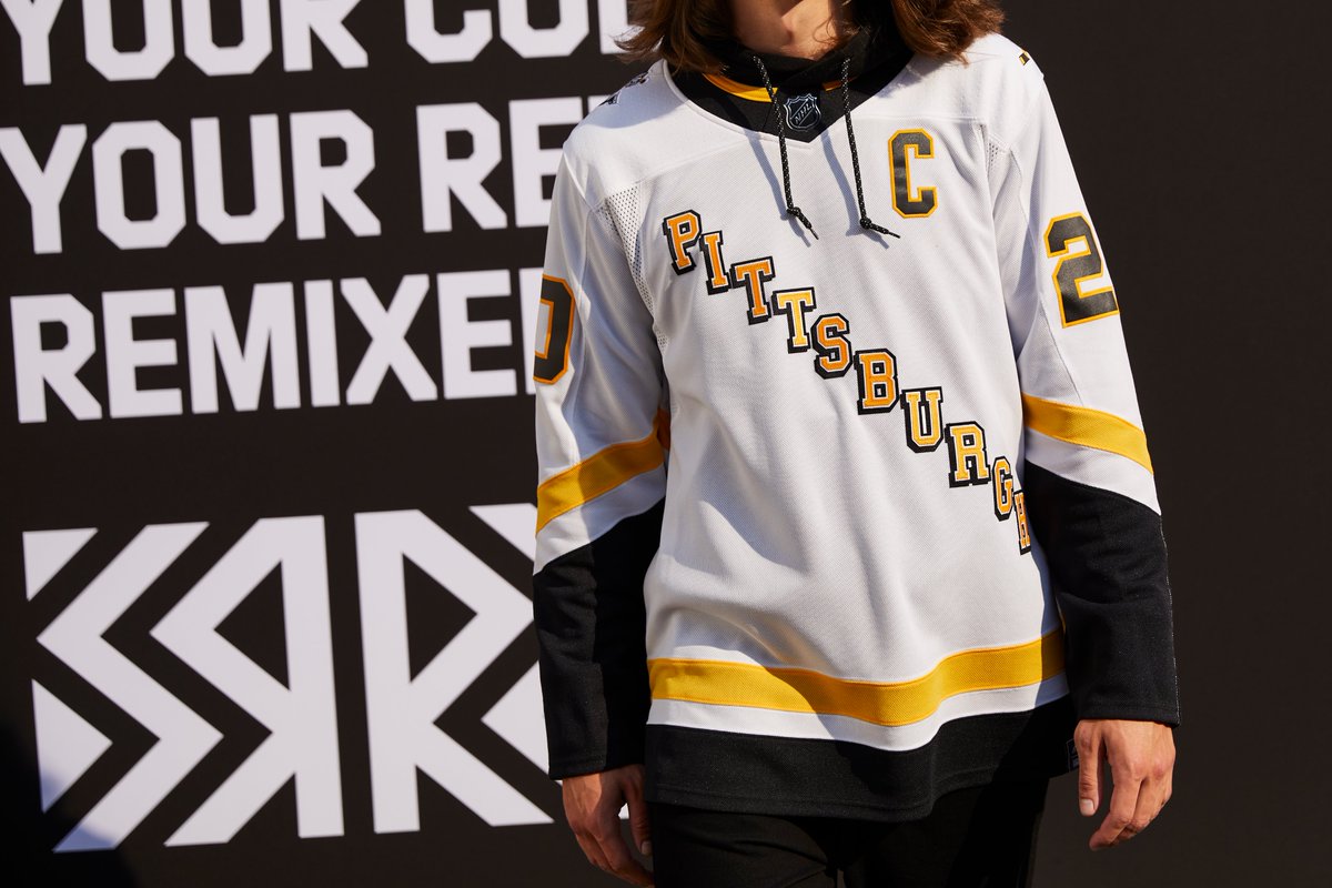
 Pittsburgh Penguins – There’s an argument to be made that this jersey is a little too simple given the inversion from the original black set. However, I think all the elements really play nicely. The diagonal font pops on the white base and I like the skating penguin by itself (even though replacing the Robo-Pen was an odd decision). Like the Bruins jersey, it may be a little boring compare to others, but it’s a good look overall.
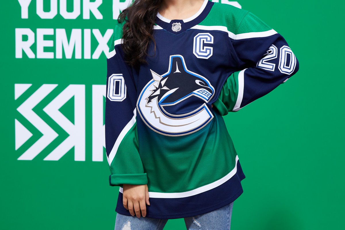
 Vancouver Canucks – This jersey works for me. I don’t know what it is but the colors look great, the gradient isn’t distracting and it’s just a fun recreation of a former design. I liked both of Vancouver’s gradient alternate jerseys the first time around, so naturally this is appealing to me, but there’s more than just nostalgia at play here. I think it’s just that the Canucks’ blue and green color scheme works so well in virtually any setting that this design lands. I can’t put my finger on exactly what about this is great, but it just works for me.
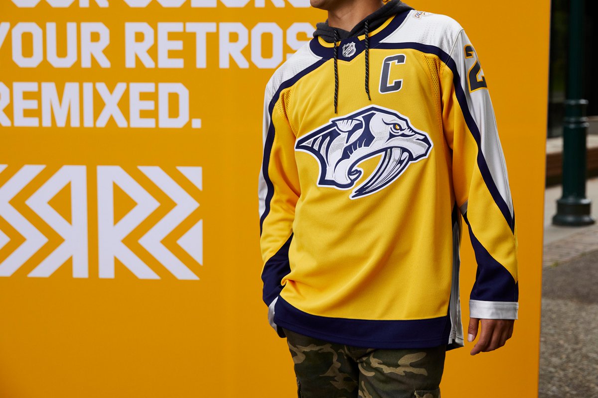
 Nashville Predators – Gold jerseys are easy to screw up but the Predators and Adidas nailed this one. Some early concepts put far too much white in the design but the final product is terrific. The navy trims out the silver arms perfectly against the gold base. I love what the Preds came up with for these. Excellent work.
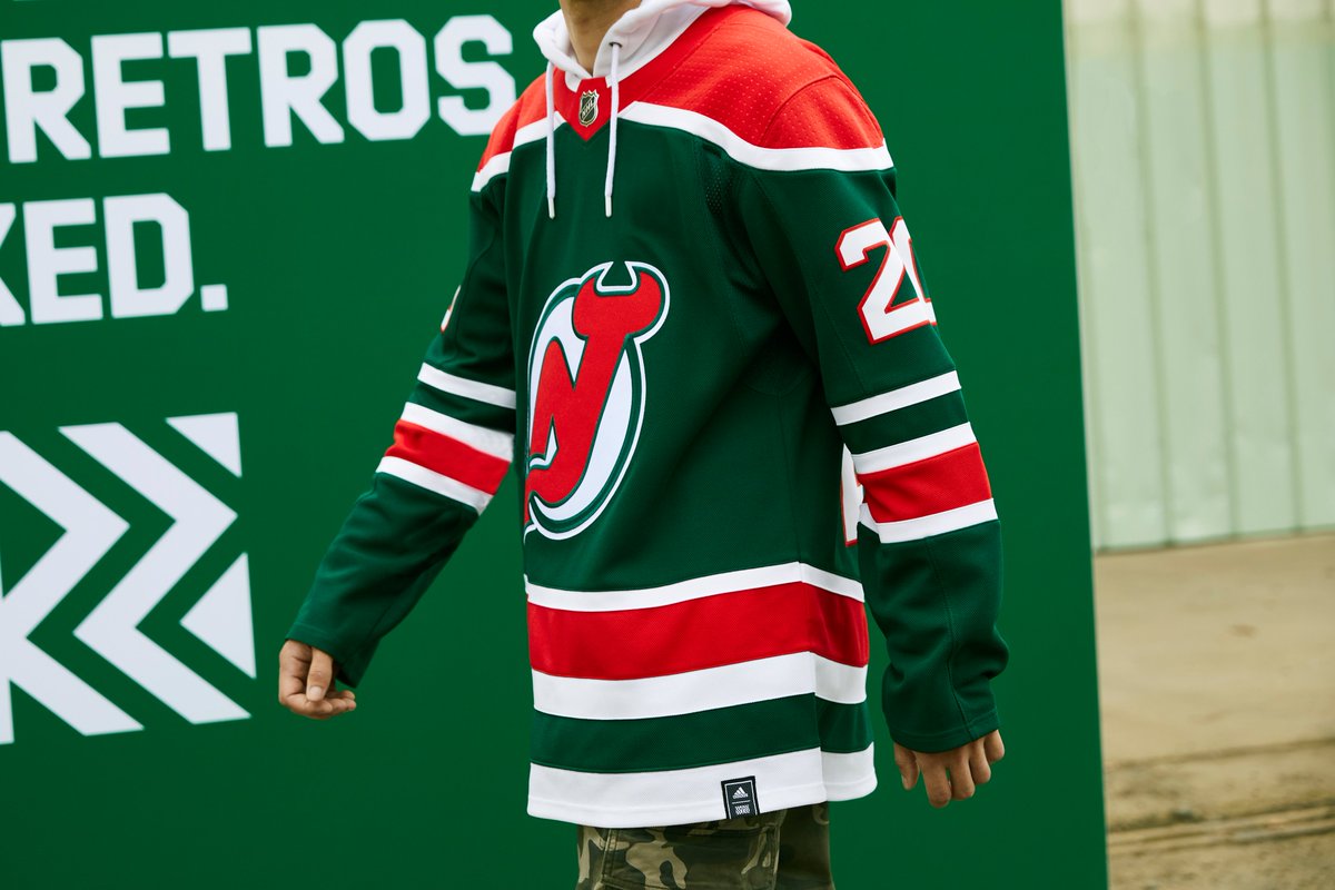
 New Jersey Devils. I usually roll my eyes at New Jersey’s red and green setup but these are awesome. Some of the designs that were really close to throwbacks we’ve seen in the past were maybe a little too safe and these do feel a little bit like hitting a six iron off the tee. But they still look cool as hell. These are one of many I hope to see used beyond this season.
 Carolina Hurricanes – I’m not keen on the Leafs grey at all and I think the Sharks jersey is just so-so, but this one works for me. While I think you can make a strong argument that neither the Wild, Avalanche nor the Hurricanes should be permitted to use the designs they’ve taken on, I’m really fond of how this came together. I think grey jerseys can work really well with the right execution and consider this exhibit A in that department. The grey doesn’t mute the colors as the logos and lettering pop on the light grey base. It’s a good design, even if you’re annoyed that the Canes continue to borrow from the city they moved the team from.
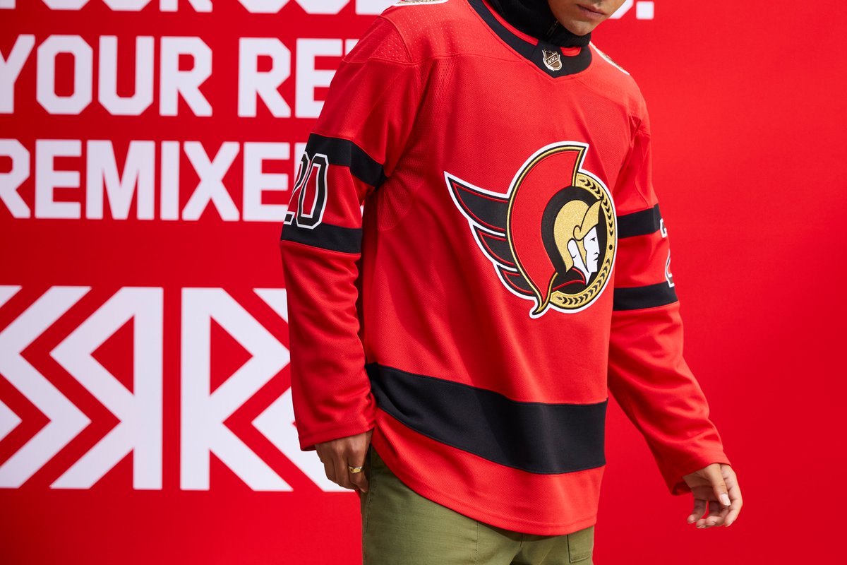
 Ottawa Senators – I’m not a fan of the Sens 2D logo and I think it’s somewhat uninspiring that they reverted to their original uniform set for their most recent redesign. However, there’s something about this jersey which just works. It’s better than either their home or away jerseys and they should start planning for the day this replaces the black jersey. The 2D logo looks sharp on the red base and the overall design is really attractive. Full marks on this one.
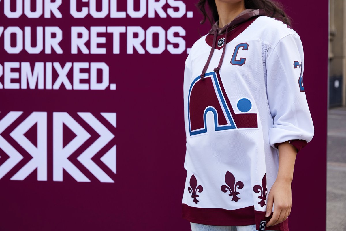
 Colorado Avalanche – I suspect the color choices here are going to be a source of debate but generally returning the Nordiques jersey to the ice is going to win favor with a vast majority of fans. Skipping and inverse of the Nordiques normal colors and instead substituting the Avs colors was an easy win and the logo looks close enough to the original that you’re not going to catch too much heat outside of Le Belle Province. Bottom line is the team is resurrecting a classic jersey, it’s hard to go wrong in that department.
 Buffalo Sabres – I was a perfect age for Buffalo’s initial switch to black and red as I was when the Butterknives third jersey was unveiled in 2000. I’ve had a soft spot for that design and I’m pleased to see it return. I think it looks pretty sharp in the new royal and gold colorway, especially the name and number font which I was so accustomed to seeing in the old triple layer red, sliver and white (or black). Given the general direction these jerseys took – using contemporary colors on an old sweater – I wasn’t sure how a uniform from the black and red era would translate, but this is a home run. The shoulder patch is missing a red eye, for what it’s worth.

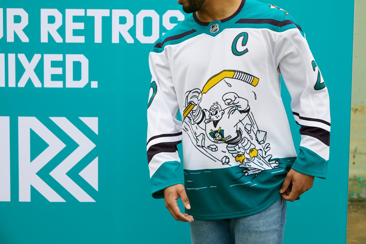
 Anaheim Ducks – Anaheim has really embraced the nostalgia tied to their eggplant and jade uniforms and they’ve been leaning into it hard since their 20th anniversary season. They made the right call resurrecting a cult classic with the Wild Wing jersey here. It’s a ridiculous design which flies in the face of pretty much every traditional aspect of NHL uniforms, which makes it perfect for this practice. It’s fun design that looks pretty good with the colors reversed. Full marks on the design with bonus points for having fun with their choice.
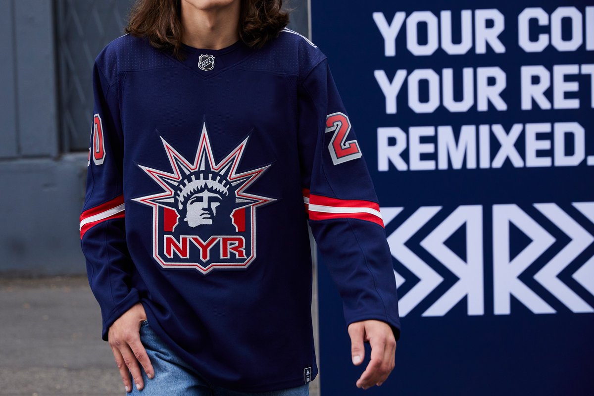
 New York Rangers – The Lady Liberty design is one of my all time favorites in the NHL and I’m delighted that it’s finally getting it’s proper rebirth. I loved the original blue design, I loved the white version and this one is no different. In fact, I think the Rangers should switch to this full time. Angular crest included. I do think the Rangers cheated a little bit here given the final form here is basically a carbon copy of the original. But I’m not going to complain. It was an excellent design when it was introduced in the 90s and it’s an excellent design now, even lacking the red sleeve accents.
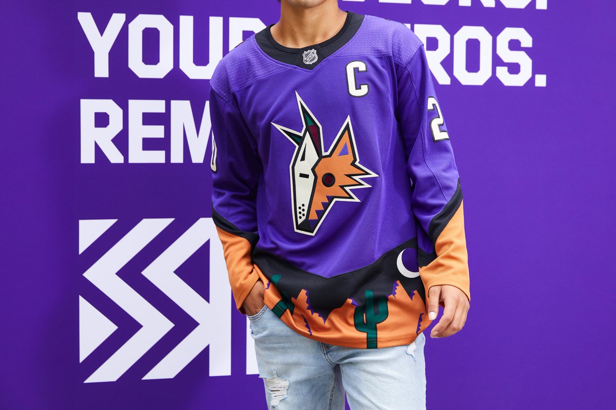
 Arizona Coyotes – I’ve always been a sucker for the 90s and early 2000s NHL alternate jerseys and the green Coyotes jersey was no exception. Like the Wild Wing jersey, it bucked any traditional trends for a more outrageous design and they made the right call to bring it back for a unique alternate jersey program. The Coyotes have already gone headfirst into Kachina appreciation, so in a way this isn’t overly surprising. What makes this my winner of the entire reverse retro set is the color choices. It’s an unusual combo that Adidas and the Coyotes nailed. The purple and orange are appealing when you take in the full design all while screaming directly in your face. This jersey is fun as hell, I can’t wait to see it on the ice.