This is an interview I had been looking forward to for some time. I was joined by Goalie Gear Nerd, one of the most interesting and enjoyable follows on both Twitter and Instagram. Especially if you’re a goalie. We discussed the way he’s grown a massive social media following and what goes into handling that rapid growth. We also dive in on the evolution of goalie equipment in the modern game and just how detailed different goalies can be with their gear.
Gear Talk
Minor Tweaks Equal a Major Win for Sabres Jerseys
The Sabres new uniforms aren’t royal blue and that’s okay. The slight tweaks the Sabres jerseys received in the Adidas changeover drastically improved the overall look of both the home and road jerseys.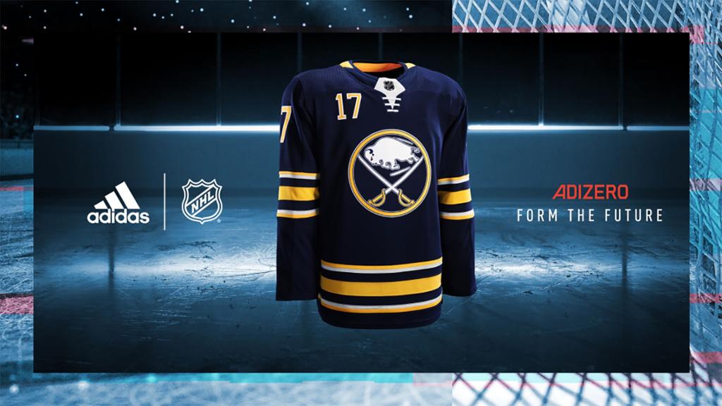
In conjunction with Adidas and the NHL, the Sabres took a step away from the grey/silver accents that have graced the uniforms since featuring prominently during the red and black era and being utilized as an accent on the Slug jerseys. Gone are the wildly unpopular apron stripes and arm pit accents.
It’s unfortunate that there was so much hubbub regarding switching to royal blue from navy because it ultimately distracted from what was one of the better redesigns in the entire league. Prior to the rumors and guesswork – some of which I’m guilty of – I think the number one item on almost every fan’s hit list would have been the silver accents. With those two prominent and unpopular features in the trash, the Sabres uniforms are cleaner and simpler and look that much better as a result. Continue reading
Goalie Gear Watch: New Masks and Gear Throughout the Sabres Organization
On the eve of the Buffalo Sabres season (and hours after the Eichel gut punch) we thought it would be cool to take a look at the new paintjobs and new gear Buffalo’s goaltenders will be wearing this season.
All four goaltenders who will be splitting time between Buffalo and Rochester will be using masks painted by Dave Gunnarsson (DaveArt) which probably should be of little surprise given his massive NHL portfolio and Swedish nationality. That the Sabres feature three Swedes certainly helps push business to the NHL’s preeminent mask artist.
As for gear, things are split down the middle between CCM and Vaughn. Robin Lehner and Jason Kasdorf are Vaughn disciples while Anders Nilsson and Linus Ullmark both sport CCM gear. Here’s the full rundown: Continue reading
Gear Talk: Reviewing Buttendz Hockey Grips
Perhaps it’s because I’ve played goalie longer than I’ve played forward, but I’ve always been very set in my ways when it comes to gear. I’m an unabashed gear nerd but when it comes to how I wear my equipment and what I prefer, there’s really only one way I like to do things.
So when I was given the chance to try out Buttendz – a rubber hockey stick grip – I was skeptical to the feel I’d end up with compared to regular tape. My concern wasn’t related to how my stick handling may be affected – mainly because I don’t have very good hands – but to how the grip would add bulk to the end of my stick. I’m very set in my ways when it comes to how my equipment feels when I’m playing and the idea of adding a thick rubber grip wasn’t high on my list.
However, I haven’t noticed any sort of difference between the Buttendz Fusion grip I put on my stick and the old, ratty tape butt end I had before. In fact, I have to say I prefer the feel of the Buttendz to any previous taping method I used before.
I went with the Fusion as it was closest to the butt end I typically use. It has a smaller knob on the top and a textured grip section that extends a few inches down the shaft of the stick. Buttendz also offers the Flux and the Twirl which together address just about every type of butt end you may find at the rink.
Oh by the way, Buttendz is a company started and based in Buffalo by Kevin Lonergan and AHL and ECHL veteran Rob LaLonde. So if you weren’t already interested in buying because the product is great, you’re boosting up a Buffalo-based company at the same time. Continue reading
