In a move akin to the NBA’s recent jersey expansion, the NHL appears set to introduce a new jersey for all 31 teams beginning in the 2020-21 season.
Early reports describe the new jersey set as a “reverse retro” alternate, with some early leaks indicating the direction the league and teams appear to be going with the program. With indications that all 31 teams will be getting their own reverse retro jersey, the league is taking a new tack with regard to the alternate uniform program. The current process allows for teams to utilize a third jersey with rules providing somewhere between 10-15 games that teams may wear their third jersey. Teams also have latitude to utilize a vintage uniform with stricter stipulations on the number of games they can be worn.
You may remember this as a topic of conversation last year as the Canucks took full advantage of the league’s uniform allowance, wearing their 50th anniversary third jerseys and then allowing their fans to select the fourth jersey they wore (the 90s-era flying skate) via vote.
The reverse retro jersey set appears to be following the pattern set by the NBA with their Icon, City, Association and Statement uniform sets. The NBA’s shift exponentially expanded the number of jerseys around the league, offering up new revenue streams for the clubs and giving fans another jersey set to purchase if they so chose. If this indeed the path the NHL is following, more power to them.
I was hopeful the NHL would follow the NBA’s lead when the Association first announced they were moving away from a traditional home-away jersey setup and to a four-uniform system which allowed teams more flexibility with what they wear each night. It’s a great boost to the league’s bottom line, a key factor given the cloud over the start of next season and whether or not fans will be in the stands. And even though the bottom line is what really drives decisions like this, it’s still a fun addition for the league to pursue. This is a league that’s always been reticent to pursue change, so even if financial considerations are forcing this decisions, it’s still a good one to see them make. Jerseys are fun, so good on the NHL for taking this on.
There’s a lot we don’t know about the new jersey set. It’s not even guaranteed that these will be worn on the ice, let alone what all 31 designs will look like. Though reports suggest that these will indeed be worn in games once the season kicks off (the Icethetics article linked above offers up some key details). There isn’t a firm indication of what design constraints the teams will be held to. I’ve been told that the series will be apply each team’s current colors to the designs they’re resurrecting. That appears to be accurate based on the four designs that have leaked via Icethetics, giving some indication of what direction the Sabres may go in with their reverse retro jersey.
What’s interesting in the variety in design based on the four jerseys that have leaked thus far. The Flyers and Penguins leaks are both pretty straightforward: recolored patterns from the 80s and 90s. But the Ducks and Golden Knights’ designs are curious. Vegas, lacking a diverse history of jersey designs, will apparently be wearing a design inspired by the ECHL’s Las Vegas Thunder. Anaheim’s jersey is expected to be the Wild Wing design from the mid-90s but in the Ducks’ current color scheme. While it’s only four jerseys, it’s a very diverse cross section from the league’s history, meaning that we won’t likely be seeing 31 retro (or faux retro) designs, but some more contemporary looks as well.
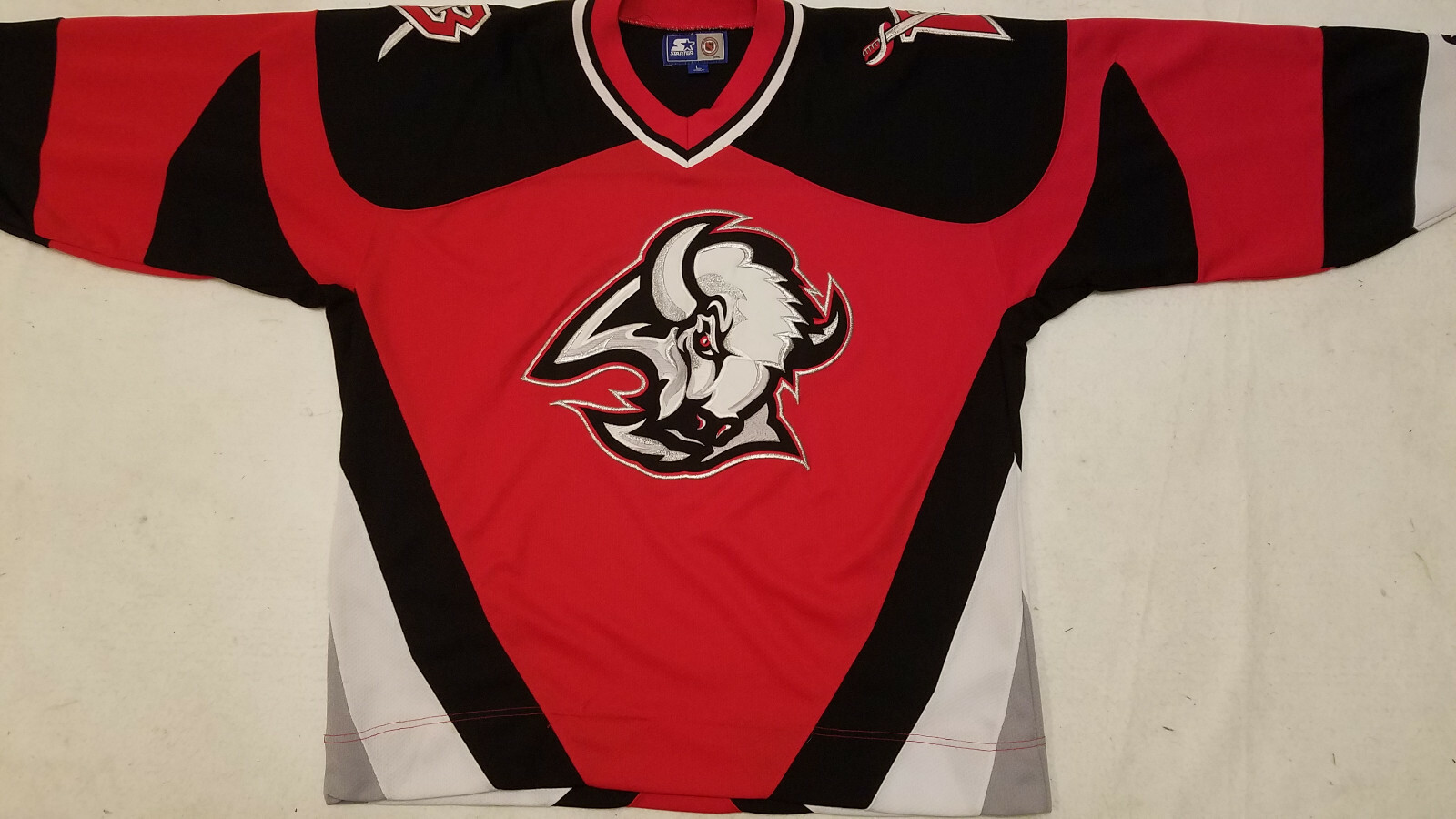
That creates some interesting opportunities for the Sabres. If you’re hoping for a return of the goathead jerseys, don’t hold your breath. Given what’s out there in terms of leaks and rumors, it seems extremely unlikely that they’d simply roll out either the home or road version of their black and red jerseys. If anything, the template the league appears to be following would indicate that the Sabres would use the red fashion version of the black and red jerseys which were around for a couple of years. And I don’t think anyone wants to see that on the ice.
The expectation that each team’s reverse retro will also utilize their current color scheme likely rules out any black and red design. Including the red alternate from the late 90s and early 2000s. Blue and gold will almost certainly be the path they take. Perhaps it will be a blue and gold version of one of their red and black jerseys, maybe it will just be a new take on another pattern from their past – though given their design new jerseys those choices are somewhat limited.
My best guess is that they reverse the design of the 40th anniversary sweaters from 2011. A version of that was featured among the potential designs on the videos and website introducing the new uniforms. It’s a sharp, popular design (effectively the 2018 Winter Classic jersey with the Buffalo script from the 40th jerseys) which fits the mold of the reverse retro design trend. I just hope they skip the reverse colored nameplate.
Below are a few concepts I played around with, including a version of the design featured on the Sabres jersey reveal designs. The other three are inspired by the butter knives alternate as I think that would be a fun design to play with in terms of inverting colors. There’s no date on when the league will formally announce the reverse retro program, nor do we know when the Sabres version will come out. Until then, enjoy the concepts which will be floating around.

Is there any way I could get the file for the vector of the butter knives jerseys? Looking for a .svg if possible would really appreciate it.
LikeLike