Tote bags and a hockey documentary

My friend Annmarie, a dedicated reader of 2ITB (I think) works for WNED. We did some work together during my time with the Sabres and Bandits and now she works for WNED. She wrote a pretty cool blog pumping WNED’s documentary Hockey: More Than A Game.

From what she wrote this seems like it is going to be a pretty comprehensive look at the game. I know that I was consulted on one tiny question regarding the film, I’m really hoping I make the credits as a production assistant, or something. I urge you to read her blog post, watch the documentary and buy a tote bag from the people who cut in half way through the show.

2ITB NHL preview: The West

Since it is a yearly occurrence for the West to have 13 teams in the playoff race and two team at least 20 points out of eighth, I struggled to find a good balance of picks this season. I made a bold choice with the Kings last year. While I don’t have them coming out of the West, I have made a similarly bold statement

Continue reading

NHL’s worst idea since the glowing puck

This is easily the worst idea the NHL has had in quite some time. Numbers on the front of a player’s helmet.

Puck Daddy posted this story today after seeing the tweet from the Minnesota Wild’s equipment manager. The Puck Daddy story comes with a complete breakdown straight from the NHL, be sure to check that out.

I guess i get what they were going for here. With a number on the front of the player’s dome he will be easier to identify. However, the level of ridiculousness here is astounding.

The numbers are way too big, they don’t look natural on that part of the helmet and it makes the helmets look like they belong in a European league.

The thinking is that the player will be easier to identify, by everyone, with the additional digits on their dome. However, the way helmets are built – plus the size of the players – these numbers will be rendered useless. Not ot mention, they will be too small to see from the press box, so broadcasters are out too. The only people this will benefit are those at the game or watching the broadcast.

While most will certainly be able to see that number, it doesn’t make it any less tacky. Plus, there are already four different locations a number can be found on any given uniform; the back, sleeves and back of the helmet. Some teams even have chest numbers which would bring the total to six if this stupid number is allowed to stand. The teams with chest numbers will look like an Excel spreadsheet with six different numbers on each player. To enact something so gimmicky and awkward to aid the casual fan is the height of stupidity.

For the record, the glowing puck was supposed to help casual fans, too.

This is clearly something that wasn’t thought through, by anyone. Someone needs to take this back and do it soon.

Proud to Puck launches today

Along with providing Bandits, Bills and Sabres content here at 2ITB, along with other random musings, I will be contributing as the Sabres writer for Proud to Puck. It is a new NHL news website that will offer coverage of the entire league. I’ll often re-post content here from P2P and vice-versa.

I am joining a great group of writers and it will be a fun season providing content for this new site. Be sure to check it out on a daily basis.

Lokomotiv Yaroslavl tragedy adds to hockey’s heartbreak

In a summer that has been filled with heartbreak for the hockey world, another tragedy struck the tight-knit community today in Russia.
The plane carrying the KHL club Lokomotiv Yaroslavl crashed shortly after takeoff and claimed the lives of 43 of the 45 people on board. Statements released by the team indicated that the entire roster, plus members from the youth team. As IIHF President Rene Fasel explained, “Today is the darkest day in the history of our sport.”
Among those on-board are ex-NHLers, Pavol Demitra, Karel Rachunek, Ruslan Salei, Karlis Skrastins and Josef Vasicek. In addition, goaltender Stefan Liv, head coach Brad McCrimmon and assistants Alexander Karpotsev and Igor Korolev also have ties to the NHL. Of course, each and every life that was lost in this horrific accident is mourned equally, the fact that names so familiar to so many fans are involved makes the issue hit very close to home. Continue reading

Winnipeg Jets unveil new uniforms

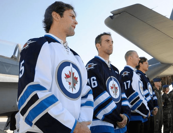
The Winnipeg Jets alleged logos and uniforms have been a fun topic of conversation this summer. After a surprise logo unveiling earlier in the summer, the Jets showed off their new jerseys today.

A close-up of the terrible vertical arm striping on the new Jets uniforms.

Overall the jerseys are pretty underwhelming. They don’t stink, which is a good thing. But they aren’t show stoppers. The blue home uniform looks good. The sleeve and waist stripes aren’t ridiculous and the color scheme works well. Aside from the main logo, the home uniform works.

As for the away jersey, it is awful. The sleeve stripes aren’t all that terrible. The light blue looks good. However that stupid vertical navy blue arm band is horrendous. There is no trim on it, so it is just floating out in space, part of it fills in between the horizontal stripes and it has no counterpart on the home uniforms. To top it off, it makes the horizontal stripes, which on their own would look good, look like something you see on a crossing guard.

i was really hoping the Jets organization would stay away from mistakes like this, especially those awful third jerseys. For the most part they did. They chose a cool color scheme with a very cool secondary logo and a fairly unique wordmark, depending on your taste. The boring logo doesn’t help much, but coupled with that idiotic vertical stripe, I can only hope the NHL goes to white jerseys at home so I don’t have to witness these in person.

On the bright side there is an opportunity for a baby (aviator) blue third jersey with that awesome secondary logo. Also, the numbers and letters are pretty unique, so that is a small victory.

Again, they’re not the worst things in the world. Just not worth all the waiting and fan fare. I think I may have taken the counterfeits over this model.

A look at the numbering and lettering on the new Jets uniforms.

Farewell Captain Clutch

In case you hadn’t heard, Chris Drury played in, and won, the Little League World Series. No fooling.

In a related note, Captain Clutch is calling it a career. After an underwhelming and injury plagued tenure with the New York Rangers, Drury was bought out earlier in the summer and has decided to retire from professional hockey all together.

What this tells me is his degenerative knee condition is more severe than originally expected in July. There were many who figured he would find his was onto a contender’s roster at discounted rate for the 2011-12 campaign. After all his face off skills, penalty killing and other intangibles would be very attractive to a team making a Cup push.

Alas, his injuries likely played a large role in this decision.

Drury was, and will be, one of my favorite players of all time. Ever since his first seasons with Colorado I was a fan of his style and skill. When he was acquired by Buffalo I was ready to do back flips.

Drury was part of some of the best Sabres hockey in the history of the franchise. He, Daniel Briere and the rest of the core players carried the team to the Eastern Conference Finals in back-to-back years in what was one of the most memorable runs I can think of with this team. Then, of course there was the goal. Who else?

And here is an even cooler angle

Continue reading

New Winnipeg Jets logo = fail

After quite a bit of hype, the Winnipeg Jets finally unveiled their new logos. Of course, they didn’t include the jerseys, just the logos. What I was left wondering was, is this seriously the best they could do? Honestly, I understand that True North wants to establish their own brand separate from the former franchise that now resides in Phoenix, but c’mon.

The former Jets logos, while similar, were iconic to the team. They also grew somewhat of a cult following after the team left. The same can be said for the Whalers and other defunct franchises.

My problem with this logo is that it is so bland. They do a good job playing off the True North name by giving the compass look, same with including a real jet. Those are really the only good points about the primary mark. Otherwise I just see the same thing as the Penguins Winter Classic, Florida and Columbus third jersey logos. Continue reading

Unwinding a crazy weekend

Suffice it to say this was the wrong draft weekend to head out to Boston to catch the Dispatch reunion show. I’m not mad at my decision, Boston is a great city and the show was absolutely killer. However, there were some major stirrings in the hockey world – both in and outside of Buffalo.

As the Robyn Regehr trade gets pounded into oblivion by the sports media, I want to offer my take on the other major transactions from draft weekend. My opinion, and many others have been cast regarding the Sabres trade. No need to rehash it.

One set of moves that outweighed anything else were the ones made by Philadelphia. By shipping Jeff Carter and Mike Richards to Columbus and Los Angeles, respectively, the Flyers really put a stamp on their goal for 2011-12. They needed cap space to sign Ilya Bryzgalov to a major deal (that they did) and they found it with two major cogs. Continue reading

2ITB 2011 NHL Awards predictions

When the NHL decided to move their annual awards show to Las Vegas the idea was to create more buzz and publicity for the event.

I completely forgot that he show is tonight. Mission accomplished.

Still, it is a big day and there are few awards that aren’t going to be decided by a runaway vote. The three awards that are determined at the end of the season are the Richard (Corey Perry), Art Ross (Daniel Sedin) and the Jennings (Roberto Luongo). Here are my picks for the remaining awards. Continue reading