It’s taken a little longer than usual due to the late-November launch of the Sabres alternate jersey but all the different sets of gear worn by Buffalo’s goaltenders have now seen the ice (with the exception of Eric Comrie’s black and red setup).
The black and red uniforms offer a great shift for the team’s netminders, providing a drastically different look for each when the team wears their new third jersey. Perhaps we will see more mask art or pads for the team’s Reverse Retro jerseys, but for now each goalie has sported two different sets on the year. It offers a great variety of looks and there’s a similar collection of mask art to admire. I’ve included Rochester’s goaltenders in the mix as well since more gear is always more fun.
Craig Anderson
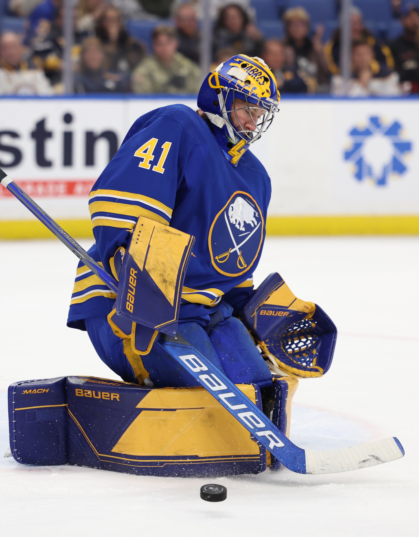
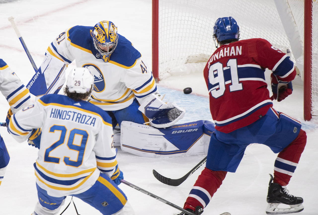
Anderson is still in Bauer gear this season. Last year he sported Bauer’s Hyperlite graphic but has shifted to the company’s Mach graphic for the season. He’s rotated graphics the last few years between the Supreme and Vapor lines and while I’m unsure which build he uses, he’s explored a few different takes on the Mach’s stock graphic for the year.
His standard home set is the gear his son designed. Blue and gold with no additional trim. The Mach graphic doesn’t play well with every color scheme and I think the all blue and gold looks a little flat as a result. But it’s a good, adventurous take on what can tend to be a fairly boring graphic package. I think it looks a bit better on the white road jerseys as the all-color pads get washed out with the home uniforms.
Conversely, Anderson has introduced a white-based set which he’s word with the team’s Reverse Retro jerseys and their road jerseys as well. The set looks sharp with the white uniforms. As you can see in the picture, the lack of options for color placements limits the graphics. When you see it close-up, the gold trims the pads nicely. But from a distance, the pads look a little washed out. But overall, the look is superior to his blue and gold pads.
Anderson has been wearing a mask he debuted from last season. A two-color design that stands out from distance, which is something mask purists will certainly appreciate. He does have a new mask from his painter Sylvie Marsolais which looks terrific. He wore it in training camp at least once or twice but it hasn’t seen the light of day since. It’s a sharp mask and I love the cracked stone effect on the chin and sides of the mask. The partial logos look great and Sylabrush did it right by not contorting the logo to make it look better in reverse. That’s been an issue with some of Daveart’s recent work and I think Sylabrush did it right here. Maybe he hasn’t worn it yet because he doesn’t like the fit of the new Bauer NME, hard to say. But I’m hoping to see it soon.
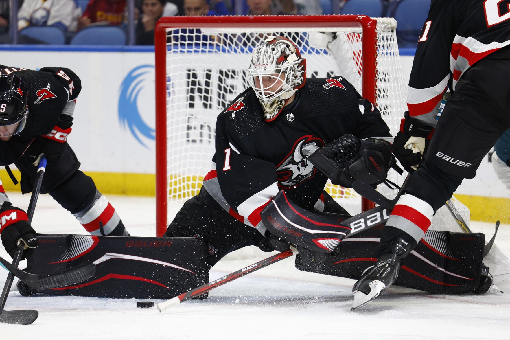
His black and red set swaps his home set for the new (old) color scheme. It’s a fine look overall but once again the Mach graphic limits him. The mask, however is great. It has some awesome vintage design cues and the oversize logo on the forehead is excellent. Full marks for both masks.
Eric Comrie
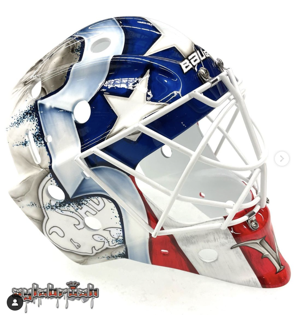
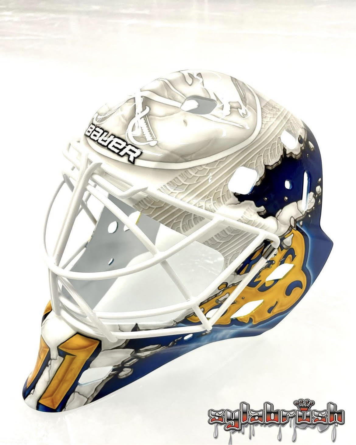
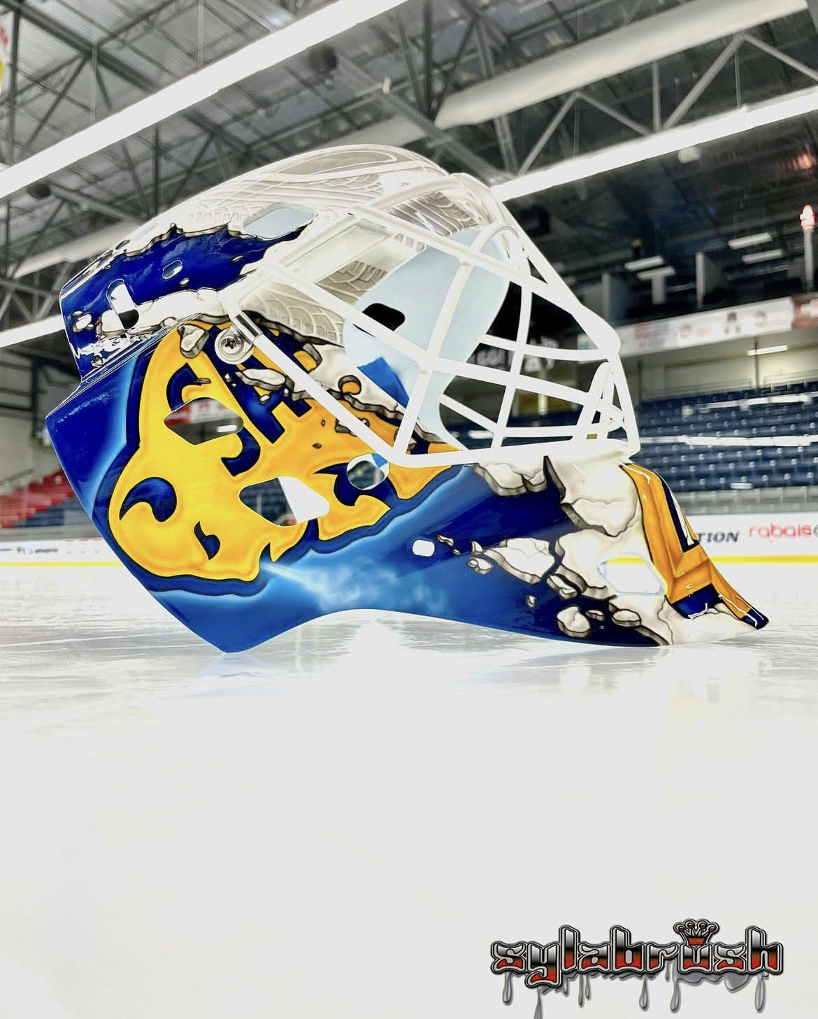
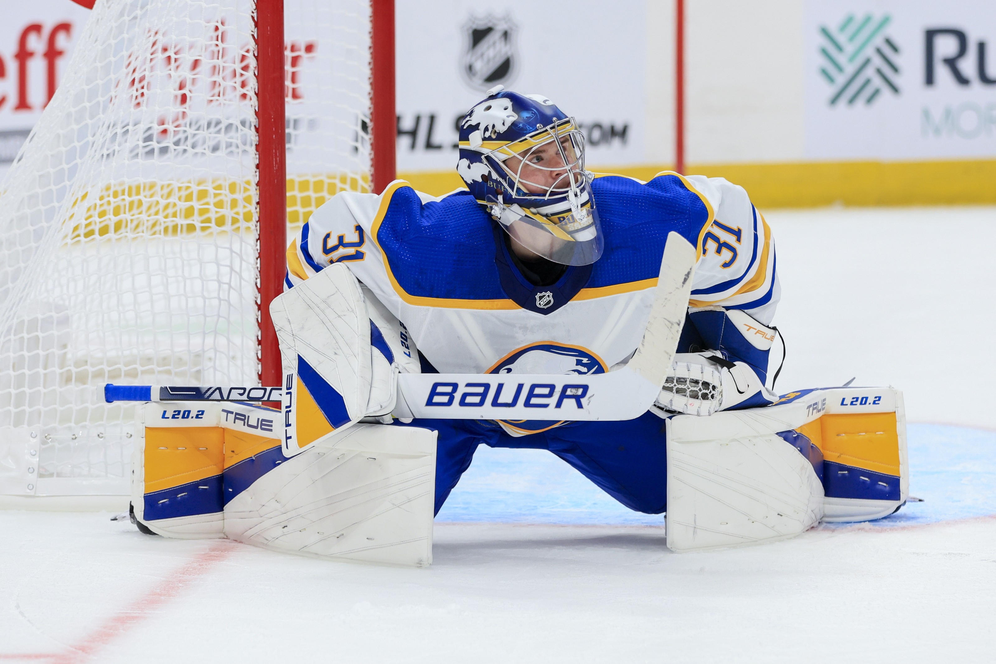
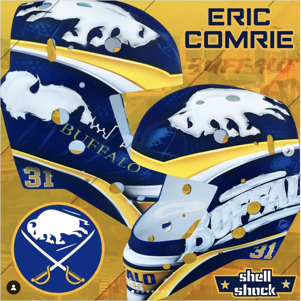
There’s nothing complicated with Comrie’s gear for the season but the simple, understated design looks terrific with Buffalo’s uniforms. The True graphic plays beautifully with the Sabres’ colorway and the mask from Shell Shock Paint brings a new artist into the fold in Buffalo. I especially like the 40th anniversary script on the left side of the mask. The design has a cool effect from distance that’s reminiscent of early 90s or late 80s Sabres masks from the likes of Tom Draper or Darren Puppa.
Comrie’s black and red mask is a killer. The side that pays tribute to Ryan Miller is especially great and it’s unfortunate that we are being prevented from seeing it due to his injury. Similarly, his black and red pads ought to look terrific thanks to the True graphic package.

Ukko-Pekka Luukkonen
Buffalo’s stand-in planned ahead well this season. Not only did he get a great looking set of Bauer gear made for the team’s home and road set, he had the same set made in black and red. I’m of the opinion that the best application of Bauer’s digiprint custom pads is a unique graphic as opposed to simply plastering logos on the pads. A creative graphic which might could double as a stock design is almost always preferable in these uses.

UPL’s home pads may be a touch too white, but it’s a nice design overall. I think they look strong with the white jerseys and particularly good with the team’s home uniforms. Meanwhile, his set with the team’s alternate uniforms are aces. Possibly the best set of anyone in the pipeline this season. The pads look supremely cool with the black base and the whole set is brought together beautifully with his new red and white mask.
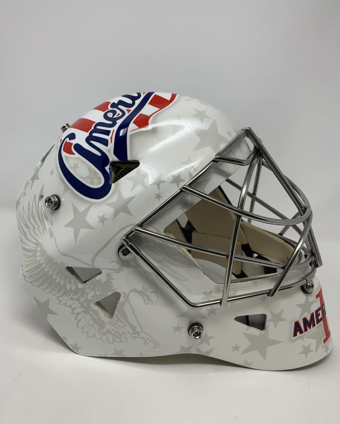
Looking at the masks of the rest of the goalies in the Sabres’ system presents another Sylabrush product (Beck Warm), Gliders Design (Michael Houser) and what I believe is a Skin FX wrap for Malcolm Subban. As an aside, Subban’s Sabres set would look terrific should he be called on at any point this season while Warm’s mask is a terrific application for the Amerks. One of the best I’ve seen in recent years.