The jersey news Sabres fans have been waiting for finally came this week as the club added a bit of fan service to the unveiling of their alternate jersey, finally confirming they’ll be returning to royal blue uniforms in 2020-21.
Rumors on the third jersey were flying from the minute it was confirmed the Sabres would have an alternate jersey for the 50th anniversary. All white, white and gold logo, no blue, there was a lot floating around with the third jersey. The end product is a sharp jersey that does well to mix the gold color being adopted for the anniversary season and the current navy blue used by the club. I may be biased because my alma mater sported navy blue and vegas gold, but it’s an excellent color combination.
The detail embroidery on the crest is tremendous. It’s not quite chain stitching, but it is just as impressive. Much like the 2018 Winter Classic crest with the felt backing and leather applique bison, this crest is bold enough to be seen from a distance and extremely detailed up close. Thanks to the excellent color scheme, the numbers pop on the sleeve and back of the uniform. Same goes for the crest as the gold dazzle fabric pops against the navy blue.
Kudos to the Sabres for finally getting around to including artwork on the inner collar. They had something on the Turd Jerseys, but those were such a travesty it barely registered, so this addition is terrific. Their four primary logos have been a big part of the 50th celebration already, including them on the collar feature was a nice touch. Here’s hoping we get more of that on the new royal jerseys come next year.
White gloves can be a divisive topic in the hockey world, but I’ve always been fond of them. I’m a goalie and a gear geek, so I’m almost always down for unique takes on gear design. On an alternate jersey that will get a limited run like this one, I think white gloves fit in. Not unlike the rest of the ensemble, the colorway is incredible, so it helps the design pop. I’m glad to see the rumors about white pants were unfounded. With the white gloves and socks it would’ve been Stormtrooper central. The blue pants break up the look nicely and allow the white gloves to serve as a nice additional touch.
The only real miss on the uniform is the striping pattern. Specifically, on the jersey itself. The socks are alright, but the sleeve and waist stripes don’t work for me. The thick blue stripe doesn’t jive with the four smaller stripes and it’s just visually jarring to look at them. They basically took the striping pattern from the 40th anniversary jersey, added a thick blue stripe in the middle and called it a day. To put all the effort into the intricacies of the crest and other design features and then just mail in the stripes is perplexing. It’s like they got to the end of the project, forgot about doing the stripes and went full high school student. “It’s cool if you copy my work, just make it different enough that they’re not exactly the same.”
I know what they were going for, five stripes, five decades, it’s a nice Easter egg of sorts. But they do distract from the overall design of the jersey. The blue and gold just play off each other so nicely, I wish they would’ve capitalized on that as they did with the numbers. They could’ve kept the five stripe layout but in a way that wasn’t quite as distracting that allowed for the blue and gold to play off one another better. That’s a fairly small complaint in the grand scheme of things.
It’s a good jersey overall. A third jersey shouldn’t simply recreate an old design and call it a day. The whole point of being an alternate is to change things up from the usual look. In that regard, this is an excellent take on an alternate jersey. The Turd Jersey was a design nightmare, but it was aiming in the right direction. I’ve grown tired of teams just reintroducing their old uniform as a third jersey. Mainly because too many teams have taken to adopting the third jersey as their primary uniform. Give me something original that differs from the home and away set for an alternate jersey. It’s easy to miss that mark, but a third jersey should be unique and fun, not safe and recycled.
Comparing strictly to recent anniversary jerseys, it kicks the crap out of the Flyers, and I think it compares favorably to the Kings jersey which had a nice mix of modern and throwback elements. It works perfectly as a third jersey as well. The unique design isn’t a recolored version of the home and away uniform and it’s different enough that you wouldn’t want to see it adopted as the primary jersey.
In a sport and league that’s so rooted in tradition, it’s hard to break the cycle of safe alternate jerseys. Radical uniform designs in the NHL are almost always met with disdain, even when they’re alternate jerseys. As much as I want to see the NHL take a step into the future, I’ve come to accept that most primary sets will remain rooted in tradition as opposed to branching off the beaten path. It’s not a bad thing, either. Seeing teams with a rich heritage return to their classic designs is almost universally good. The Oilers and Islanders are perfect examples of teams getting it right by going back to their classic designs. Of course, the Oilers went and screwed it up by swapping their classic royal for navy blue. That decision by the Buffalo’s cousin in futility is awfully ironic as the Sabres are set to get their house back in order by ditching navy to reintroduce royal blue.
It took the Sabres long enough to get around to making the change, but I think most fans can rest easy knowing that they were heard. They had to yell and scream into the void for a few years, but they got the job done.
The Sabres were handcuffed by the league’s rules against updating primary uniforms as the updates they made ahead of 2017-18 reset the three-year clock for another set up changes. If you’re unfamiliar with this rule, it first gained notoriety after the 2007 Reebok Edge changeover when teams like Florida and Edmonton dealt with a great deal of backlash for their uniform designs. The rule has never been fully publicized by the league but has made the rounds in various uniform geek circles. Why the league or individual teams haven’t made it public knowledge is perplexing to me. Offering some clarification on when (and sometimes what) a team is allowed to do within the rules set by the league and in their uniform contract would likely soften negative feedback like the Sabres have been receiving for at least the last three years.
Knowing the team was stuck until 2020-21 doesn’t make it less frustrating that the original uniform color won’t play a prominent role in the 50th anniversary season. However, it’s worth noting that the changes the Sabres made in 2017 played to the fans as well, as they addressed a pair of extremely unpopular uniform features – the silver armpits and apron stripes. In hindsight, the team probably should’ve either made the switch to royal blue in 17-18 or made no changes at all, knowing the potential for a 20-21 lockout could alter their plans for the 50th anniversary.
That planning would have either served up a slam dunk for fans ahead of the introduction of Adidas as the league’s new uniform supplier (not to mention the 2018 Winter Classic), or put them on track to celebrate their golden season with a unique alternate jersey along with a home and away set fans had been pushing for. That would’ve eliminated the fan service of trimming some (not all) of the silver in 2017, but it’s also worth noting that plenty of fans were already clamoring for royal blue ahead of the adidas redesign at that time. No matter how you slice it, it’s messier than it needed to be.
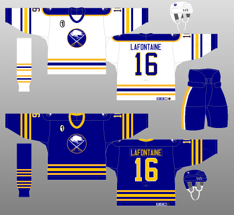
At the end of the day the team is finally getting back to the colors nearly everyone has wanted. We’ll have a year of waiting to see how the organization opts to incorporate the original colors. The teaser video includes a crest with no silver trim, so that’s a pretty big win right off the bat. It will be a crime if they fail to include the striping pattern from the original white jerseys that capitalized on a design error that alternated the stripe pattern on the sleeves and waist. That’s a must-have in my opinion. Dumping the numbers on the chest would be another big win. Everything else will be a layup.
After all this I’m not sure there are any more uniform complaints left for fans to make. In another year or two we’ll see an alternate jersey introduced and maybe they’ll even do a limited heritage jersey in red and black like the Coyotes kachina jersey.
Until then we’ll have to enjoy seeing the various throwbacks in warmups, the sharp new alternate jersey with the knowledge that the big win is another year away.
