In case you haven’t heard, old is new in Western New York. All new construction bids must be accurate to the Canal-era, historic preservation is the hip thing to do and sports teams are reverting to their past with uniform designs.

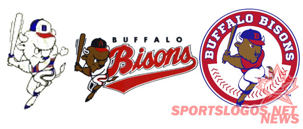
The Bisons joined the Bills and Sabres on the retro train with today’s logo unveiling. The new logo is a new take on the original batting Bison logo which has recently stepped in as the team’s alternate logo. As the picture shows, the new logo is the same batting Bison but with softer details and more of a royal blue than the navy from the throwbacks. I am, however, a fan of the wordmark. It isn’t close to being superior to the classic script of the throwback, but it is bold and an improvement over the last wordmark.
The understated baseball stitching is a nice touch and compliments the logo quite well. However, Buster looks almost devoid of any sort of detail aside from his snout and eyes. The throwback logo – which this is obviously based on – gives far more detail in every portion of Buster. That alone makes this logo inferior to the original. The lack of general detail looks weak and somewhat cheap. While the direction was clearly spot on, the execution wasn’t. Continue reading


