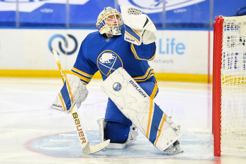
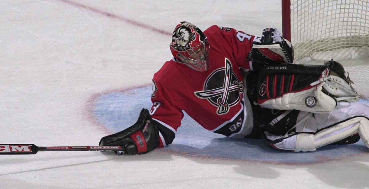
Custom goal pads have been revolutionized by the introduction of digitally printed graphics. CCM introduced their printed graphic technology a few short years after Bauer’s digiprint was released. Now, virtually every NHL team features at least one goalie whose equipment uses the technology.
The technology’s applications are practically limitless, Linus Ullmark had a few unique looks of his own, Ukko-Pekka Luukkonen does as well (both Bauer wearers) and Devon Levi will be taking advantage of CCM’s feature this season.
One of the most popular utilizations of this technology has been to recreate graphics from years past. It’s a fun way to remember some guys gear, and one day I’d love to see Sabres goalies honor some of the best looks of the team’s past. Especially with the distinctly different looks of the goatheads and the team’s home and away uniforms.
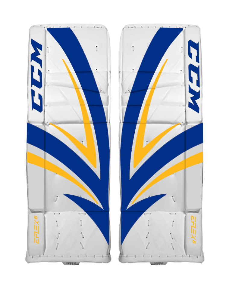
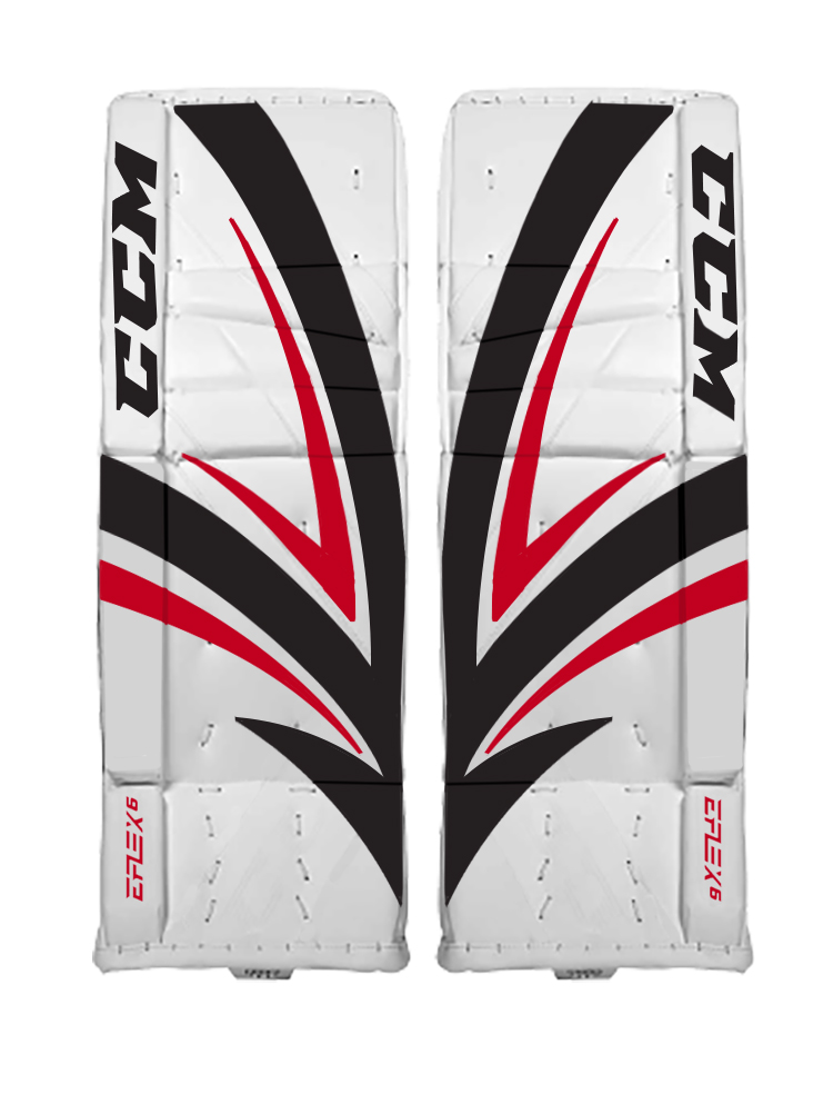
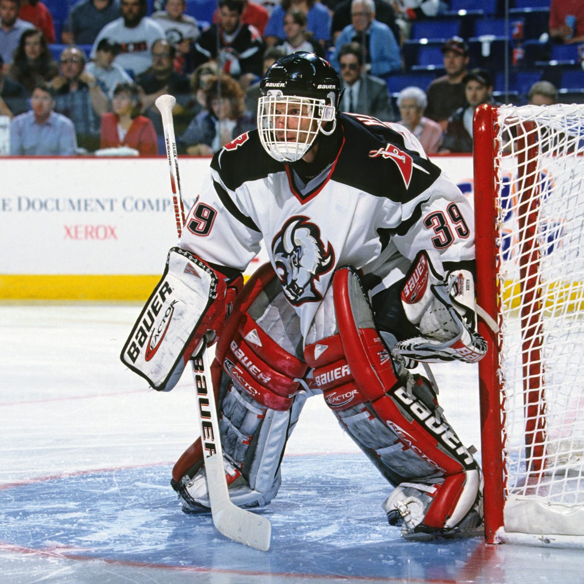
As a CCM goaltender, Levi can pull from a number of looks sported by Ryan Miller and Martin Biron. Though I’m not sure there’s anything that could top the CCM Vector graphic Miller used in both 2005-06 and 2006-07. It’s a bold graphic that looks especially good in red and black and is reminiscent of some of the most memorable years in team history.
There are quite a few other related graphics in the CCM catalog that you could take into consideration here. Biron wore several CCM and Koho designs and I’d love to see a design modeled after the Koho 500s he wore in the late 90s. Miller himself not only wore Koho 580 pads, but he also sported Heaton 10s and the CCM Gatekeeper graphic. There’s also the RBK X-Pulse graphic he wore shortly after the Vector (a boring graphic if we’re being honest) and the Reebok Larceny, which would be another pad design worth exploring for Levi.
I don’t feel there’s a perfect blue and gold look that Luukkonen (or another Bauer user) could utilize. Before the mid-to-late 1990s when pad design became more refined, Sabres goaltenders wore a lot of random gear. Hasek sported pads from the Cinderella Shoe Shop in Niagara Falls when he first arrived while Grant Fuhr wore Brown. I suppose you could have a company recreate Darren Puppa’s Aeroflex pads but that would be a really obscure set to reference. Hasek moved into Heaton before the team switched colors, and those designs wouldn’t ever adorn a set of Bauer pads. So that leaves Luukkonen in no-mans land a bit when it comes to his base set. His take on the One95 for this season looks great and I thought the graphic he had last year was a cool, unique design. But when it comes to cooking up pad designs for him, there’s not much to go on in blue and gold.
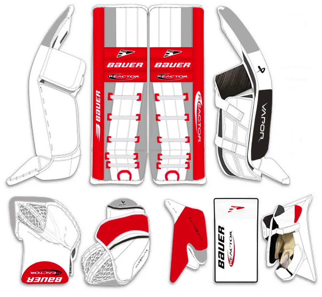
Luckily, there are some good options in red and black. One particular set that I think would be cool to honor, is Biron’s Itech X-Factor pads from 2005-06. I’ll spare the in-depth details, but given that Bauer did purchase Itech many years ago, the option to use this art would be on the table for Luukkonen. The alternating colors on the two pads is a nice touch and Biron nailed this colorway. The X-Factor wasn’t a very good looking retail pad, but leaving most of the pad white save for the pops of color on the trim made these look awesome.
Of course, there’s not much that could top Dominik Hasek’s Reactor 5 pads. The Reactor line has been a popular go-to for many goaltenders in their stable, and there have been some pretty cool applications. Hasek’s set for the team’s Cup years could arguably the most recognizable in team history. I’m not sure you could do better than seeing Luukkonen take the ice in the team’s alternate jerseys wearing a set that honors Hasek.
Eagle eyed gear nerds may notice I didn’t put FlexxDarts on the mockup of the pads for Luukkonen and that’s because Hasek didn’t wear a true Reactor 5 pad. There’s a great interview with Todd Brown on Mike McKenna’s podcast talking about the various specs in Hasek’s pads. So I honored his particular setup by omitting the FlexxDarts from this mockup. I also used design traits from the pads he wore in the 1999 Cup Finals for some of the smaller details as you may see photos of him in that era with a glove with a black graphic or more red on the outside of his pads. As these designs are meant to be a time capsule, it felt like his setup from 1999 was the most appropriate.
The beauty of pad technology these days is that goalies can be just as imaginative with their pads as they are with their masks. Small nods to the past, or wholly unique designs can be dropped right on to a pad. The likes of Levi and Luukkonen don’t need to be shackled to old pad designs, although I think it would be pretty fun to see them take the ice in one of these old designs at some point in the future.

