The NHL took a monumental step in allowing teams to place ads on their helmets for the 2020-21 season.
So far, the decision is being described as an effort to make good on lost advertising from the shortened 2019-20 season. The helmet ads are said to be a one-year effort in an attempt to make up lost revenue from last year. Whether that decision holds remains to be seen. It’s hard to imagine the league and teams will happily turn away whatever advertising dollars can be generated by the ongoing placement of ads on helmets.
At the very least the status quo will be different for this coming year. Ads have made their way to the NHL’s uniforms, that ice has been broken, just a few short years after the NBA placed ads on their jerseys. The NHL’s jerseys remain untouched for now and I suspect they’ll remain that way for at least a few more years.
Even if this doesn’t wind up as a one-year trial, the helmet ads ought to satiate the league, owners and advertisers enough that nothing is added to the jersey. Gary Bettman has described the jerseys as sacred and I can take him at his word on that. If helmet ads are the trade-off for the jerseys remaining untouched, possibly indefinitely, that’s a fair trade to take.
Naturally this is a fraught issue. If you’re a uniform purist, you’ll hate the decision. After all, there are some fans out there who hate that there’s any advertising on or around the field of play, let along the uniforms.
One interesting note is that ESPN has reported teams can include two advertisers if they wish. Meaning it’s conceivable that a team would have one advertiser for their home jersey and another for their away jersey.
I’m not as worried about the addition. It’s disappointing to see the league backed into this corner. But it’s not as if there’s any sort of storied history with the sides of hockey helmets. It wasn’t long ago that teams had to navigate the maker’s mark on helmets, so this isn’t equivalent to swapping the crest for a Honda logo.
The key for this is integrating the logo with the uniform. Advertisers on soccer uniforms are just part of the scenery these days and that’s due, in part, to how they’re mixed with the jersey’s design. So long as these logos work with the team’s color scheme, they won’t be a distraction.
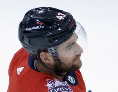
As of writing this post, the Devils, Predators and Capitals have released the company whose decal will be on their helmets. None of the three look particularly bad. Even the black and red Bridgestone logo doesn’t look horrendous mocked up on the Predators helmet. Maybe I feel this way because I’m not typically bothered by this sort of thing (sponsor banners in the rafters is another story). If the logo is cool and isn’t gigantic, it will probably look okay. For exampke, Nashville using just the B in Bridgestone’s logo is a heck of a lot different than using their entire wordmark. Capital One’s red white and blue colors mix perfectly with Washington’s uniform. So, they work. They logos don’t look gigantic, they’re not dominating the helmet and I’m willing to bet by game 33 you’ll hardly notice them.
What does this mean for the Sabres? There hasn’t been any report of which company will be advertising on their helmet. Their partner page offers an interesting mix of possibilities. Some of the logos are better than others when it comes to fitting on a helmet. The Docmentelligence wordmark wouldn’t look quite as aesthetic as the StubHub or Labatt logo might look. I’m pretty sure so long as the Sabres have wiggle room with colors – so to avoid a red or green logo on their helmets – they’ll be in fine shape.
This is far from ideal. I’d much rather see those sharp alternate logos on the Sabres’ helmets as opposed to KeyBank. But it’s hardly a federal case (and probably not worth 700 words of text). The Sabres jerseys are still going to look incredible and that’s really all that matters.
