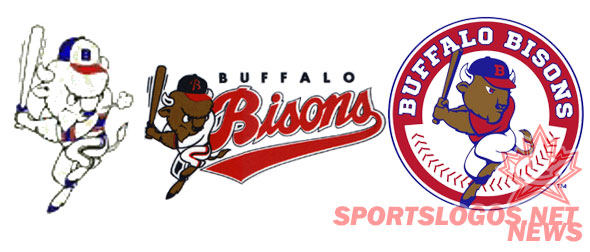
In case you haven’t heard, old is new in Western New York. All new construction bids must be accurate to the Canal-era, historic preservation is the hip thing to do and sports teams are reverting to their past with uniform designs.

The Bisons joined the Bills and Sabres on the retro train with today’s logo unveiling. The new logo is a new take on the original batting Bison logo which has recently stepped in as the team’s alternate logo. As the picture shows, the new logo is the same batting Bison but with softer details and more of a royal blue than the navy from the throwbacks. I am, however, a fan of the wordmark. It isn’t close to being superior to the classic script of the throwback, but it is bold and an improvement over the last wordmark.
The understated baseball stitching is a nice touch and compliments the logo quite well. However, Buster looks almost devoid of any sort of detail aside from his snout and eyes. The throwback logo – which this is obviously based on – gives far more detail in every portion of Buster. That alone makes this logo inferior to the original. The lack of general detail looks weak and somewhat cheap. While the direction was clearly spot on, the execution wasn’t.
However, the new logo is still a win. This blows the Mets-themed logo out of the water. That design was a poor attempt at combining the Mets design scheme with a Buffalo twist. What resulted was a strange fire-breathing buffalo with a bad wordmark. Simply because the previous color and logo set-up were so faulty, this logo is a vast improvement. It just leaves far too much on the drawing board.
To me, the logo looks far too amateurish when you take into consideration what could have been. Drawing on the tradition of the franchise was a brilliant move, it was just poorly executed.
Personally, I liked the idea of incorporating the Bisons history of red white and blue along with the Blue Jays recent return to their design roots. By combining the Jays iconic blue jay head into a buffalo design, the Bisons could have had the best of both worlds. Not only would the throwback colors be fully incorporated, but the design would have solid roots with the parent club.
When the logo change was first announced, I drew up this very rough sketch of what I was thinking. Luckily the WNY Watercooler ran a very similar, full-color logo about a month later. Perhaps I’ll dust off my photoshop skills and take a run at my idea and see what I can add to the conversation. UPDATE: Here’s a pretty rudimentary mock-up of what I was thinking. Obviously this is a below-average effort on my part, but it gets the point across. Any actual photoshop experts could certainly give a far better effort than I. This was just to be food for thought.


You’re spot-on. I do like the thinking of the red, white and blue scheme, considering we had season tickets in the 90’s. That said, it falls short and feels very amateurish. Before this mark was unveiled, I put together a proposal for the Bisons that attempted to do the same thing you suggest here, incorporating elements of the Bisons’ brand and the Toronto brand together. Sadly, (for me, at least) the front office didn’t latch on. http://forzamilo.wordpress.com/2012/11/20/re-branding-the-bisons/
LikeLike
Phenomenal work. Truly impressive stuff. Wonderful update of the classic logo. Far more attractive that the one they came up with.
LikeLike
Thanks! I tried to sell the team on it but I sense they were already in the middle of the process with the company they found to do the work.
LikeLike