The Olympics are right around the corner and one of the hallmarks of international tournaments are the uniforms each country’s team will sport during the event. The Olympics have been a launchpad for new uniform designs for decades now. Nike launched the Swift uniforms in 2006 – a new-age uniform design that featured new fabrics and vertical striping patterns – and Nike has continued to debut for new runs of international team jerseys at the Games. That has made the debut of new Olympic uniforms an exciting event as many countries will continue to use the uniforms for several years to follow. Although not every set has been a winner.
This year will be no different as Nike has produced a new fleet of uniforms for the 12 countries participating in this year’s Olympic Games. Now that all of the uniforms for 2026 have been released (or leaked), and with games a month away, what better time than now to rank them? We’ll start from the bottom and work our way up.
Not Ranked – Japan: While their roster has been announced for the women’s tournament, I haven’t been able to find the Japanese uniforms for the 2026 Olympics. At least not yet. When they’re released, I’ll add them to the list. Hopefully they’re an improvement over their 2022 uniforms.
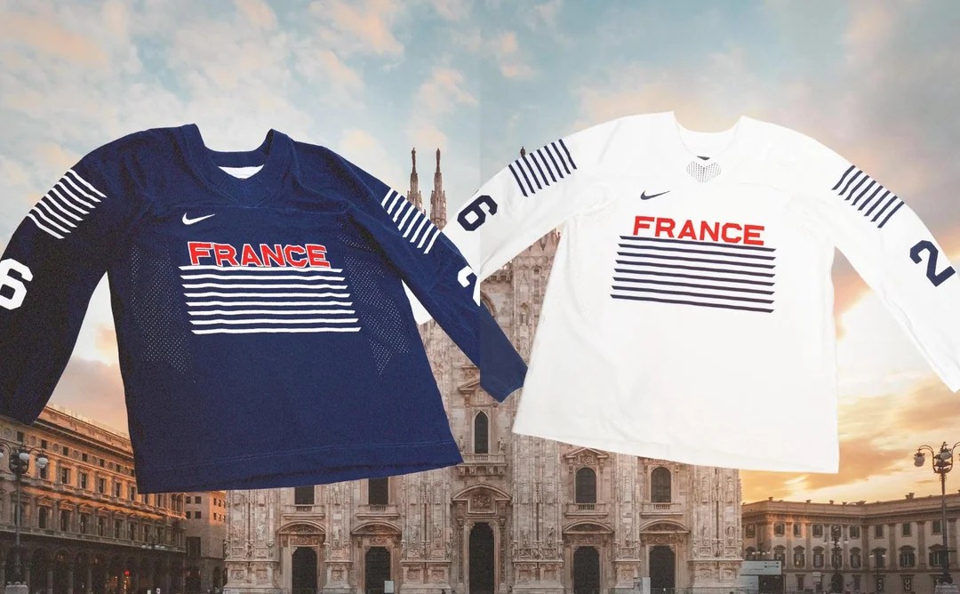
12. France: What am I looking at? Did the designers run out of time and just CTRL+C a few lines and call it a day? This is a bland uniform with a woefully bizarre design on the chest. The thin lines don’t work on the shoulders and they really don’t work on the chest. As a result of the design, the TV numbers are pushed way down, adding to the mess. Luckily, France isn’t exactly a marquee team, so you won’t see too much of these unless you seek them out.
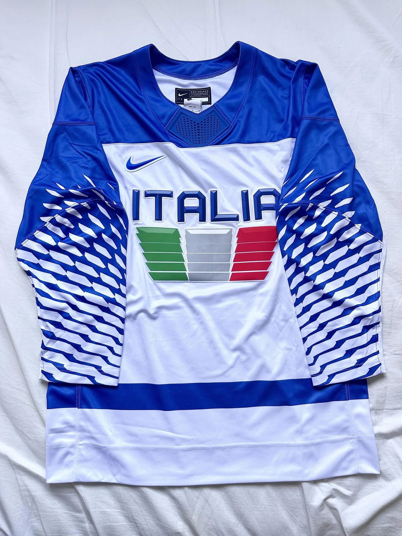
11. Italy: These are giving 1990s soccer goalie kits more than they are hockey jerseys. There’s a lot going on here for the hosts. The take on the Italian flag is a cool treatment for the crest, but the sleeves are really out of place. The end result is a very busy jersey that doesn’t really tie together. There have been some sharp Italian hockey jerseys over the years, but this isn’t one of them.
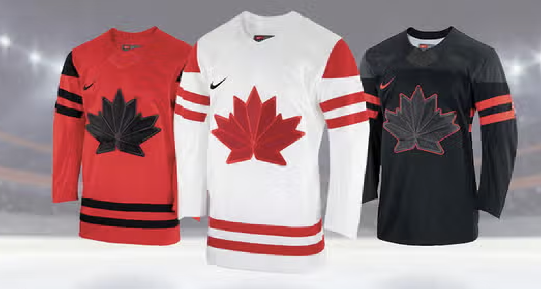
10. Canada: This is one of the worst Canadia jerseys I’ve seen in a long time. The monochrome leaf with the geometric patterns doesn’t work. I don’t think there’s a country that’s been harmed more by the Olympic rule prohibiting the use of a national sporting logo than Canada. The Hockey Canada logo is gorgeous and makes for an excellent jersey crest. Some of the coolest international jerseys of all time belong to Canada. Sadly, these won’t make the list. The black jersey is particularly ugly, though I think the white uniform has some redeeming qualities.
They’re also being done in by Nike’s number font. Virtually every team is using the same numbers for this year and they don’t look good on the Canadian uniforms. I don’t mind the treatment on the stripes, I think in the right circumstances, the stripes not connecting on the back would be a cool feature, but the other aspects of these jerseys let down any redeeming qualities.
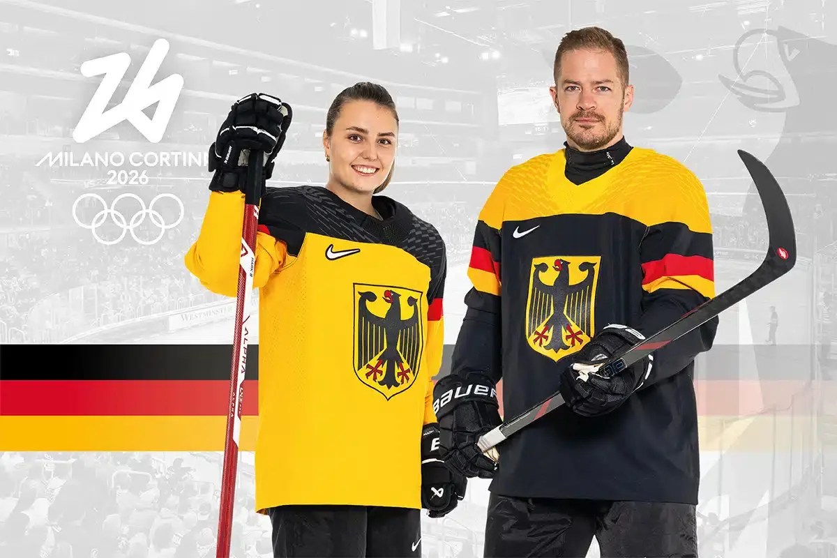
9. Germany: If these had anything going on along the hem they would rank a lot higher. Germany has a bold color scheme that lends itself well to a lot of jersey designs and I think the black jerseys are especially cool. But the gold version is a step away from being a practice jersey with no hem stripes to speak of. There’s also a subtle difference in the striping pattern on these two jerseys that further affects the gold uniform.

8. Sweden: For a long time Sweden pushed back against any and all design suggestions in favor of their timeless Tre Kronor design and horizontal striping. Never was this more evident than in 2006 when they were the only country not wearing vertical stripes. Similarly in 2018, they were the lone country not to adopt Nike’s hideous sleeve patterns. However, they appear to be folding to some pressure in recent years. Sweden’s turn to navy blue has been a let down as the brighter royal blue always popped on their gold uniforms. Similarly, Sweden’s jerseys lack a hem stripe, which is a significant downgrade as is the non-connecting sleeve stripes. The standard number font that Nike is pushing on the teams is another downgrade, making these some of the most forgettable Sweden jerseys in quite some time. It’s time they got back to their roots.
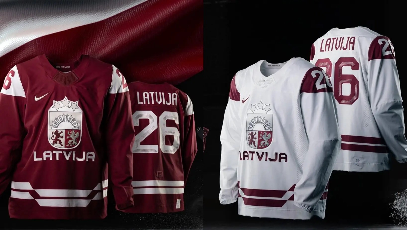
7. Latvia: It helps that Latvia’s maroon and white make for an awesome color combination and the striping detail on these is a cool inclusion. I don’t like the shoulder cut outs – just like the shoulder cut outs on the Fanatics practice jerseys – and I think those detract from the overall look. I would’ve much preferred these had the hem stripe carry over to the sleeve instead of leaving the sleeve blank and using the contrasting shoulders caps.

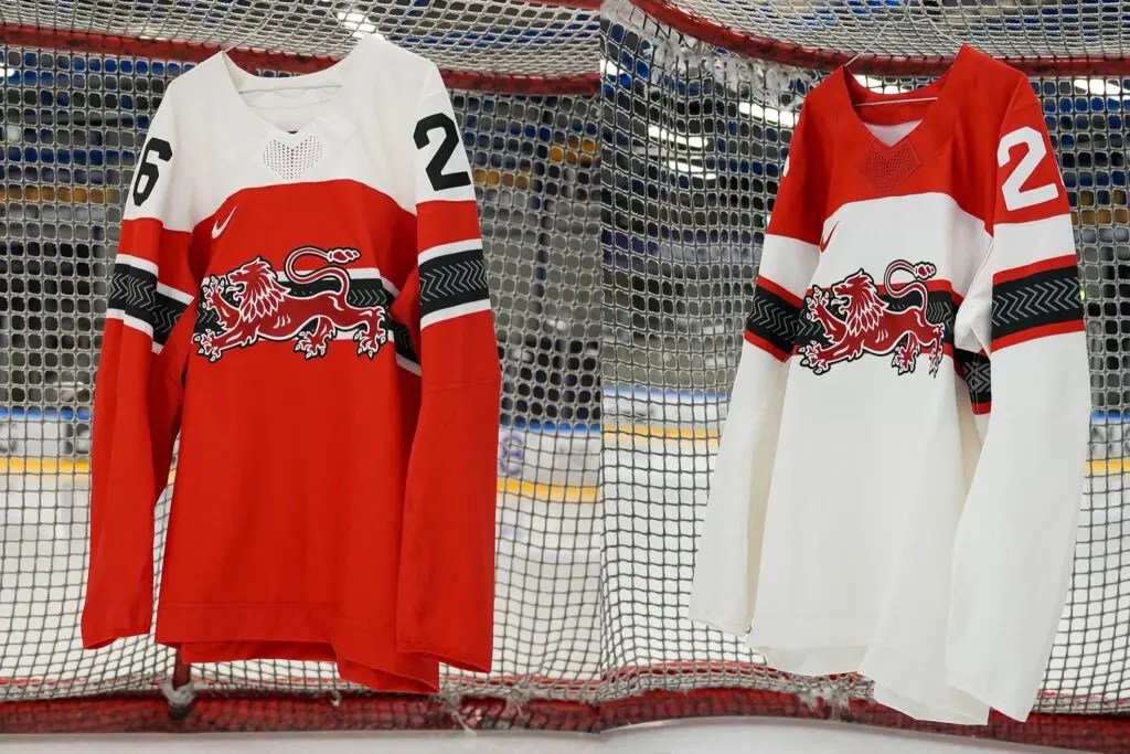
6. Switzerland: These are a little drab but the chest stripes are a nice addition. Nike’s decision to cut off any striping on the back is an odd one and I think it hurts some jerseys more than others. The Swiss definitely fall into the former category as I feel these would be much cooler if the stripe connected and a different treatment was needed for the numbers to pop against the stripe. Also, a small nitpick, but I would’ve liked to see red numbers on the white jersey as opposed to black. These are a sharp uniform set, I’m just having trouble not comparing them to the incredible jerseys the Swiss wore in 2006.

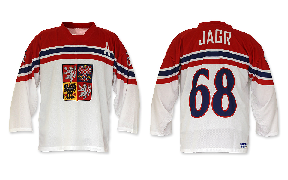
5. Czechia: All things considered, these are a bit boring. I’m partial to the white jersey, I think the red shoulder yoke looks awesome and the striping pattern is a great complement to it. The red jersey isn’t quite as good, but it’s still sharp, as most Czech jerseys tend to be. These aren’t quite as cool as the Czech’s 2014 uniforms, and I wish there was something happening on the hem (a common theme), but they’re going to look great on the ice.

4. Finland: It’s hard to screw up a Finland jersey. The color scheme is elite and the country’s iconography is compelling. The gold lion on these jerseys is a very cool touch. It looks like Nike is trying a specific type of graphic treatment on a lot of the crests to mixed results, but it definitely works on the Finnish lion. The extra flourish on the chest stripe is interesting (I can take it or leave it) and this happens to be a jersey where the interrupted striping may just work. If I could change one thing (other than the number font), I’d make the dark and light blues contrast a bit more, but that’s a small change on a uniform set that looks excellent.
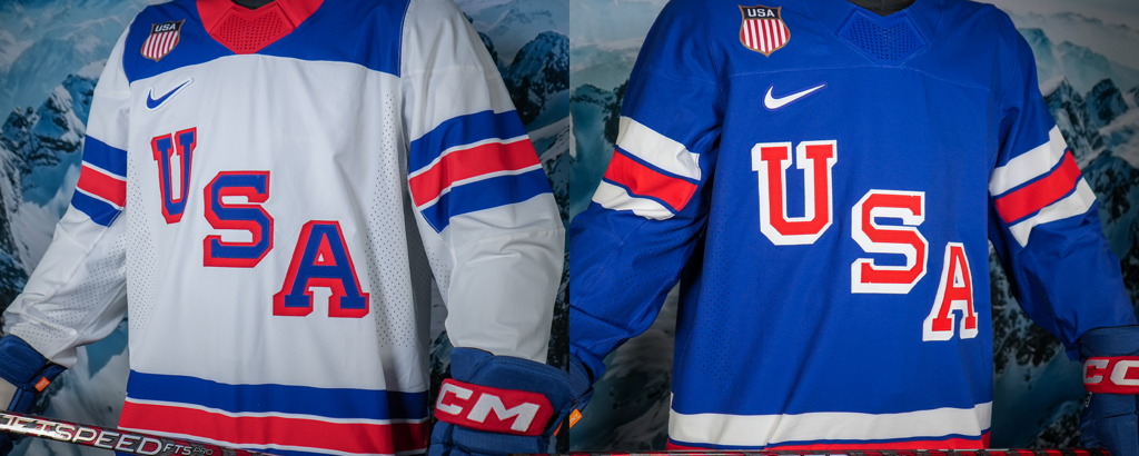
3. USA: Praise be. The Americans have finally broken free from Nike’s template-centric designs. The U.S. rolling out a 1960 inspired set is the sort of thing I would have only expected from Sweden in past years. While most of the other uniforms appear to have adhered to design cues from Nike (like in striping or numbers), the U.S. has a jersey design unique to the country and sport. The template presents some drawbacks from prior 1960-style jerseys. In prior iterations, the shoulder yoke was much longer and looked more natural. The shorter design on these looks off, especially compared to prior versions like what was worn in 2010. Similarly, moving the USA shield from the left to the right side and into the blue fabric is likely due to the limitations of the jersey template. Although the hem stripe is uninterrupted, the sleeve stripes do break on the underside. While the shoulders don’t look quite as natural, the overall design of this jersey is excellent and it’s just what the doctor ordered after several years of underwhelming international designs for the Americans. It looks like USA hockey is adopting the 1960 style for virtually every level of international play, which is a great decision and we get to reap the benefits at the 2026 games.
2. Denmark: These go hard. The striping pattern is awesome and it’s very annoying that Nike’s template doesn’t allow it to wrap all the way around. The white jersey is beautiful. It’s an eye-catching design that pops. Every feature complements the others perfectly, especially on the white jersey. The white shoulders on the red jerseys aren’t great, I would’ve liked to see a different option there, or perhaps even leaving that portion red, but otherwise, what works on the red jersey works on these. The crest is excellent, as mentioned, the striping is very cool and it’s all tied together by a great color scheme.

1. Slovakia: I’m not sure you could improve on these if you had 100 tries. Well, the numbers stink, but let’s set that aside as a Nike-wide oversight as opposed to something that’s uniform specific. Using the shape of the mountain range to differentiate the striping isn’t subtle but it isn’t in your face either. The jerseys and crests work perfectly together that looks just as good in white as it does blue. No notes on these, they’re a 10/10.
