New gear makes for one of the best parts of a new season and goaltenders are always at the center of attention in this department. Devon Levi, Ukko-Pekka Luukkonen and Felix Sandstrom are no exception as all three have picked up new looks for the 2024-25 season.
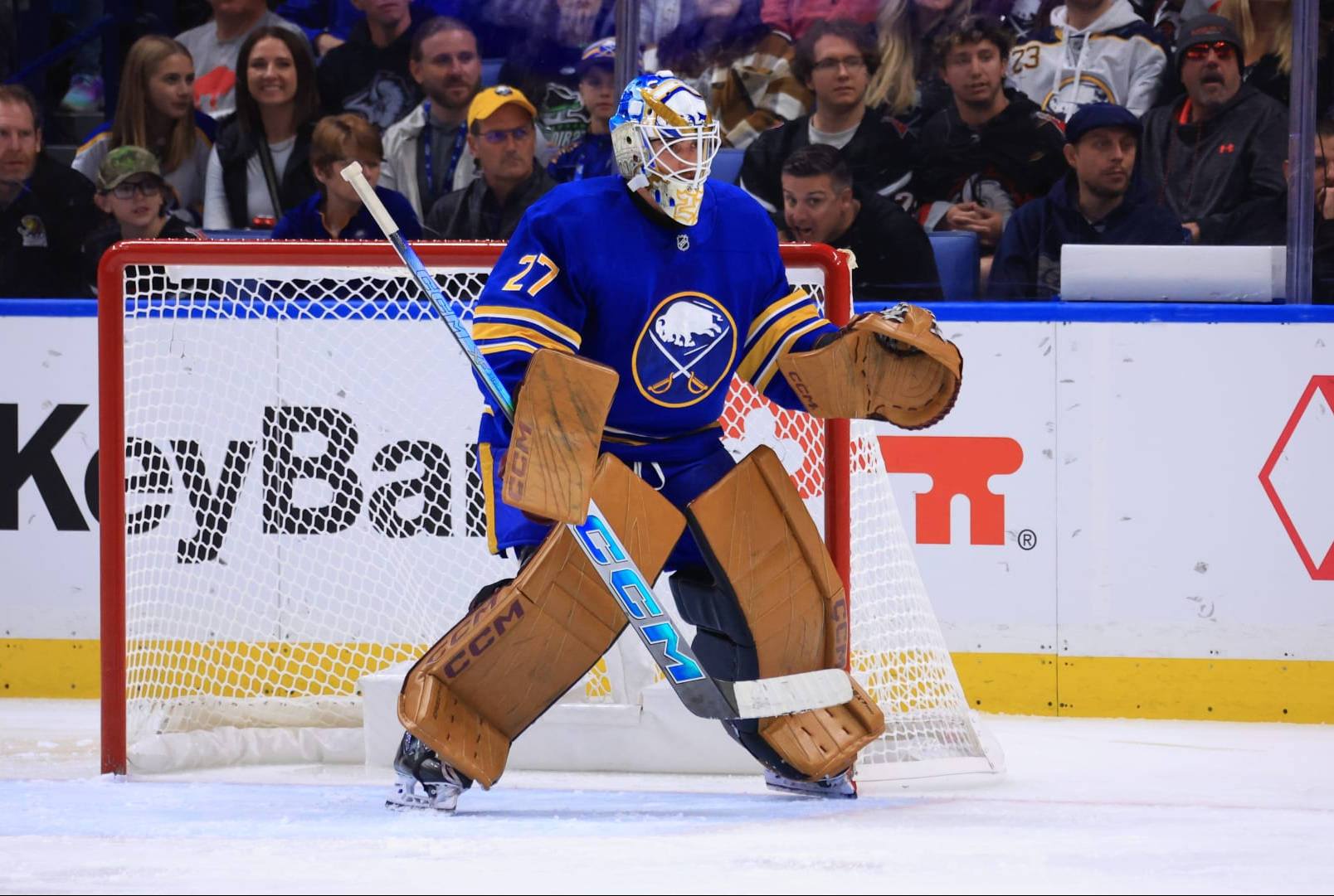
Levi has the most eye-catching set of the young season, option for a vintage-inspired look from CCM. The brown leather look hearkens back to pads from the 1970s and early 1980s before team colors started to become incorporated into the materials. There is some expectation that he will be receiving a set of pads in Buffalo’s colors and that he is wearing the brown pads in the interim. That would be too bad as the brown pads look especially good with Buffalo’s home and away uniforms. The vintage brown setup is right at home with a set of jerseys that draw their design from the team’s original uniforms. It’s a serendipitous outcome and I hope he keeps rolling with the brown pads when the team is in blue and gold.
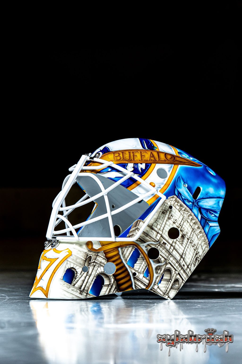
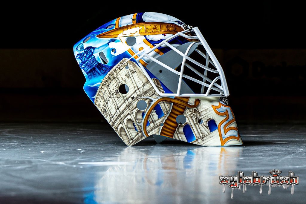
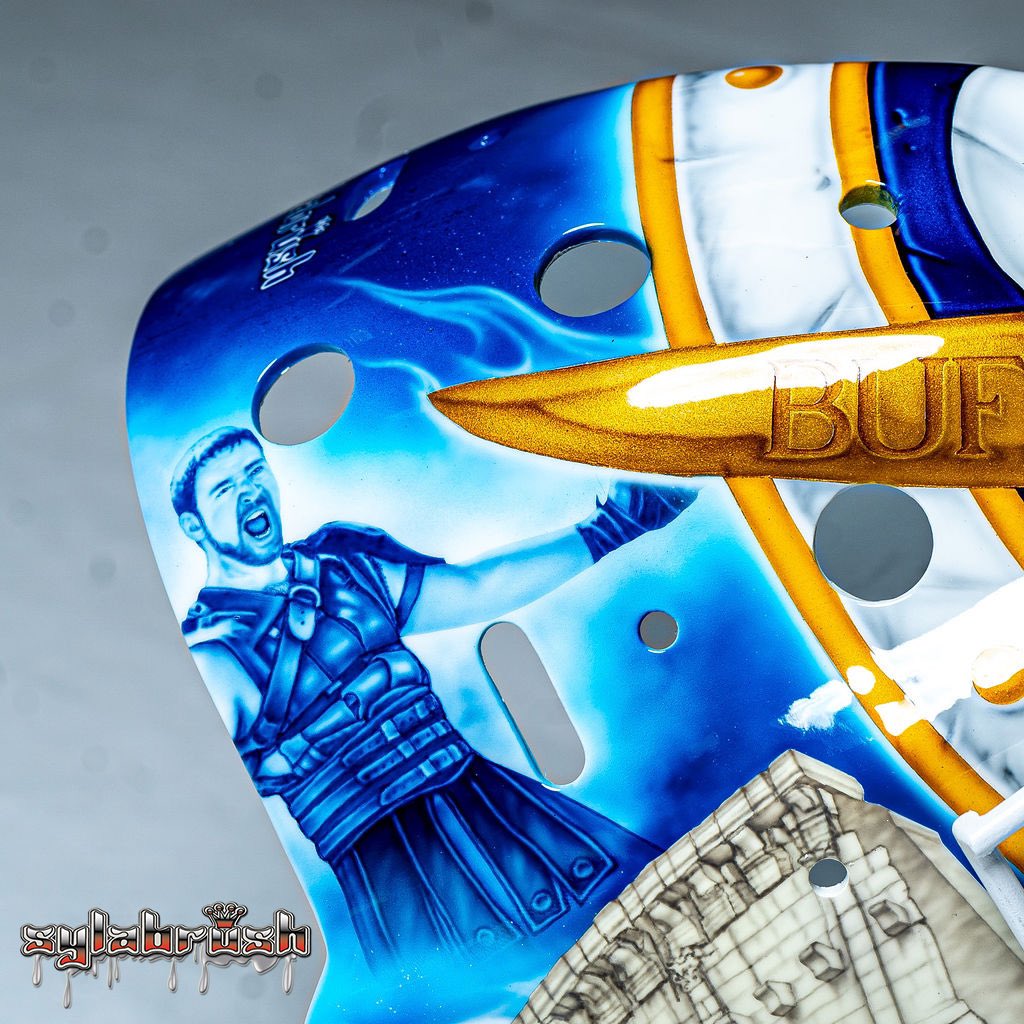
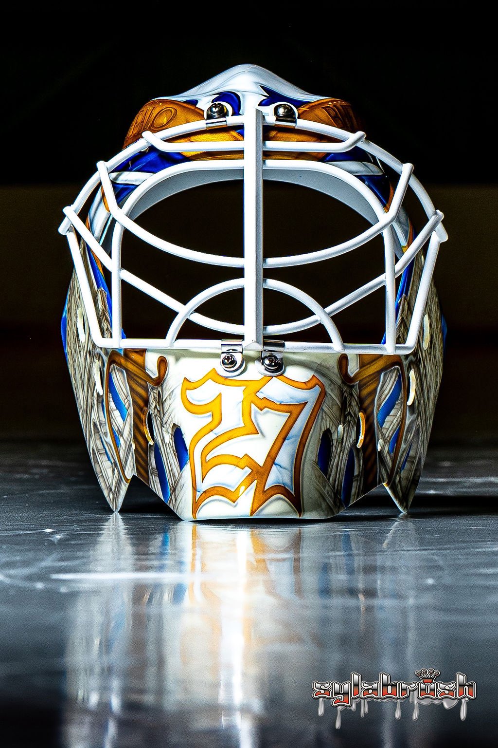
Levi’s helmet for the year, painted again by Sylabrush, features imagery from Gladiator. Sylabrush is unparalleled in goal mask design and she did an excellent job melding Buffalo’s iconography with the Gladiator theme. The treatment of the crest on the round shield is especially sharp and adapting Maximus’ sword design for the blades was another nice touch.
Levi doesn’t have his black and red mask just yet, nor does he have the pads he will be wearing with the black and red uniforms. We’ll have to wait and see what his entire setup looks like once that equipment arrives. Though, if he doesn’t even have pads in the team’s primary colorway, I have to wonder how far behind his black and red gear could be.
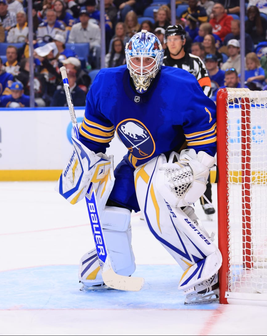
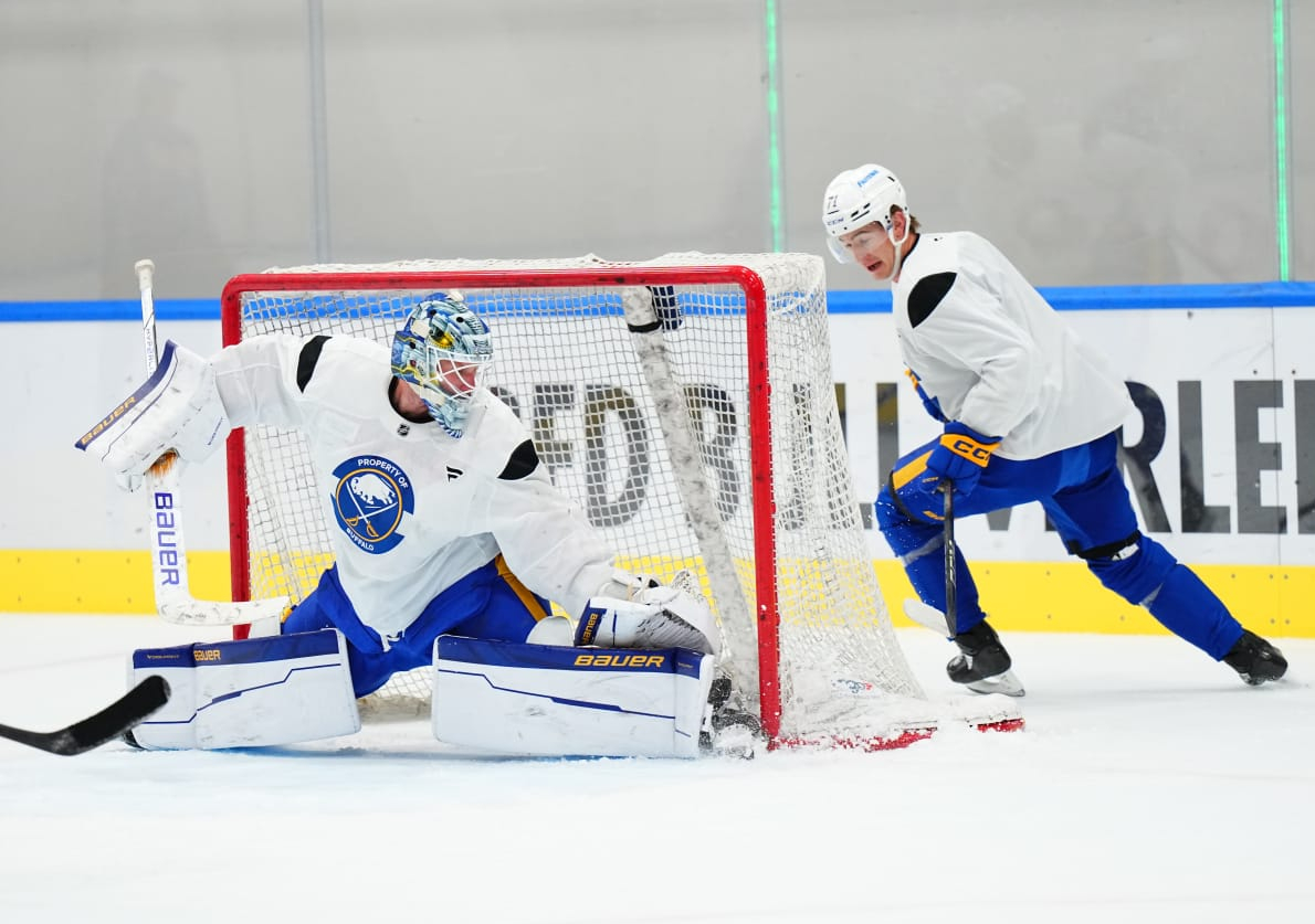
Ukko-Pekka Luukkonen’s gear this year draws similar inspiration from the past Bauer graphics. Luukkonen wore an homage to the Bauer One95 pads last year and had adopted the One100 graphic for this season. It’s an excellent graphic for Buffalo’s home colors and Luukkonen looks especially good in his blue and gold pads. I hope Luukkonen sticks with this trend for the next few years as there are plenty of good designs from Bauer to pull from.
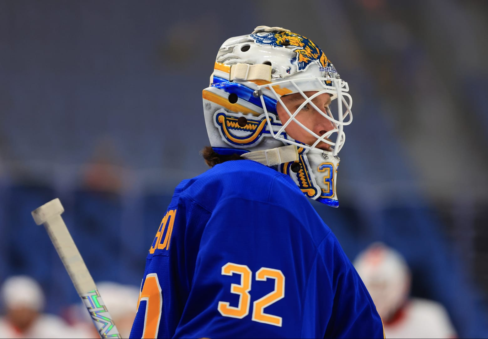
He has also continued to use the same general design on his masks, with an aggressive, snarling bison engulfing the shell. It hasn’t become quite as iconic as Ryan Miller’s design did, but sticking with the same base design really makes the look unique to Luukkonen, which isn’t something many goalies do these days.
Luukkonen’s red and black setup isn’t quite as sharp as his standard equipment. The One100 graphic never lent itself well to a dark base and that remains true with Luukkonen’s primarily black pads. I wish he’d opted for silver instead of white on the trim as I think that would have made for a slightly better overall design than using white.
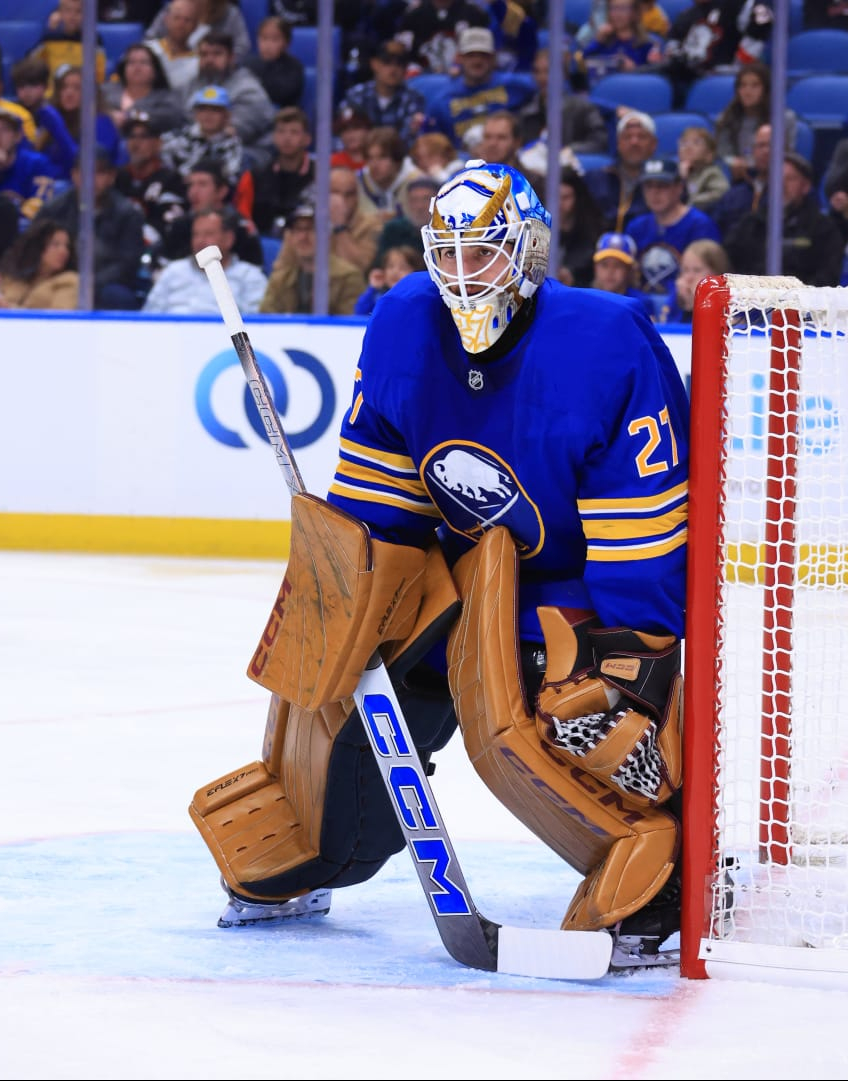
Down in Rochester, Felix Sandstrom kept it pretty simple. Blue and white True leg pads that will match Rochester and Buffalo’s jerseys as needed. His current mask is a gorgeous Sabres design which has a very cool treatment of the charging buffalo, jersey stripes and swords on either side, with a more detailed design on the top of the helmet. Much of the design is very straightforward but it’s very well executed and is probably one of the better Sabres masks of the last five-to-ten years.
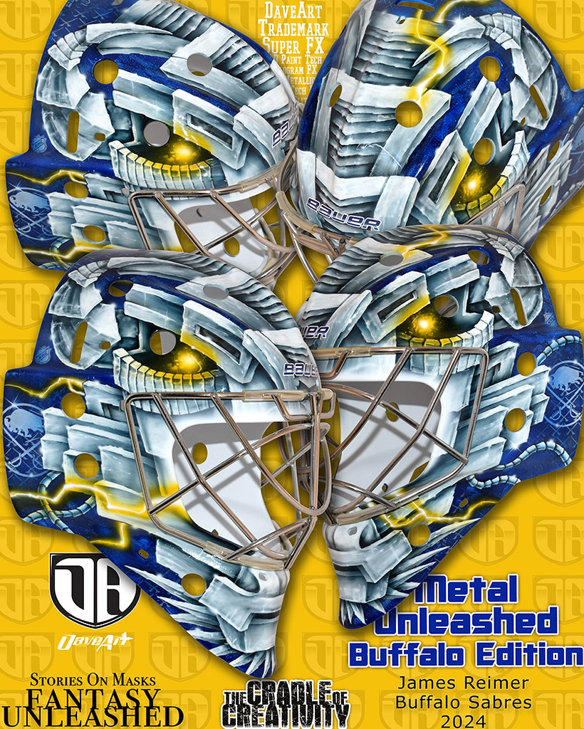
James Reimer is no longer with the club, but he was around long enough to get some Sabres gear. So, for posterity, we’ll include him in the exercise. Somehow, Reimer managed to find the one poor application of Bauer’s new Shadow design. This is easily one of the best graphics Bauer has had in the post-Odin, digi-print era, yet Reimer managed to find an underwhelming take. His mask looked pretty interesting, it was a clever blend of his Optimius Reim nickname with the same sort of all-encompassing bison head used by Luukkonen and Ryan Miller. It doesn’t have the same visual beauty of Sandstrom’s or Levi’s masks, and even Luukkonen’s mask has some more minute details that I favor, but it was still a cool way to incorporate Optimus Reim and Buffalo’s logos.