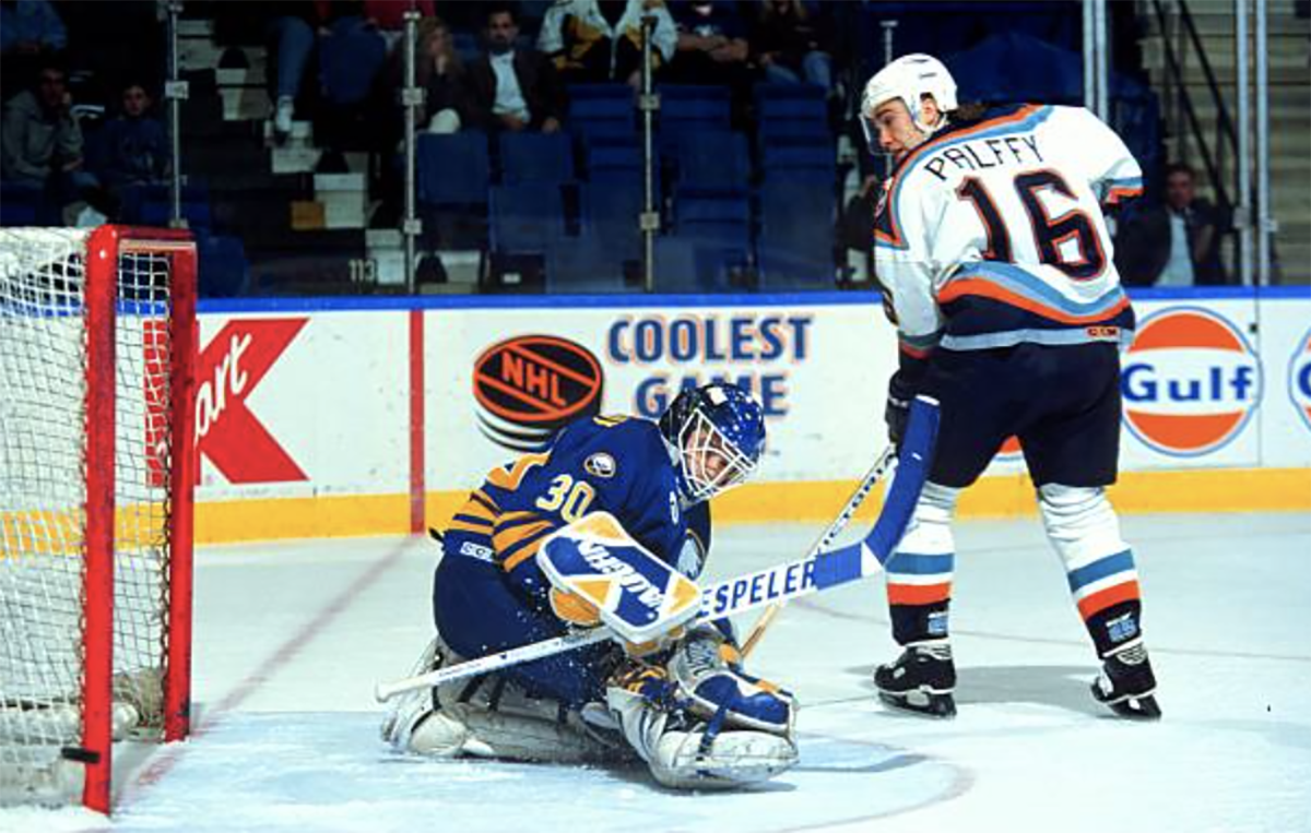
Another season is winding down and the future in net for the Sabres is up in the air once again. That’s exciting for a few reasons. First and foremost, the opportunity to improve in net opens the door for the Sabres to take a big step back to respectability as they work through this rebuild.
Second, and most importantly, a new goalie (or goalies) means new goalie gear.
Thanks to the Sabres rich history in goal, there have been buckets of goalies whose mask design or gear choices have been terrific. With the 2021-22 NHL season ready to wrap up, it felt like a good time to look back at 10 of the best sets of goalie gear in Sabres history.
You’ll notice that no one from the era of vintage pads did not make the cut. That’s simply because vintage pads are quite ambiguous. There’s nothing that really sets Roger Crozier apart from Gerry Desjardins or Gary Bromley besides their masks (and we’ve already ranked those). Those terrific vintage sets all have their place in history, but when it comes to the best looks in team history, they can’t compare to the way more modern pads pop with different color combinations.
This isn’t a ranking so much as a collection of the sets I feel look the best. So, the list isn’t in any particular order. Though I did save the best for last.
Honorable Mention – Andrei Trefilov
Unfortunately, there are not enough photos of Trefilov available on the internet to fully investigate this particular set of gear. But that Vaughn blocker is probably the coolest blocker ever made and looks incredible in blue and gold. Assuming the rest of the set looks as it does in this photo, it would supplant one of the entries on this list. Those Heaton pads look nice even with a mostly white design and the updated mask would make this a winner.

Ryan Miller – CCM Vector
I’ve written about this set of gear on the blog before and the cool nature of the pads Miller wore for a long period of his Sabres career. Of the many graphics that adorned the spec pads Miller sported, the Vector stands out as the best looking.
The graphic looked great with Buffalo’s jerseys and allowed for a solid combination of the team’s two primary colors. It still looked great the next year as they shifted to blue and gold, though he’d move on from the Vector to the Reebok X-Pluse graphic later in the 2006-07 season.

Dwayne Roloson – Vaughn Vision
Points should be deducted here for the non-matching blocker and the Itech glove, but overall, this looks excellent.
Dark pads don’t play as well on today’s modern pads. But the pads of the 90s and early 2000s typically had graphics which were almost tailor made for a darker base color. Roloson’s pads here are a great example as the white and red accents pop on the black upper portion. Bonus points for the mask paint level the mismatched blocker and glove.

Dominik Hasek – Bauer Reactor
Hasek’s Bauer (and Cooper) Reactor 5s were probably the most iconic of his time in Buffalo. They’re the pads he wore for the 1998 and 1999 seasons and tend to be what’s featured of any photos of him in black and red.
Even as simple as the design is, there are some small traits that stand out. Using red as the main accent instead of black made them far more interesting. The silver accents on the pads played well with the silver accets on the jerseys of that time as well. Then there’s the player himself, who would’ve made a set of Franklin street hockey pads look iconic.

Bob Essensa – Vaughn Vision
Essensa’s forgettable season in Buffalo shouldn’t overshadow the terrific equipment he wore. Going with a primarily silver accent on black pads was an excellent, excellent choice.

Steve Shields – Vaughn & Heaton Helite
I mentioned in the Trefilov section how the Vaughn Legacy 2 blocker holds a special place in my heart. It’s a clever design that Vaughn should find a way to bring back.
Sheilds entire set up here looks awesome with Buffalo’s black and red uniforms. The red accents on the black pads pop and his choice in blocker is clearly unimpeachable. Full marks all around.

Michal Neuvirth – Vaughn Sock Stripe
Vaughn’s sock stripe graphic enjoyed a nice run of prominence in the mid-2010s and the Sabres were lucky enough to nab Neuvirth during that run. He’d go on to use the graphic in Long Island as well, kicking off his use of the basic, yet clever graphic here in Buffalo.
I love how it looks with Buffalo’s uniforms (home and away) and I’m hopeful that if the Sabres pick up another goaltender who uses Vaughn, that we see the graphic return in the future.

Mika Noronen – Brian’s Beast
This might actually be the most attractive set of gear on this entire list. It might not be the best, or my favorite Sabres set of all time. But in terms of pure aesthetics, it might just take the cake.
The Beast graphic itself is an all-time great. The pads were a huge hit for Brian’s and the graphic looked awesome. It’s just abstract enough while keeping a tie to the Beast namesake to work on a number of levels. It’s awesome in a three-color set up as the Sabres had in the early 2000s and looks especially cool with silver as the third accent color.

Grant Fuhr – Brown Excel
Fuhr’s stay in Buffalo was fairly short, but he cycled through a pretty healthy amount of gear in that time. I’m not sure how long this particular set was in use for, but it’s the best one of the bunch for him.
Those old Brown Excel sets were pretty cool and the graphic on this version is sharp. A more modern iteration of these would likely feature a bit more gold which would really make these pop. But even without the gold accents, this set is really sharp. Bonus points for the incredible mask.
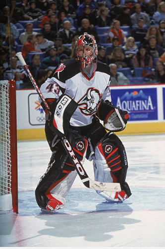
Martin Biron – Koho Revolution
One of my all-time favorite sets of goalie equipment. I tend to think that the Revolution’s graphic played a role in ushering in the primarily white sets of equipment we see today. The idea that the shape of the graphic helped create an optical illusion was probably overblown, but it didn’t make them any less cool.
These pads looked good in basically any colorway you could come up with and the Sabres black and red set was no exception. Biron looked incredible in this set. His split color helmet makes this set up that much cooler.

Dominik Hasek – Heaton Helite
The Heaton Helite III is another one of my all-time favorites. Hasek bounced around a few sets of gear early in his Sabres career – including some from the locals at Cinderella Shoe Shop – so these probably didn’t get as much run as they could have. But they still look phenomenal.
I love how the gold accents trim different areas of the pads and the angled graphic on the shin is still so simple yet cool. It’s a really perfect blend of light and dark colorways on a pad. Something I think gets overlooked far too often today. I can only imagine what it would have looked like had he not switched to Cooper for Buffalo’s first season in black and red.
